

ℹ️ Affiliate Disclosure: This article may contain affiliate links. We may earn a commission at no extra cost to you. Thanks for your support! ❤️
Introduction
If you are new to choosing modern script fonts, they can be surprisingly difficult to judge. A script typeface may look beautiful in a preview image, but once you place it inside a logo, website hero section, product label, or social post, the weaknesses become more obvious.
I see this often in branding work. The font itself is not always the problem. The issue is usually scale, spacing, contrast, or using a decorative script in places where clarity matters more than personality.
This guide looks at 18 modern script fonts with a designer’s eye: how the letterforms feel, where the visual weight sits, how readable they are, and what kind of brand personality they create. The original article organizes these fonts into clean monoline picks and more expressive script styles, with quick notes on readability and use cases.
Quick Picks
- Best clean monoline option: Night Wednesday
- Best soft handwritten option: Melorine Script
- Best luxury option: Gristha
- Best romantic calligraphy option: Friday Calligraphy
- Best relaxed lifestyle option: Palm Springs
How I Picked These
I compared these modern script fonts by headline and wordmark readability, stroke consistency, spacing, small-size performance, alternate-character usefulness, pairing flexibility, visual tone, and how well each style can carry short expressive text without becoming difficult to use across logos, packaging, websites, social graphics, and print.
1. Night Wednesday
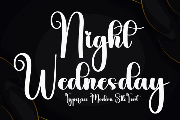
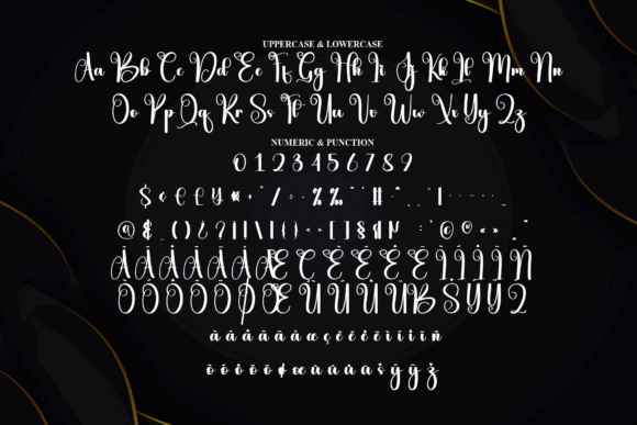
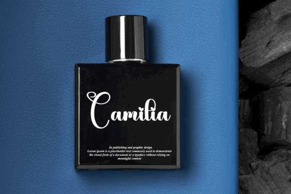
Night Wednesday has a smooth, monoline structure, which gives it a more controlled and contemporary appearance. The even stroke weight makes the lettering feel steady rather than overly ornamental.
Visually, this typeface creates a calm, slightly moody tone. I can imagine it being used in lifestyle branding, boutique music projects, personal brands, or fashion-related visuals where the brand needs softness without becoming too delicate.
The main advantage is readability. Because the strokes stay fairly consistent, the font should hold together better than high-contrast scripts at smaller sizes. That does not mean I would use it for body text, but it gives more flexibility for logo systems and small-format brand applications.
I would pair it with a quiet sans serif and keep the layout restrained. Let the rhythm of the script do the visual work.
2. Melorine Script
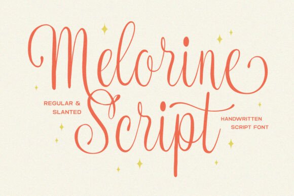
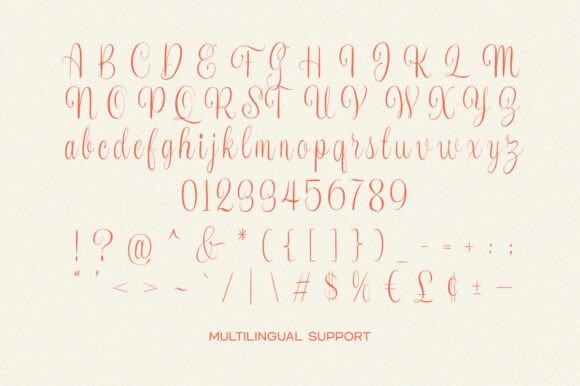
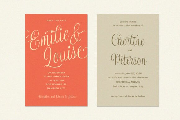
Melorine Script has a softer, more feminine rhythm. The curves feel relaxed and handwritten, but not messy. That balance matters because many handwritten fonts either become too casual or too decorative.
From a branding perspective, Melorine Script suits beauty brands, stationery, packaging, handmade labels, and editorial accents where warmth is part of the identity. The letterforms have enough personality to feel personal, but they do not rely on excessive swashes.
The spacing gives it a gentle, open quality. I would still use it mainly for short names, product lines, and headline moments. It may read better than fine hairline scripts at smaller sizes, but it will still look strongest when given room.
A clean sans serif would keep it modern. A soft color palette would support its tone without making the design feel overly sweet.
3. Amanah Guru
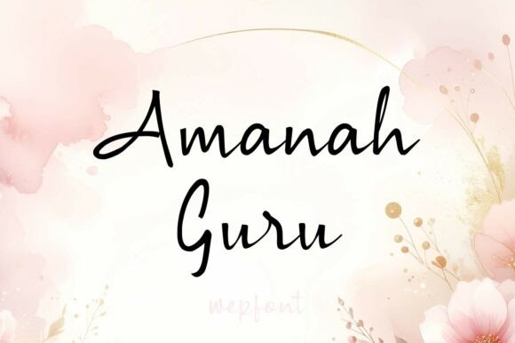
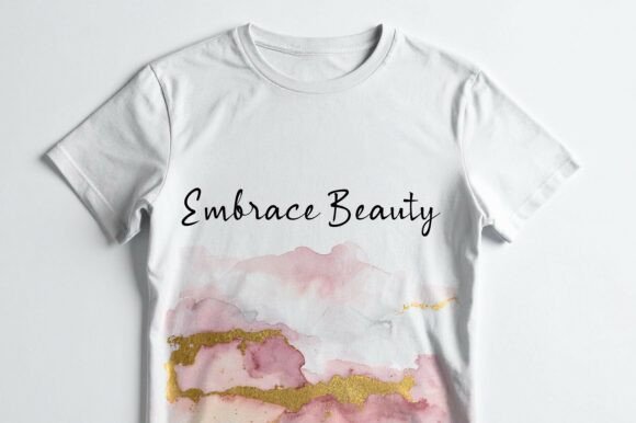
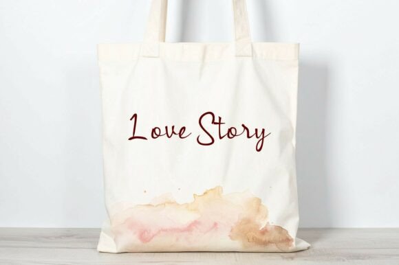
Amanah Guru sits somewhere between everyday handwriting and light calligraphy. It has a natural quality that makes it feel approachable rather than formal.
One thing I often notice when reviewing brand identities is that “friendly” typography can easily become childish if the letterforms are too loose. Amanah Guru avoids that by keeping a more refined rhythm. The strokes feel delicate, but the structure still feels intentional.
It could suit packaging, editorial details, personal branding, or small boutique identities that need warmth. I would not use it as the main interface font on a website, but as a logo accent or handwritten detail it has a useful personality.
Pair it with a clean sans serif for body copy. The contrast between a plain supporting typeface and the handwritten script will make the brand system feel more controlled.
4. Aromantic (Iromantic)
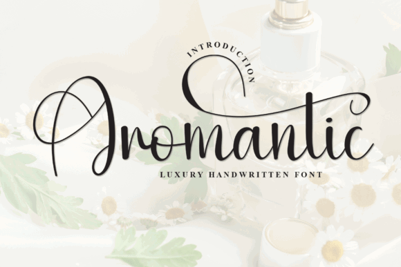
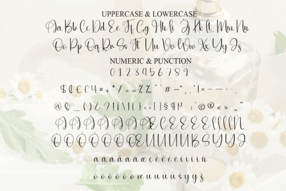
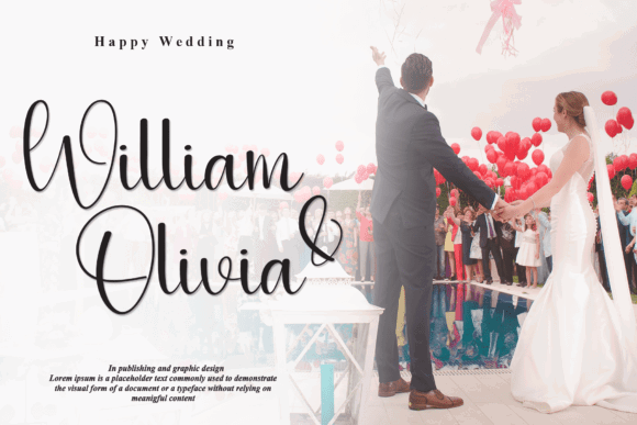
Aromantic, also labeled Iromantic in the source, has a very light, luxury-oriented style. The thin strokes and restrained curves give it a premium, minimal feel.
This type of script can look elegant, but it needs careful handling. Fine strokes often disappear on mobile screens, low-quality printing, foil effects, or small packaging labels. That does not make the font unusable. It simply means it should be treated as a high-impact display detail.
I would use Aromantic for short phrases, beauty branding, boutique packaging, wedding stationery, or editorial headers where white space is part of the design language.
The font needs room. Set it large, avoid clutter around it, and pair it with a minimal sans serif. When a script is this light, the surrounding layout has to support its delicacy.
5. Friday Calligraphy
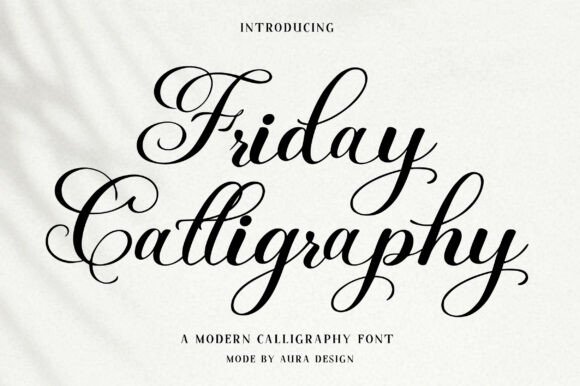
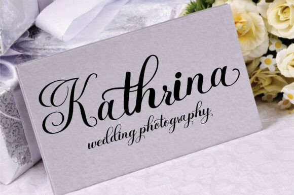
Friday Calligraphy has more movement and flourish than the monoline picks, but it still feels modern because the curves are clean and the structure is controlled.
The swashes give it a graceful finish, especially for names, invitations, and short headlines. I would be careful not to overuse those swashes across a full layout. Many decorative fonts attract attention initially but become harder to work with across larger branding systems.
In logo design, Friday Calligraphy could create a romantic or polished impression. For websites, I would reserve it for hero text, quote graphics, or signature-style accents rather than navigation, buttons, or long headings.
Pairing is important here. A neutral sans serif or simple serif would help balance the expressive letterforms.
6. The Mountaine
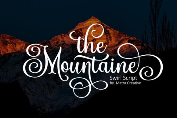
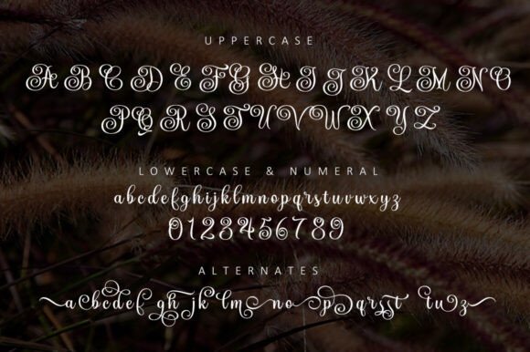
The Mountaine has flowing curves and a confident rhythm. It feels polished, romantic, and slightly dramatic without becoming overly traditional.
The letterforms have enough visual weight to hold attention, which makes it useful for lifestyle branding, quote prints, outdoor-inspired romantic visuals, or boutique logos. The connectors feel smooth, so short phrases should read clearly when the font is sized generously.
I would avoid using it in crowded layouts. A script like this needs space around the swashes so the viewer can read the word shape quickly.
For pairing, a simple serif could add editorial polish, while a clean sans serif would make the design feel more modern.
7. Emilhonne
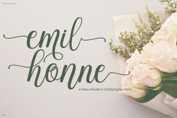
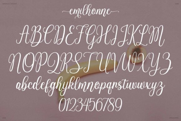
Emilhonne has a refined calligraphy feel with smooth, graceful strokes. It sits in that space between luxury and contemporary branding.
From a visual identity perspective, this kind of script can be useful for fashion, beauty, wedding, and editorial projects. The tone feels composed rather than casual. That said, the more elegant a script becomes, the more carefully it needs to be scaled.
The detailing is fairly restrained, which helps it avoid looking old-fashioned. I would use it for one important line: a brand name, product name, or featured phrase.
If the rest of the identity uses strong hierarchy and generous spacing, Emilhonne can feel refined. If everything around it is also decorative, it will lose impact.
8. Romantic (Modern Script)
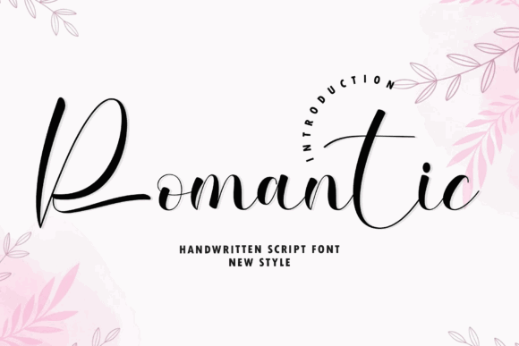
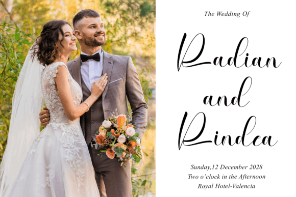
Romantic has long ascenders and a soft, flowing rhythm. The letterforms create an airy impression, which can make a layout feel light and emotional.
This is the kind of script that depends heavily on spacing. The extended strokes need room above, below, and around the words. If line height is too tight, the design starts to feel tangled.
It suits beauty branding, invitations, quote designs, and soft lifestyle visuals. I would avoid using it in narrow website containers or small mobile graphics unless the wording is very short.
Pair it with a clean sans serif and keep the supporting typography quiet. The script should be the expressive element, not one of several competing decorative choices.
9. Gristha
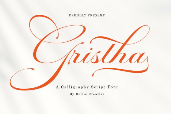
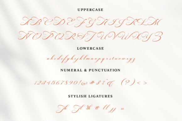
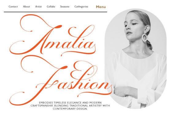
Gristha feels more confident and luxurious. The curves are fluid, and the calligraphic movement gives it a polished, editorial tone.
This typeface could work well for packaging, boutique branding, fashion visuals, or premium product labels. It has enough personality to carry a headline on its own, which is useful when the rest of the design system is minimal.
The main thing to watch is balance. Gristha has strong visual presence, so it should not be crowded by heavy textures, busy backgrounds, or too many supporting fonts.
I would set it in a single rich tone, give it generous white space, and let the contrast between the script and the surrounding layout create the sophistication.
10. Monadila
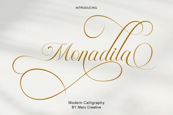
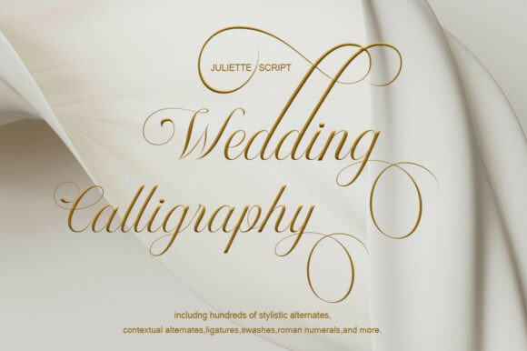
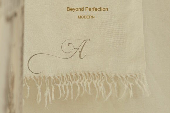
Monadila has delicate thin strokes and long, flowing swashes. It leans toward classic calligraphy but keeps a modern editorial softness.
Fine scripts like this can be beautiful in the right context, but they are not forgiving. Thin lines can break down at small sizes, especially on lower-resolution screens or textured print surfaces.
For that reason, I would use Monadila for large display moments: wedding stationery, beauty packaging, romantic quote prints, or elegant social graphics.
The font needs clean production and controlled spacing. Pair it with a simple sans serif for practical text, and avoid placing it over busy photography unless there is enough contrast.
11. Berlina
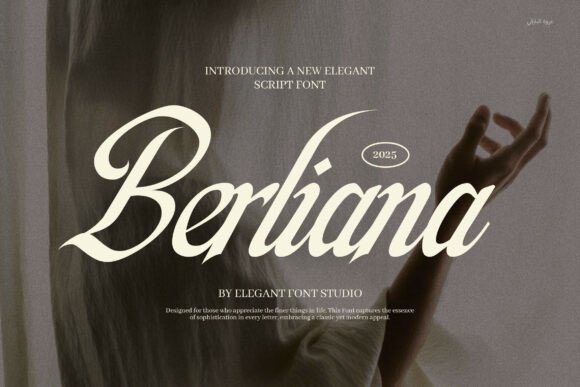
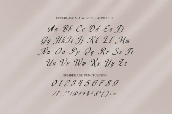
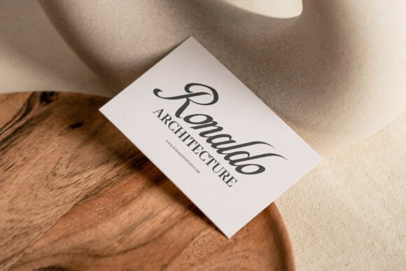
Berlina feels more formal and high-end. The strokes have a confident rhythm, and the overall appearance leans boutique, luxury, and editorial.
This could suit perfume packaging, fashion logos, wedding stationery, or premium personal brands. It has that polished hand-lettered quality that can make a design feel more expensive when used carefully.
But this is also where scripts can age quickly. Strongly stylized logo fonts often follow visual trends, so I would think about longevity before building an entire brand identity around it.
Used as an accent, Berlina has presence. Used everywhere, it may become too dominant.
12. Aslang Barry
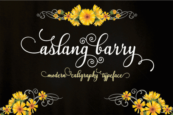
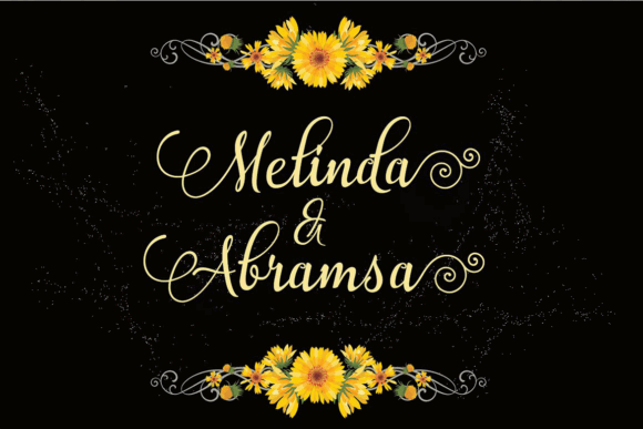
Aslang Barry has a refined calligraphy structure with smooth connectors and graceful movement. It reads as decorative, but still controlled enough for short branding applications.
The personality feels elegant and expressive. It could fit fashion, beauty, lifestyle, or invitation work, especially where the brand needs a hand-lettered accent.
I would pay close attention to repeated letters and alternates. With script fonts, repeated characters can look unnatural if the same glyph appears too many times in a wordmark. Alternates can help the typography feel more genuinely handwritten.
Pair it with a minimal sans serif and keep the color palette simple. Too many decorative elements around this font would make the design feel crowded.
13. Random Kindness
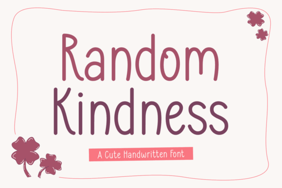
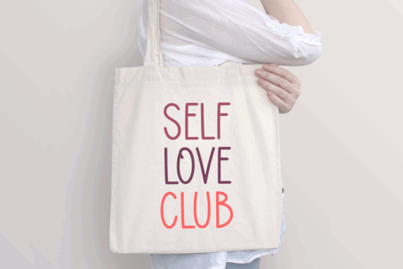
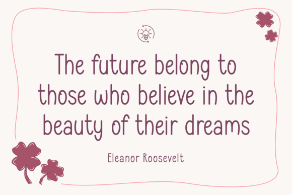
Random Kindness is warmer and more casual than many of the other fonts in this list. It has a friendly handwritten tone rather than a polished luxury feel.
This makes it useful for approachable brands: handmade packaging, cheerful editorial graphics, cards, small creative businesses, or friendly lifestyle projects. The letterforms feel relaxed, which can help a brand feel more human.
The limitation is tone. I would not choose Random Kindness for a premium beauty brand or formal logo system. It is better suited to warmth, kindness, casual charm, and lighthearted messaging.
A rounded sans serif would pair naturally with it. Keep the hierarchy simple so the handwritten voice feels intentional.
14. Rolland Honey
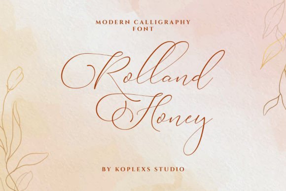
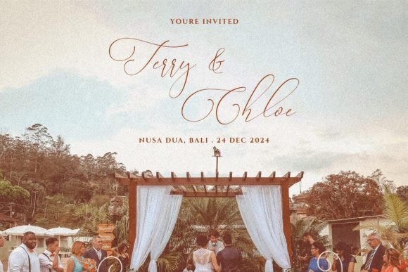
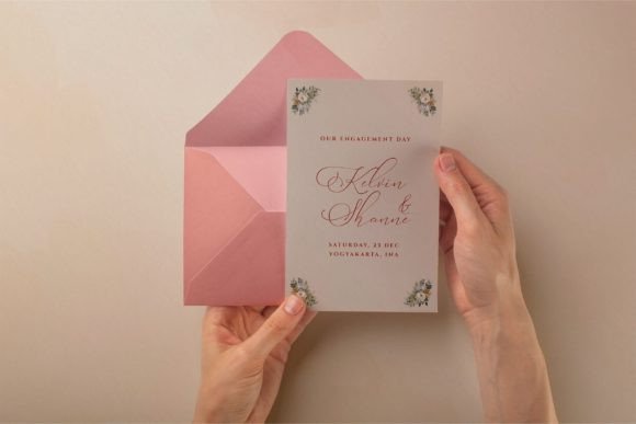
Rolland Honey blends modern calligraphy with a warm, approachable rhythm. It has enough polish to feel designed, but not so much that it becomes distant or overly formal.
This kind of script can be useful for lifestyle branding, packaging, quote art, and softer product lines. The connectors appear clean, and the detailing is restrained enough to stay current.
I would use it for short headlines or names rather than full phrases with too many words. The more words you set in a script, the more the reader has to work.
A minimal serif could make it feel more editorial, while a clean sans serif would keep it contemporary.
15. Parmidass Elarista
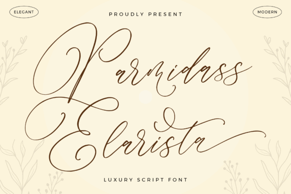
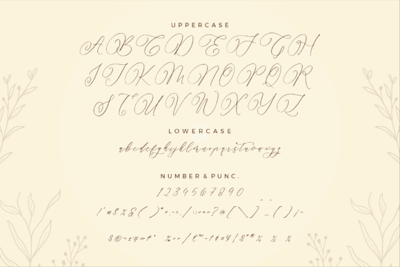
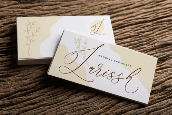
Parmidass Elarista has expressive movement and a more decorative handwritten personality. It feels flexible because it can lean romantic, playful, or polished depending on the surrounding design.
The appeal is in the rhythm of the strokes. It has enough flourish to make a short phrase feel designed without needing much else on the page.
That said, I would treat it carefully in branding. Expressive scripts can be memorable, but they can also become difficult to systemize if the brand needs many layouts, sub-brands, product categories, or digital templates.
Use it where the script is allowed to be the focal point. Keep the supporting typography plain.
16. Delistian Valentine
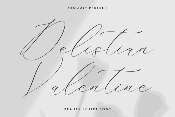
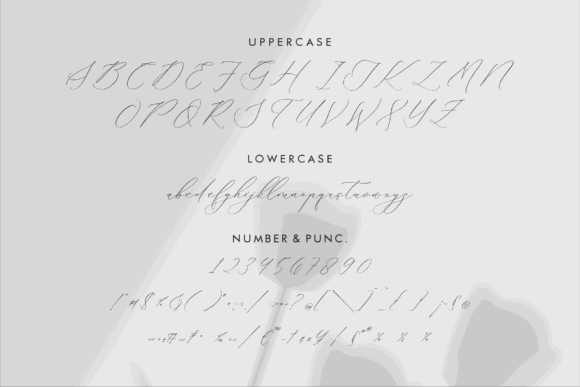
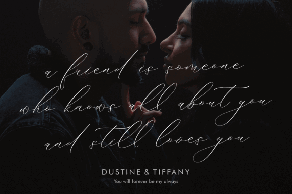
Delistian Valentine has a delicate, romantic tone. The strokes feel light, soft, and personal, which makes it suitable for cards, gift tags, wedding-related visuals, beauty branding, and gentle product packaging.
The handwritten quality is the main value here. It creates intimacy. But that also means it should not be forced into roles where structure and clarity matter more.
I would avoid using it for long headlines, small mobile text, or dense layouts. A short phrase with open line spacing will give the loops and connectors enough room to breathe.
Pair it with a simple serif for warmth or a quiet sans serif for a more modern finish.
17. Rathallod
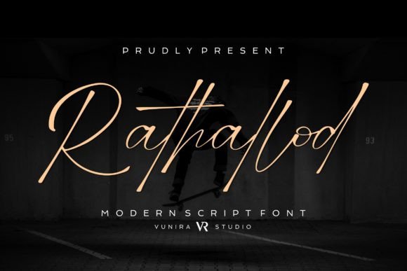
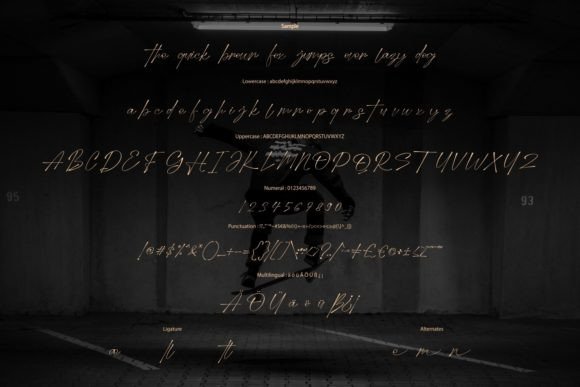
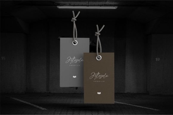
Rathallod has smooth, flowing curves with delicate hairlines. It feels stylish, graceful, and more editorial than casual.
The fine details give it sophistication, but they also create usability limits. Hairlines often look beautiful in previews and weaker in real-world applications. They can disappear on small screens, vinyl cuts, low-quality prints, or textured materials.
For fashion, beauty, and editorial branding, Rathallod can create a refined signature-style moment. I would keep it large, use strong contrast, and avoid complex backgrounds.
It is a display font, not a utility font. That distinction matters.
18. Palm Springs
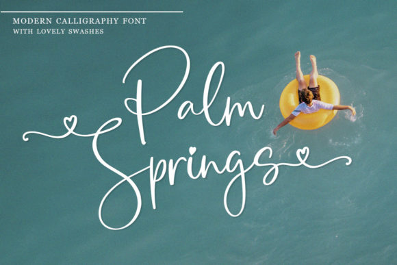
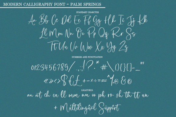
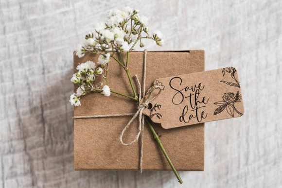
Palm Springs has a sunny, relaxed rhythm. The letters feel casual but polished, with movement along the baseline that gives the font a lively personality.
This typeface suits lifestyle branding, packaging, quote art, travel-inspired graphics, and friendly editorial accents. It feels less formal than luxury calligraphy scripts, which can make it more approachable.
The baseline movement is part of its charm, but it also means spacing and alignment need attention. If the layout is too tight, the rhythm may start to feel uneven rather than expressive.
I would pair it with a clean sans serif and use a soft, bright palette to support the casual modern tone.
Read More: Beyond these modern picks, you might also enjoy exploring our curated selection of the 33 Best Feminine Script Fonts for Elegant Branding & Wedding Design for a softer, more delicate touch.
Common mistakes with script fonts
Script fonts are easy to overuse.
The most common mistake is treating a script font like a normal text font. Most scripts are not built for paragraphs. They are built for emphasis, names, short phrases, signatures, and logo marks.
A few practical problems come up again and again:
- setting a fine script too small
- adding too much tracking and breaking the letter connections
- using scripts for long blocks of text
- pairing a decorative script with another decorative font
- ignoring alternate characters when repeated letters look too mechanical
- choosing style before checking readability
Small spacing decisions often have a bigger impact than people expect. With scripts, kerning and line spacing matter because the loops, ascenders, descenders, and connectors need breathing room. If the letters start colliding, the font loses elegance quickly.
My rule is simple: use a script font where emotion matters, not where information needs to be processed quickly.
Which Modern Script Font Should You Choose?
Choose Night Wednesday for a clean monoline wordmark, Melorine Script when you want softer handwritten warmth, Gristha for a more luxurious editorial look, Friday Calligraphy for romantic display use, and Palm Springs for a relaxed lifestyle direction.
For logo design, I would keep the system simple.
Choose one short word for the script. Set the supporting words in a plain sans serif or simple serif. Make the script large enough that the connectors read clearly. Keep the color treatment restrained.
A script logo usually fails when too many things compete at once: swashes, shadows, textures, gradients, icons, and decorative secondary fonts. Strong typography usually feels effortless, which is why it is often overlooked.
The font should carry the personality. The rest of the identity should support it.
FAQ
What is a modern script font?
A modern script font is a typeface that mimics handwriting or calligraphy but usually has cleaner strokes, more restrained flourishes, and a more current visual rhythm than traditional decorative scripts. In branding, modern script fonts are often used for logos, packaging, invitations, quote graphics, beauty brands, lifestyle brands, and short display text.
Do modern script fonts work for body text?
Usually, no. Script fonts are built for short expressive moments, not long reading. For body text, I would use a readable serif or sans serif and keep the script for names, headlines, signatures, or accent phrases. Readability should always come before decoration, especially on websites.
How do I keep a script font legible?
Set it larger than you think, avoid adding tracking that breaks the connections, and give the letters enough line spacing. If the design needs to work at smaller sizes, choose a monoline script or a script with moderate stroke contrast. Very fine hairline scripts usually need more space, cleaner printing, and stronger contrast.
Are modern script fonts good for logos?
They can be, but only when the wordmark is simple and readable. A script font may look strong in a logo but weak in a wider brand system if it cannot scale, pair well with other fonts, or remain clear across digital and printed materials. Before committing, I would test it in a website header, social avatar, packaging mockup, and small-size layout.
What should I pair with a modern script font?
Most modern script fonts pair best with a clean sans serif or a quiet serif. The supporting font should not compete with the script. I usually look for contrast in role rather than decoration: let the script bring personality, and let the secondary typeface handle clarity, hierarchy, and practical reading.
Follow Us