

20 Premium Fonts Every Designer Should Know
Typography can shape the personality of a design before color, photography, or illustration enters the picture. A single typeface can make a brand feel refined, rebellious, nostalgic, playful, or distinctly modern.
I spend a lot of time browsing font collections, and one pattern appears again and again: the fonts that look most dramatic in a preview are not always the ones that remain useful in real layouts. Strong typography needs more than visual impact. Spacing, readability, flexibility, and compatibility with the rest of the design all matter.
This collection brings together 20 premium fonts covering modern serifs, handwritten scripts, graffiti lettering, retro display styles, and experimental typefaces. Some are versatile enough for broad branding work, while others are better treated as expressive display fonts for specific projects.
Quick Picks
- Best versatile duo: Bright Darling Duo
- Best editorial serif: Maglite
- Best romantic duo: Cloudy Aurora
- Best modern experimental option: Aborm
- Best personal-brand script: Business Signature
How I Picked These
I compared these premium fonts by readability, spacing, character-set usefulness, visual distinctiveness, scalability, licensing practicality, and how well each option can support real logos, packaging, editorial layouts, merchandise, websites, social graphics, and client work rather than simply looking impressive in a promotional preview.
1. Bright Darling Duo Font
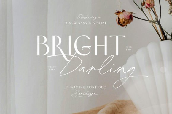
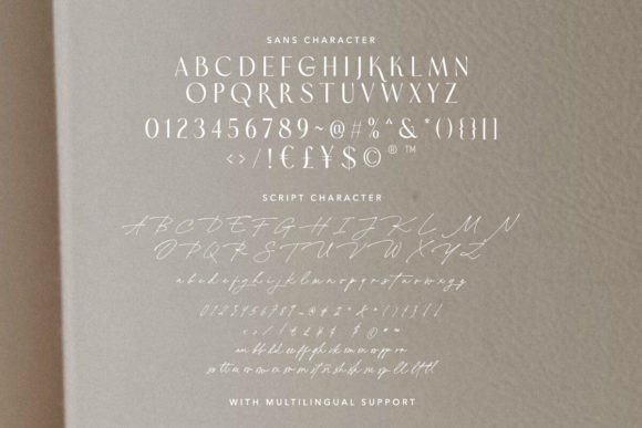
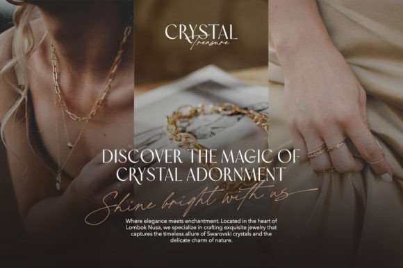
Bright Darling Duo combines an elegant script with a clean sans serif, creating the kind of contrast that often makes font pairings feel more intentional.
Visually, the script adds softness and personality, while the sans serif provides structure. This balance makes the duo useful for boutique logos, social media graphics, invitations, product packaging, and lifestyle branding.
The handwritten side has enough movement to feel personal without becoming excessively decorative. Still, I would keep it away from long paragraphs. Its strength is in names, short phrases, signatures, and visual accents.
From a branding perspective, Bright Darling Duo feels especially suited to beauty, wedding, fashion, and handmade businesses that want an approachable but polished identity.
Best suited for: boutique branding, wedding stationery, packaging, social graphics, and logo design.
2. Maglite Font
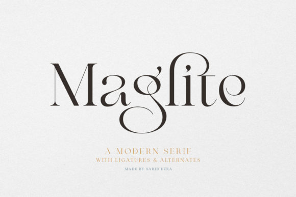
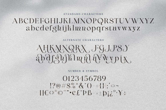
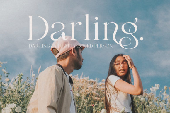
Maglite is a modern serif with expressive curves and high-contrast letterforms. The sweeping details give it an editorial personality that immediately feels more distinctive than a conventional serif.
The preview shows some interesting movement through the lowercase characters, especially where curved strokes interact with sharper terminals. That creates an elegant rhythm, although the more decorative forms may need careful spacing in shorter headlines.
I can see Maglite working particularly well on fashion covers, beauty packaging, portfolio headings, and refined logo concepts. It has enough personality to lead a composition without requiring much additional decoration.
This is not the sort of font I would use for dense text. Its visual character is much stronger at larger sizes, where the unusual shapes have room to breathe.
Best suited for: fashion branding, editorial layouts, cosmetics packaging, posters, and premium logos.
3. Cloudy Aurora Font
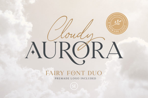
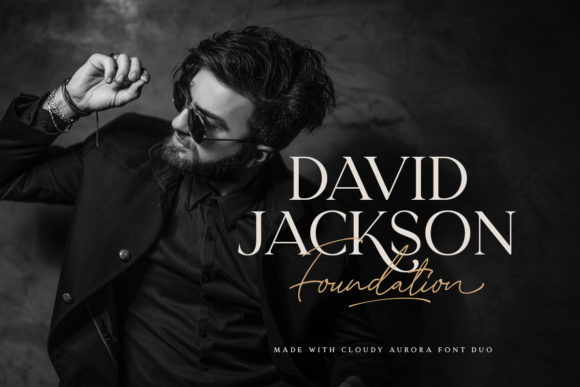
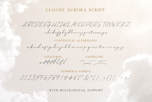
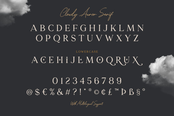
Cloudy Aurora is a font duo that combines a flowing script with an elegant display serif. The contrast between the two styles creates a dreamy, almost storybook-like visual identity.
The serif includes decorative details that give it a fantasy-inspired mood, while the script introduces warmth and movement. Together, they feel appropriate for wedding stationery, romantic packaging, handmade products, and boutique branding.
One thing I often notice with decorative font duos is that both typefaces compete for attention. Cloudy Aurora works best when one style clearly leads and the other is used sparingly. A serif headline paired with a small script accent would probably feel more balanced than using both at equal scale.
Its personality is quite specific, which is part of its appeal. It may not adapt naturally to corporate or minimalist branding, but it has strong potential in emotional, feminine, and imaginative design.
Best suited for: wedding invitations, candle labels, boutique logos, beauty products, and romantic branding.
4. Martha Esthela Font
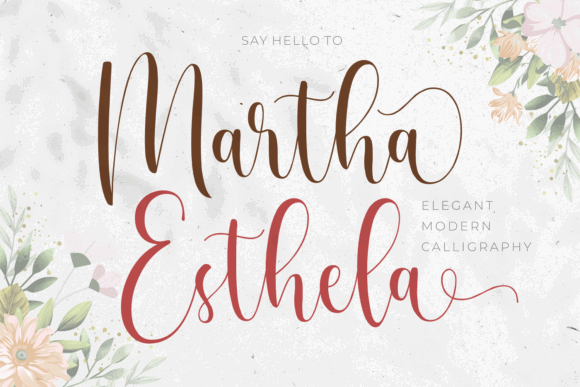
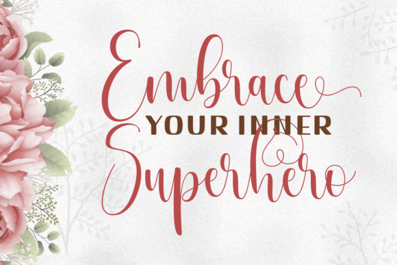
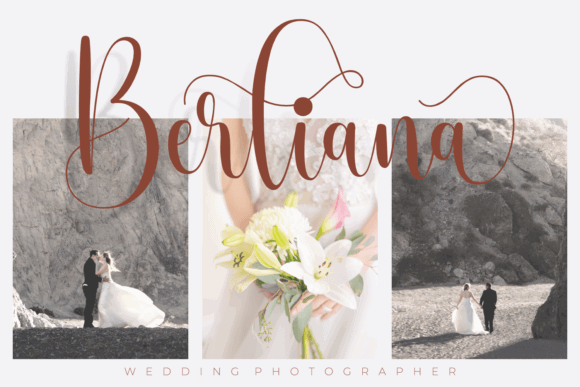
Martha Esthela is a modern calligraphy font with long ascenders, generous loops, and a natural handwritten rhythm.
The letterforms feel expressive without looking overly formal. That makes it useful for designs that need a personal signature-like element rather than traditional ornamental calligraphy.
I would use Martha Esthela for names, short quotations, invitation headings, stationery, and selective logo treatments. The extended strokes create attractive movement, but they also require space. Tight layouts could make the flourishes collide with surrounding elements.
As with most script fonts, readability decreases quickly when the text becomes long or small. Used as an accent, however, it can introduce a warm and handcrafted tone.
Best suited for: signatures, invitations, personal branding, stationery, and beauty logos.
5. Blank Zones Font
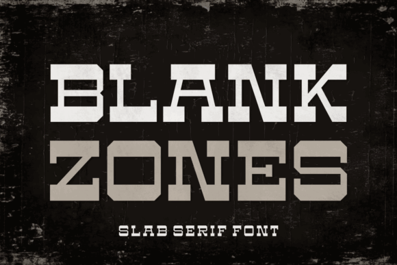
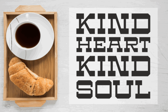
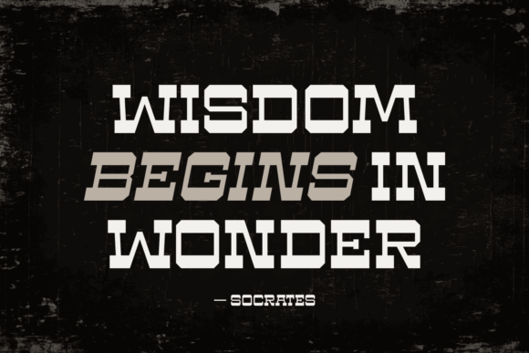
Blank Zones takes a completely different direction. It is a geometric slab serif with angular cuts, heavy proportions, and an industrial personality.
The wide letterforms feel bold and mechanical, while the unusual internal shapes give the font a slightly futuristic edge. It has the kind of visual weight that can anchor a poster or logo without additional graphic elements.
This is clearly a display font rather than a general-purpose typeface. Its blocky construction works best in short headlines, badges, apparel graphics, gaming visuals, and branding that needs a rugged or technical mood.
Spacing will be important here. Heavy fonts can quickly become visually crowded, especially when set in uppercase. Giving the letters more breathing room would help preserve their distinctive silhouettes.
Best suited for: sports logos, gaming graphics, streetwear, posters, and industrial branding.
6. Graffiti Hipster Font
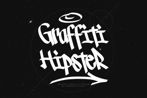
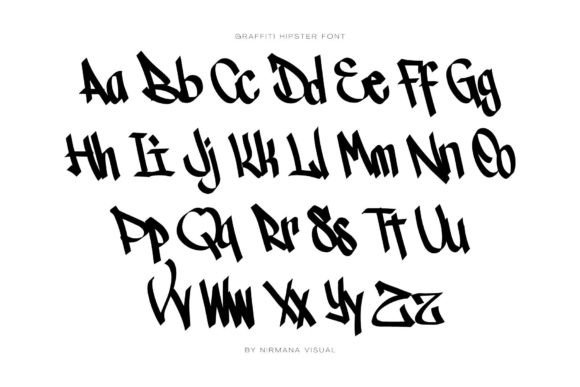
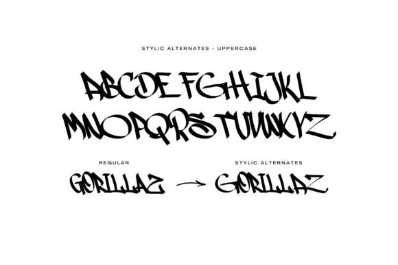
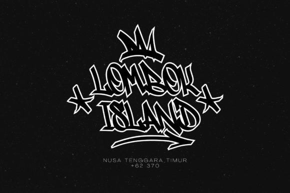
Graffiti Hipster is a bold urban display font influenced by street lettering and hand-drawn graffiti.
Its irregular forms, sharp angles, and dramatic strokes give it an energetic personality. It feels designed to dominate the layout rather than quietly support it.
This typeface could bring authenticity to streetwear graphics, music artwork, event posters, sticker designs, and youth-focused branding. It also has potential for Cricut projects and apparel designs where a strong central phrase is needed.
The main limitation is readability. Graffiti fonts often look impressive as individual words but become difficult to follow in full sentences. I would keep the copy short and allow plenty of contrast around the lettering.
Best suited for: streetwear, album covers, urban posters, apparel, and graffiti-inspired branding.
7. Rustic Font
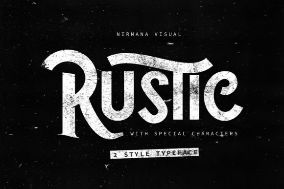
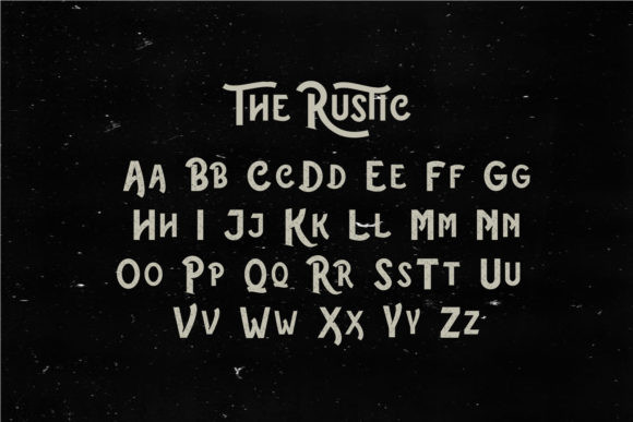
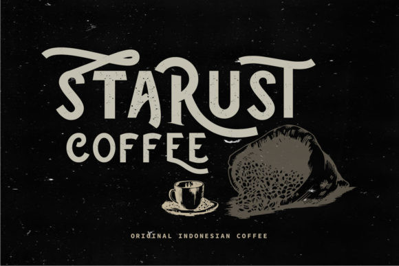
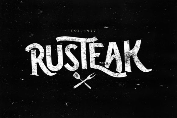
Rustic is a textured vintage display font with strong curves and a weathered surface.
The distressed treatment gives the lettering an aged, printed quality that feels connected to handmade packaging, outdoor brands, workshop signage, and heritage-inspired identities.
What stands out visually is the combination of thick strokes and decorative letter construction. It feels more crafted than a standard Western font, which helps it avoid looking completely generic.
Texture can be useful, but it also limits flexibility. At small sizes, distressed details may disappear or create visual noise. Rustic will be most effective in larger headlines, labels, badges, and signage.
Best suited for: outdoor branding, food packaging, craft products, vintage labels, and merchandise.
8. Vintage Fashion Font
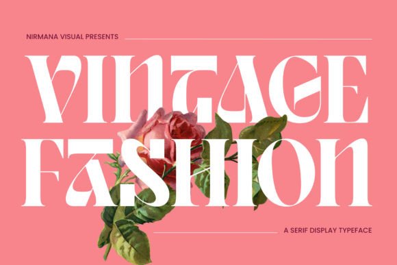
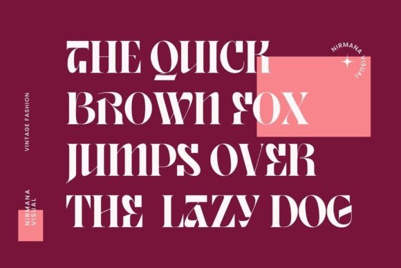
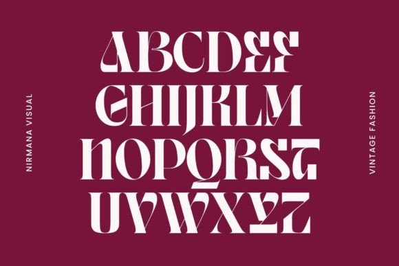
Vintage Fashion is a high-contrast display serif with an editorial mood. Its tall proportions and dramatic stroke variation recall fashion magazines and classic advertising typography.
The font feels refined, but it is not quiet. The exaggerated forms create a strong visual hierarchy, especially when used across large headlines or magazine-style layouts.
I would consider it for fashion branding, editorial covers, perfume packaging, beauty campaigns, and elegant social media graphics. The structure is distinctive enough to become a central part of a visual identity.
Some of the thinner strokes may lose clarity when reproduced very small, so this is another font that benefits from generous scale and clean surrounding space.
Best suited for: fashion editorials, luxury packaging, magazine covers, beauty branding, and advertising.
9. Rainbow Beauty Font
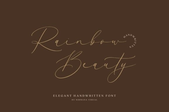
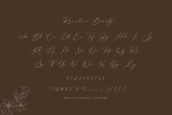
Rainbow Beauty is an elegant handwritten font with thin, flowing strokes and a relaxed signature style.
Its letterforms feel refined rather than playful, which gives the font a more premium personality. The subtle connections between characters create a smooth visual rhythm that could work nicely in beauty, wellness, fashion, and personal branding.
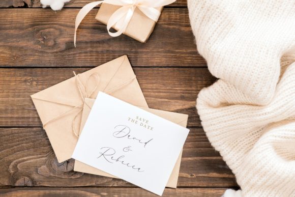
This type of script is especially effective when placed against a simple background. Too many decorative elements nearby would compete with the delicate strokes.
I would avoid using it for essential information or small labels. Thin scripts can lose definition in print and may become difficult to read on mobile screens. For a logo, name, or short accent, however, it has a graceful presence.
Best suited for: beauty logos, signatures, social media quotes, product packaging, and lifestyle branding.
10. Business Signature Font
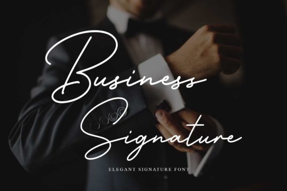
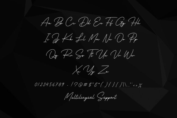
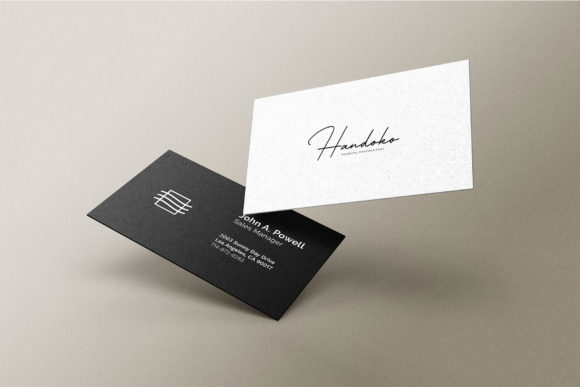
Business Signature is a clean handwritten script intended to resemble a polished personal signature.
Compared with more decorative calligraphy fonts, its letterforms feel controlled and professional. The strokes are smooth, the slant is consistent, and the overall appearance suggests confidence rather than informality.
It could be useful for consultant branding, photographer logos, business cards, digital signatures, portfolio marks, and personal websites.
The name suggests corporate use, but I would still treat it as an accent font. Professional layouts depend heavily on clarity, and a signature script should support the identity rather than carry every piece of information.
Best suited for: personal brands, consultants, photographers, business cards, and digital signatures.
11. Abang Fashion Font
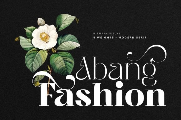
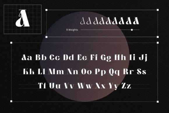
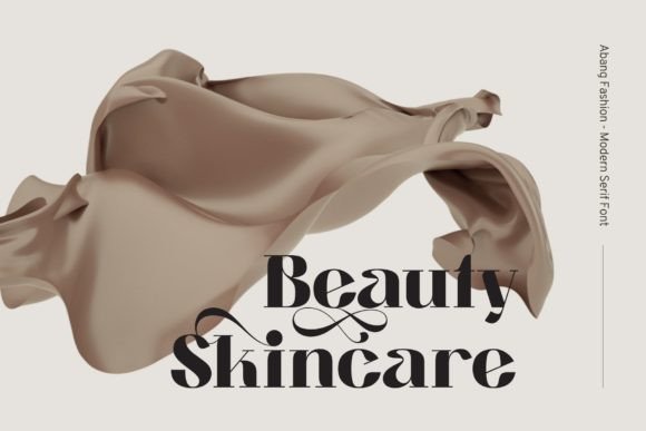
Abang Fashion is an experimental serif with unusual ligatures, curved terminals, and dramatic differences between thick and thin strokes.
It has a strong editorial personality. Several characters include exaggerated shapes that feel almost illustrative, helping the typeface stand out in fashion or artistic layouts.
This is the kind of font that can make a simple wordmark feel visually complex without adding symbols or ornaments. At the same time, the unusual details mean it may not remain equally readable in every word.
I would test the actual brand name before committing to it. Experimental fonts often look excellent in selected previews but behave differently depending on the character combination.
Best suited for: fashion logos, editorial titles, cosmetics branding, lookbooks, and art direction.
12. Modern Aesthetic Font
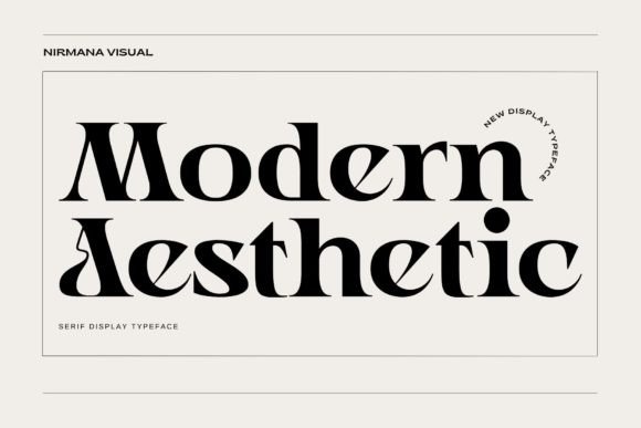
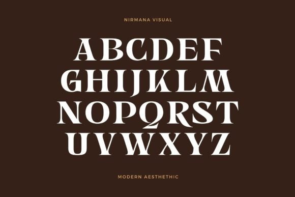
Modern Aesthetic is a bold display serif built around high contrast, rounded forms, and playful cuts within the letterforms.
Despite its name, it does not feel neutral or purely minimalist. The shapes have a strong personality, especially in letters with curved bowls and unconventional terminals.
It could work well for contemporary branding, magazine headlines, creative portfolios, poster typography, and social media campaigns. The font creates immediate visual interest even in a simple black-and-white layout.
I would pair it with a restrained sans serif for supporting text. Combining it with another expressive display font could weaken the hierarchy and make the design feel unnecessarily busy.
Best suited for: editorial design, modern logos, posters, portfolios, and creative campaigns.
13. Fashion Stencil Font
Fashion Stencil combines a high-contrast serif structure with carefully placed breaks in the strokes.
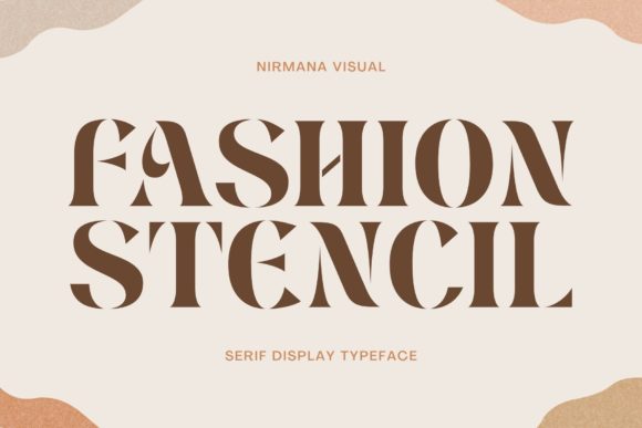
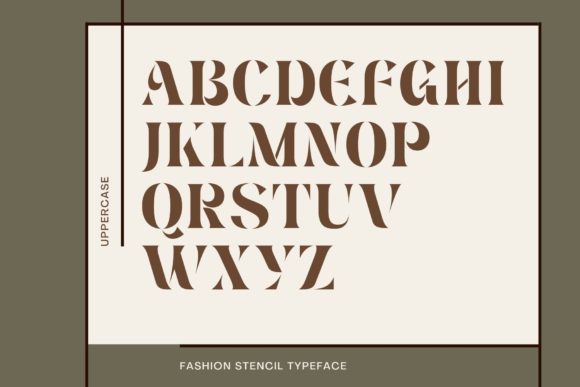
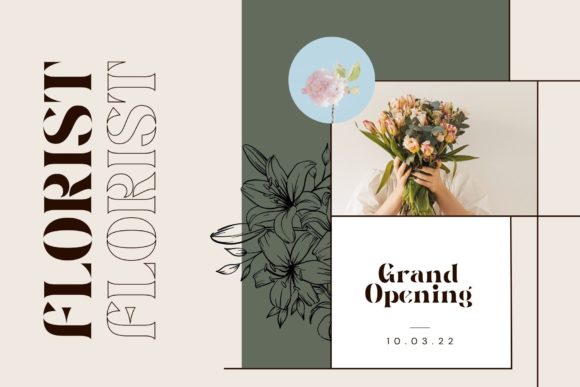
The stencil cuts give the font an industrial edge, but the proportions remain elegant enough for fashion and beauty projects. That tension between refinement and structure is what makes it visually interesting.
The typeface could create memorable packaging, magazine covers, poster titles, and campaign graphics. It would also suit monochrome branding where typography carries most of the visual personality.
Stencil fonts can become repetitive if used throughout an entire identity. I would reserve this one for primary headlines and use a quieter font for navigation, descriptions, and body copy.
Best suited for: fashion campaigns, luxury packaging, editorial covers, posters, and display branding.
14. Vintage Mohai Font
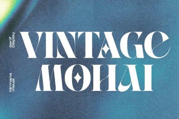
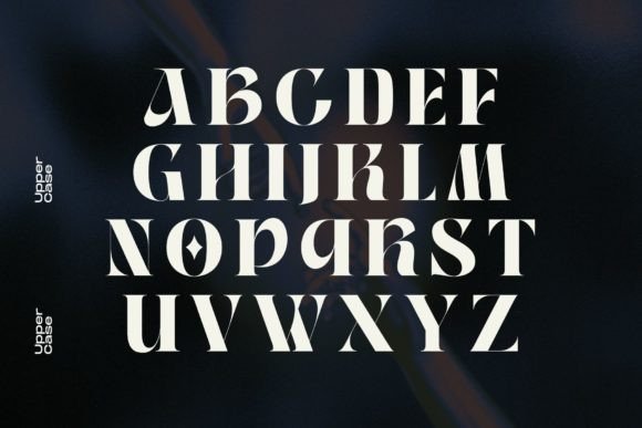
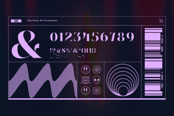
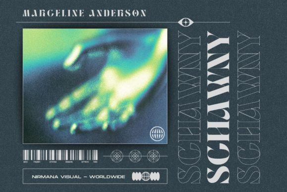
Vintage Mohai is a decorative serif inspired by retro display typography.
The letterforms include geometric cutouts and pointed details that create a clear vintage mood without relying on distressed texture. That gives the font a cleaner and slightly more modern finish than many traditional retro typefaces.
It has potential for record covers, beverage labels, hospitality branding, posters, and retro-inspired merchandise. The broader shapes also create a strong presence in uppercase settings.
The style is recognizable, so it should be used carefully. When every element in a design follows the same retro theme, the result can begin to feel like a costume rather than a contemporary identity. Pairing it with restrained colors and simple layouts would help keep it fresh.
Best suited for: retro branding, album artwork, labels, posters, and hospitality design.
15. Japan Bento Font
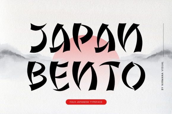
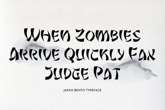
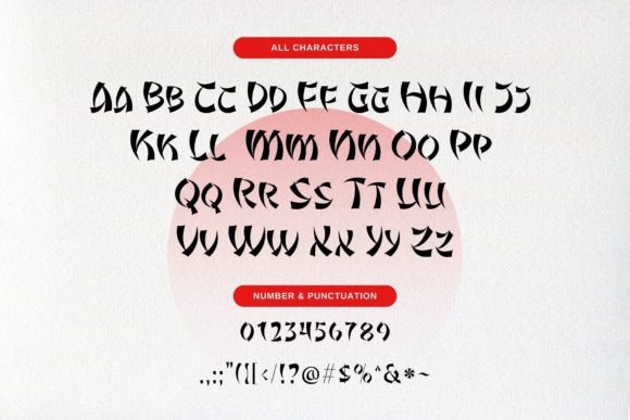
Japan Bento is a decorative display typeface influenced by stylized interpretations of Japanese lettering.
Its angular, curved shapes create a playful and distinctive silhouette. The font could attract attention in restaurant branding, food packaging, event posters, game graphics, or pop-culture-inspired artwork.
Because this is a highly stylized Latin typeface rather than authentic Japanese script, cultural context matters. I would avoid using it as a generic shortcut for representing an entire culture. It is better suited to specific visual concepts where the reference is thoughtful and relevant.
Readability is also limited by the unusual construction, so shorter words and large sizes will produce the strongest results.
Best suited for: restaurant graphics, food packaging, themed events, games, and display lettering.
16. Baket Fashion Font
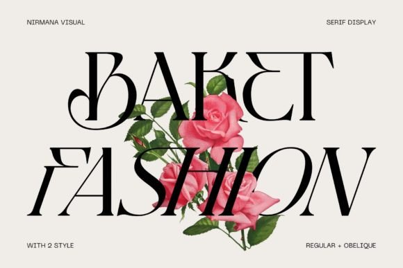
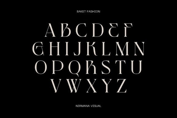
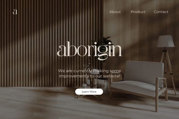
Baket Fashion is an elegant serif with elongated strokes, sharp intersections, and a slightly experimental structure.
The letterforms feel fashionable and contemporary, particularly where horizontal strokes extend beyond the expected proportions. This creates a sophisticated rhythm that looks attractive in large editorial compositions.
It could suit fashion campaigns, magazine covers, boutique identities, perfume packaging, and art-focused branding. The font has enough presence to work as a wordmark, although the specific letters in the name will influence how balanced the result feels.
Some shapes are more unconventional than others, so careful kerning may be needed. Automatic spacing rarely handles expressive display type perfectly.
Best suited for: fashion branding, editorial layouts, perfume packaging, posters, and boutique logos.
17. Retro Vintage Font
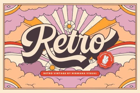
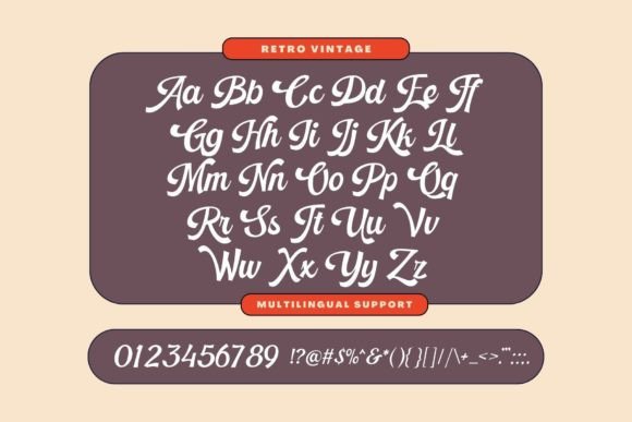
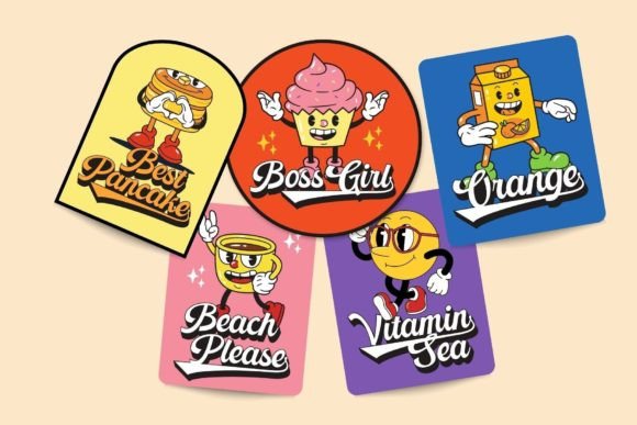
Retro Vintage is a bold script display font inspired by 1960s and 1970s lettering.
Its rounded shapes, thick strokes, and sweeping connections create a cheerful nostalgic mood. The style feels well suited to colorful posters, café branding, retro merchandise, stickers, and music artwork.
This kind of typography has remained popular for several years, partly because it feels friendly and handmade. Still, it can become visually predictable when paired with the same familiar sunsets, rainbows, and muted orange palettes.
A more restrained or unexpected color system could help the font feel less like a trend template and more like part of an original identity.
Best suited for: retro posters, cafés, merchandise, music graphics, and nostalgic branding.
18. Galmoru Font
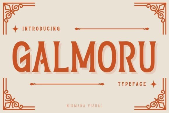
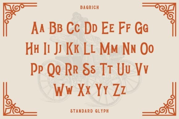
Galmoru is a quirky display typeface with narrow proportions and irregular character shapes.
The font blends vintage poster influences with a more contemporary, playful attitude. Its uneven structure gives words a handmade quality without turning into a script or brush font.
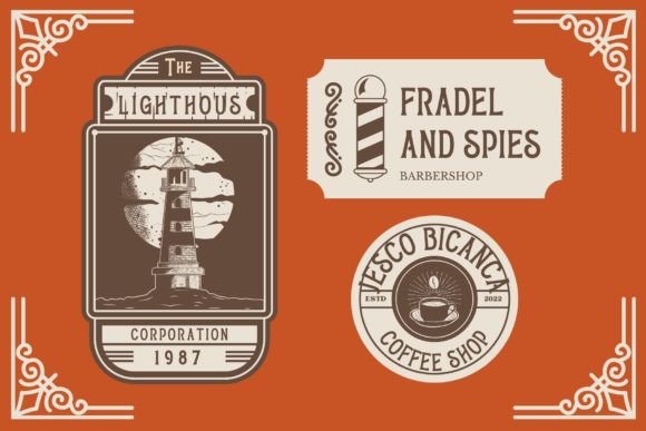
I can imagine it in indie game graphics, food labels, creative event posters, social media titles, and unusual startup branding. The strong personality could also work nicely in packaging for products that want to appear independent and slightly unconventional.
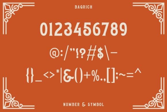
Not every letter appears equally legible, so it would be sensible to preview the full word or phrase before building a concept around it.
Best suited for: indie branding, posters, packaging, games, and playful headlines.
19. Fashion Wacks Font
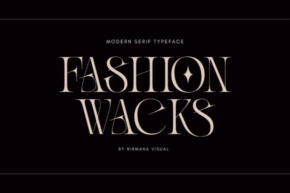
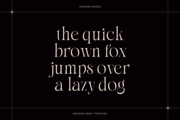
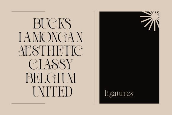
Fashion Wacks is a narrow modern serif with decorative curves and dramatic contrast.
The lettering feels refined but slightly mysterious, especially in uppercase compositions. It has the polished atmosphere often associated with fragrance packaging, luxury campaigns, and fashion editorials.
The narrow width allows large words to fit into compact layouts, although the thin strokes require sufficient size and contrast. On dark backgrounds, the font can create an especially striking effect.
I would keep the supporting design minimal. This typeface already contains enough visual detail, and excessive decoration could make the composition feel crowded.
Best suited for: fashion editorials, perfume branding, luxury advertising, packaging, and campaign headlines.
20. Aborm Font
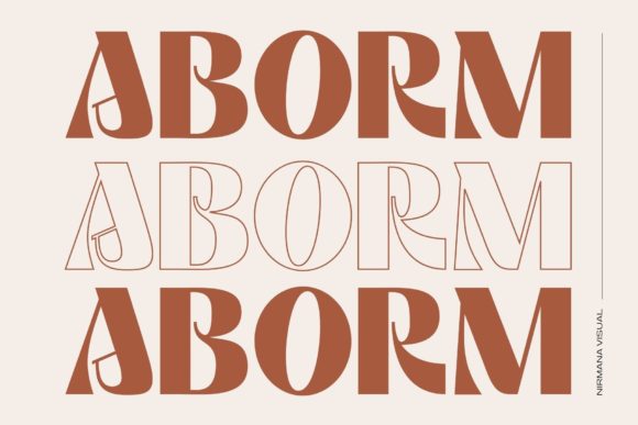
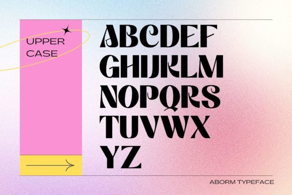
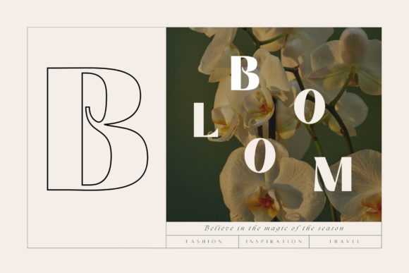
Aborm is a bold geometric serif with sharp cutouts and unusual internal shapes.
The characters feel experimental while remaining relatively solid and readable. Its heavy weight gives the font a strong architectural presence, making it useful for posters, identity concepts, exhibitions, and contemporary art projects.
The geometric details create personality without relying on texture or ornamental flourishes. That makes Aborm easier to combine with minimalist layouts than some of the more decorative fonts in this collection.
It will still work best as display typography. Repeating these unusual forms across large amounts of text would quickly become tiring.
Best suited for: art posters, modern branding, exhibition graphics, editorial titles, and experimental layouts.
Read More: Beyond knowing a variety of premium fonts, designers aiming to create captivating product presentations will find specific recommendations incredibly helpful for achieving elegance in packaging design.
How to Choose the Right Premium Font
A visually impressive preview is only the beginning. Before choosing a premium font, I usually look at how it behaves across several practical situations.
Check the uppercase and lowercase alphabet, numbers, punctuation, alternate characters, and common letter combinations. A font may look beautiful in a carefully selected sample word but feel much less balanced in the actual name of a brand.
Readability matters as well. Decorative scripts and experimental serifs usually need more space, stronger contrast, and larger sizing than conventional fonts.
Licensing deserves attention too. Commercial font licenses can vary between marketplaces and products, so review the current license terms before using a typeface in client work, merchandise, templates, logos, or products for sale.
Thousands of fonts with commercial-use licensing are also available through Creative Fabrica, which can be useful when you need a broader collection instead of purchasing individual typefaces separately.
Which Premium Font Should You Choose?
This collection covers a wide range of visual personalities, from elegant fashion serifs and signature scripts to graffiti lettering, nostalgic display fonts, and geometric experimental styles.
The most versatile options are not necessarily the loudest. Bright Darling Duo offers useful contrast, Maglite and Modern Aesthetic have strong editorial potential, while Aborm provides a more structured approach to experimental typography.
Fonts such as Graffiti Hipster, Japan Bento, and Fashion Stencil are more specialized, but that is not a weakness. A typeface with a narrow purpose can be extremely effective when the project genuinely matches its character.
Strong branding usually depends less on using the most decorative font and more on choosing one whose spacing, personality, and readability support the message consistently.
Some links in this article may be affiliate links. If you purchase through them, we may earn a small commission at no extra cost to you. Thanks for supporting our work.
Frequently Asked Questions
What are premium fonts?
Premium fonts are professionally created typefaces sold with a specific license for personal or commercial use. They often include more complete character sets, alternates, ligatures, multilingual support, and refined spacing than basic free fonts, although the exact features depend on the individual font.
Are premium fonts better than free fonts?
Premium fonts are not automatically better, but they often offer stronger consistency, broader licensing, and more design features. Some free fonts are excellent, while some paid fonts look more impressive in previews than they do in real layouts, so I always judge the letterforms, readability, spacing, and license rather than the price alone.
Which premium fonts are best for branding?
The best premium fonts for branding are those that match the personality of the business and remain readable across logos, packaging, websites, and social media. Modern serifs such as Maglite or Aborm can create a strong editorial identity, while font duos such as Bright Darling are better suited to softer boutique and lifestyle brands.
How many fonts should a designer use in one project?
Most layouts only need two or three font styles: one for headings, one for body text, and occasionally one accent font. Using too many expressive typefaces weakens visual hierarchy, so I usually pair a distinctive display font with a quieter serif or sans serif that keeps the rest of the design readable.
Follow Us