

ℹ️ Affiliate Disclosure: This article may contain affiliate links. We may earn a commission at no extra cost to you. Thanks for your support! ❤️
How to Choose Spooky Halloween Alphabet Fonts for Your Project
Spooky Halloween alphabet fonts can turn a plain phrase into the focal point of a party poster, classroom sign, treat bag, shirt, or printable decoration. I looked for lettering with distinctive silhouettes, usable character sets, and enough visual personality to communicate a Halloween theme before the reader even notices the surrounding artwork.
This collection ranges from friendly ghost letters and pumpkin-inspired display faces to dripping horror fonts, mummy lettering, cobweb characters, and sharp cinematic styles.
Best Spooky Halloween Alphabet Fonts
1. Halloween
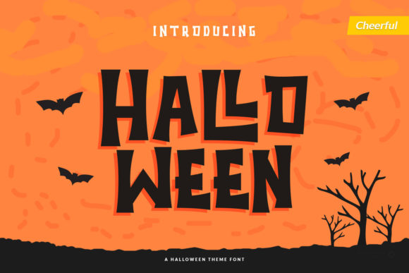
Halloween by Trim Studio is a decorative display alphabet for colorful posters, children’s party materials, and cheerful seasonal crafts. Its illustrated personality makes even a short word feel like a complete Halloween graphic.
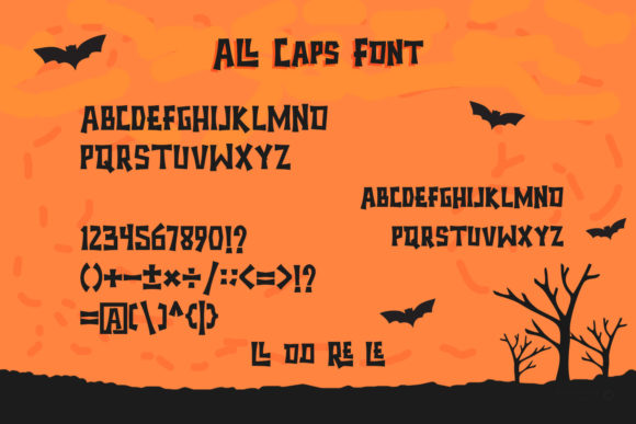
This is my pick for projects that need to look festive rather than frightening. The ornamental details deserve room to breathe, so I would keep it large and avoid using it for instructions, dates, or other small supporting text.
Best for: classroom posters, treat bags, family party signs
Key features: decorative characters, colorful personality, strong seasonal theme
2. Hellaween
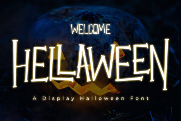
Hellaween is a chunky slab-style alphabet for crafters who want Halloween character without sacrificing immediate readability. The broad forms can anchor poster headings, banners, stickers, and simple one-color compositions.
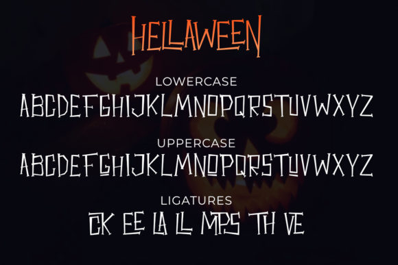
I like this option for mixed-age events because it feels animated without becoming too grim. Its weight may dominate delicate illustrations, so pair it with simple icons and leave generous spacing around the headline.
Best for: party banners, sticker sheets, school events
Key features: chunky construction, readable shapes, cartoon mood
3. The Mummy Returns
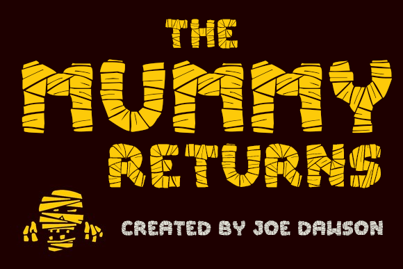
The Mummy Returns is a wrapped display alphabet aimed at Egyptian-tomb parties, escape-room graphics, and classic monster themes. Its letter treatment can communicate the mummy concept even without a character illustration.
I would use it for short titles such as “Tomb,” “Curse,” or “Mummy Bash.” The wrapping texture can become visually busy in long sentences, so a neutral sans serif is a better partner for event details.
Best for: mummy parties, escape-room posters, themed shirts
Key features: wrapped strokes, ancient-horror mood, headline emphasis
4. Halloween Party

Halloween Party is a horror display alphabet built for event titles that need a dripping, unsettling edge. It suits haunted attractions, late-night party flyers, scary labels, and theatrical poster treatments.
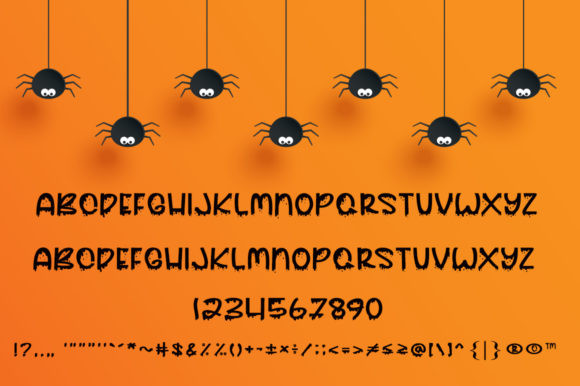
My take is that this font is strongest against a restrained background with one dominant color contrast. Because the irregular edges already create movement, extra textures behind the letters may reduce clarity.
Best for: haunted-house flyers, horror posters, party headers
Key features: dripping contours, irregular baseline, dramatic silhouette
5. Mitoos Halloween Font
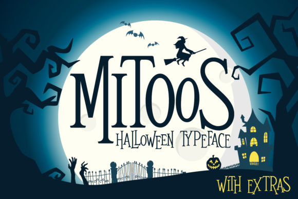
Mitoos Halloween is a lighthearted decorative alphabet for cute invitations, children’s apparel, tags, and seasonal scrapbook pages. Its playful construction provides a Halloween cue without making the project feel aggressive.

I like it for designs that combine pumpkins, candy, smiling ghosts, and bright color palettes. It is less suited to serious horror branding, where its friendly shapes may weaken the intended tension.
Best for: kids’ invitations, candy labels, scrapbook titles
Key features: playful forms, friendly mood, decorative alphabet
6. Creepyon
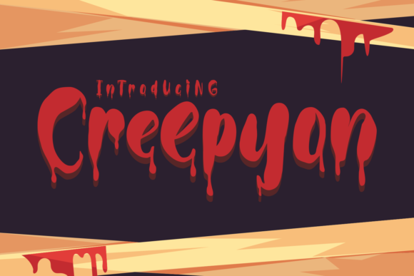
Creepyon is a bloody display alphabet for slasher-inspired posters, haunted trails, dramatic book covers, and horror-themed merchandise. Its distorted letter edges create an immediate sense of danger.
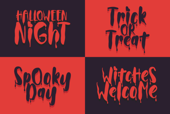
I would reserve Creepyon for audiences expecting genuine horror rather than a family Halloween aesthetic. It delivers the most impact in short uppercase-style words, especially when the background remains simple.
Best for: horror covers, haunted attractions, scary shirts
Key features: bloody styling, distressed contours, forceful headline presence
7. Ghost Walker
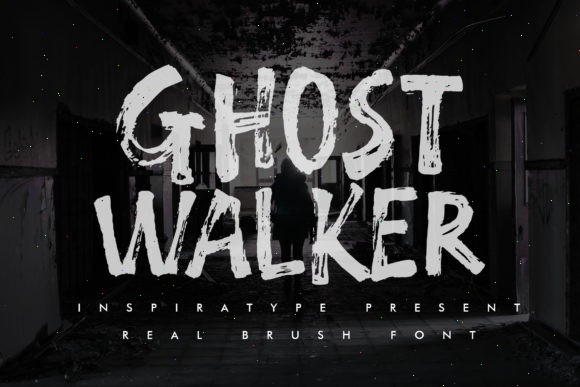
Ghost Walker is a quirky display alphabet for ghost-party invitations, stationery, mugs, wall art, and whimsical Halloween posters. The lively forms give ordinary words a hand-drawn supernatural character.
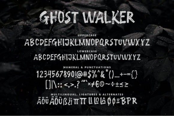
This is one of my preferred middle-ground choices: distinctive enough for a headline but not so frightening that it limits the audience. Check smaller test prints carefully because narrow decorative details may soften at reduced sizes.
Best for: invitations, mugs, printable wall art
Key features: quirky characters, animated rhythm, approachable spooky style
8. The Funny Ghost
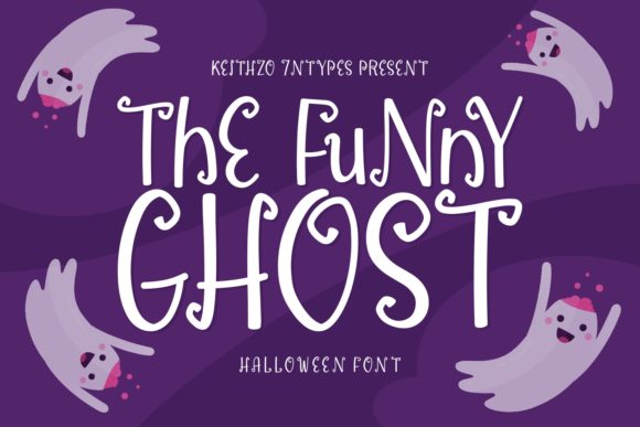
The Funny Ghost is a cartoon alphabet for children’s Halloween worksheets, party favors, name signs, and playful craft sessions. Curled stroke endings help it feel spooky while keeping the letters friendly.
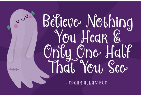
I would pair it with simple ghost faces or candy illustrations rather than realistic horror imagery. The energetic shapes can handle short supporting phrases, but a cleaner font will still be easier for dense directions.
Best for: kids’ crafts, name signs, party favors
Key features: curled terminals, cartoon styling, readable personality
9. Spooky Webbie

Spooky Webbie is a cobweb-decorated alphabet for spider-themed banners, tote bags, posters, and wall signs. The web details make the lettering function as both typography and seasonal ornament.
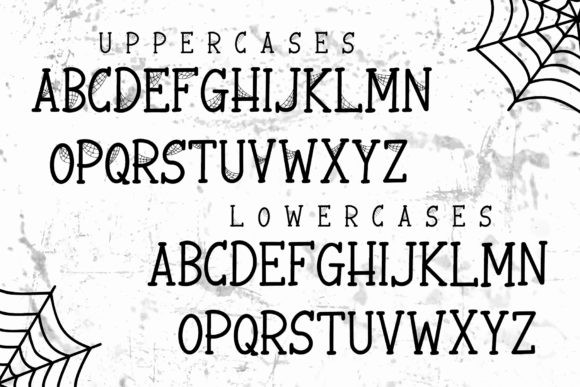
I recommend using it at display size so the connecting strands remain visible. Intricate web sections may require extra patience when cutting vinyl, making print, sublimation, and larger decals the more forgiving applications.
Best for: spider posters, tote bags, large decals
Key features: cobweb details, decorative letterforms, strong themed silhouette
10. Cute Ghost

Cute Ghost is a lively display alphabet for pastel Halloween art, friendly ghost merchandise, children’s cards, and casual party graphics. Its cheerful movement keeps the seasonal theme soft and approachable.

I like this font for creators who sell to parents, teachers, or younger audiences. It may appear too informal for vintage gothic projects, but that softness is precisely what makes it useful for non-scary Halloween collections.
Best for: pastel Halloween art, kids’ cards, ghost shirts
Key features: friendly energy, casual rhythm, cute seasonal character
11. Scary Zombie
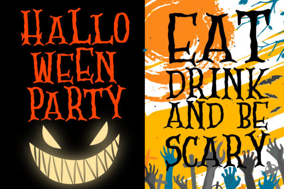
Scary Zombie is an irregular monster alphabet for zombie walks, classroom games, comic horror art, and playful party signage. Uneven strokes give the letters a handmade, shambling quality.
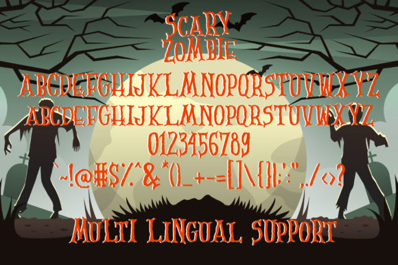
I would choose this over a dripping blood font when the project should feel goofy rather than graphic. The irregular construction can make long words look crowded, so increase tracking and preview the full phrase before cutting.
Best for: zombie events, comic posters, monster games
Key features: irregular strokes, quirky texture, playful horror tone
12. Afterlife Party

Afterlife Party is a festive display alphabet for celebration signs, costume-party stationery, apparel, and social graphics. It balances an otherworldly theme with enough energy to keep the message fun.

I see it as a useful option for an upbeat adult Halloween party that does not need gore or children’s imagery. Use it as the loud title and let a plain companion font handle the address, time, and RSVP information.
Best for: costume parties, event shirts, celebration signs
Key features: festive rhythm, bold display use, supernatural theme
13. Crusterous
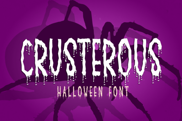
Crusterous is a chunky display alphabet for oversized banners, bold poster titles, product labels, and apparel graphics. Its heavy letterforms create a stable base for illustrations of monsters, pumpkins, or skulls.
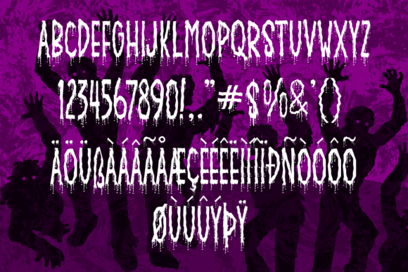
This is a practical choice when visibility matters more than fine detail. I would avoid squeezing it into narrow layouts; the broad characters look more intentional with generous margins and moderate spacing.
Best for: banners, large signs, shirt headlines
Key features: heavy strokes, chunky proportions, strong distance readability
14. Cadabra

Cadabra is a magical decorative alphabet for witch posters, potion labels, spell-book covers, thumbnails, and mystical Halloween crafts. Its unusual forms create a sorcery theme without depending on standard blackletter lettering.
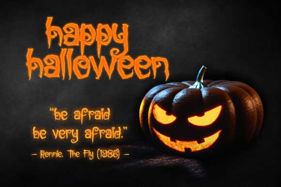
I would use Cadabra when the concept centers on spells, alchemy, or enchanted objects rather than monsters. Its personality is strongest in concise phrases, where every distinctive letter can remain recognizable.
Best for: potion labels, witch posters, spell-book covers
Key features: magical styling, unusual contours, decorative display focus
15. Spicy Fire

Spicy Fire is a flame-shaped display alphabet for infernal party graphics, demon themes, hot-sauce labels, costume shirts, and dramatic titles. The burning contours provide a built-in illustration around every word.
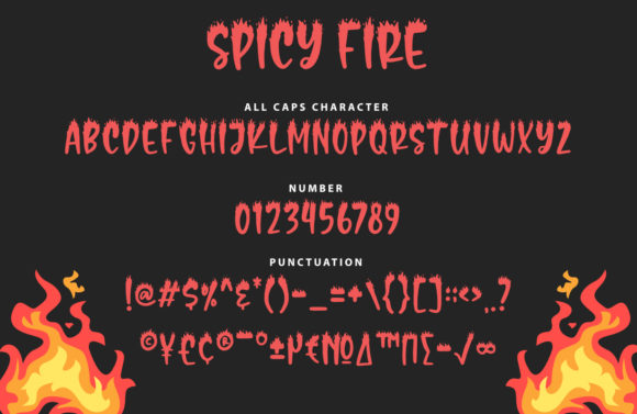
I like it for concepts involving fire, devils, or supernatural heat, but it is less flexible for ghost and pumpkin themes. Keep counters open and avoid reducing the letters until the flame tips merge.
Best for: infernal posters, flame shirts, themed labels
Key features: fire-shaped letters, energetic outline, dramatic vertical movement
16. Beastman
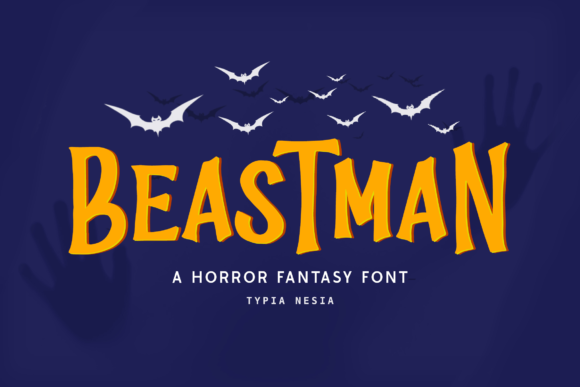
Beastman is a creature-inspired display alphabet for fantasy monsters, gaming graphics, costume events, and bold merchandise. Its stylized shapes suggest something wild and supernatural without committing to one specific Halloween icon.
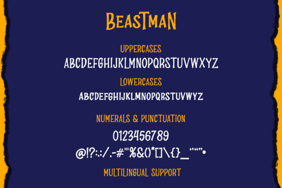
I would use it for projects that blend Halloween with fantasy or adventure. It is not the clearest option for small labels, but its unusual silhouette can give a large title a memorable identity.
Best for: monster branding, fantasy posters, gaming shirts
Key features: creature-like shapes, bold personality, genre flexibility
17. Pumpkinos

Pumpkinos is a decorative Halloween alphabet for pumpkin-patch signs, fall invitations, apparel, advertising, and seasonal packaging. Its special characters can help build a more customized title treatment.

This is my choice for designs that sit between autumn harvest and Halloween. Because the font already carries a strong seasonal voice, I would pair it with simple foliage or one central pumpkin rather than many competing graphics.
Best for: pumpkin patches, fall shirts, October invitations
Key features: seasonal character, alternate details, decorative display forms
18. Mummy Halloween
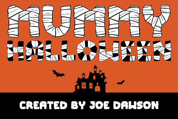
Mummy Halloween is a wrapped display alphabet for ancient curse posters, classroom history parties, themed invitations, and monster apparel. The layered bandage effect turns each character into a miniature mummy illustration.
I would select this when the mummy theme must be obvious at first glance. Detailed wrapping can become dense in long names, so use a roomy layout and test the smallest intended output before producing multiples.
Best for: mummy invitations, ancient-tomb signs, monster shirts
Key features: bandage construction, illustrated alphabet, recognizable theme
19. Wolfa
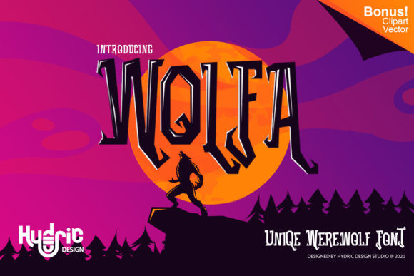
Wolfa is a sharp display alphabet for werewolf posters, creature-feature covers, banners, and aggressive Halloween headlines. Its angular character gives the typography a clawed, predatory quality.

I like Wolfa for darker projects that need tension without relying on dripping blood. The sharp extensions need clear negative space, so avoid placing the title over detailed forest photography or busy textures.
Best for: werewolf art, creature posters, dark banners
Key features: angular strokes, predatory mood, high-impact silhouette
20. Drippy Message

Drippy Message is a liquid horror alphabet for slime labels, bloody posters, monster-party signs, and dramatic Halloween crafts. Its flowing extensions add movement even when the word is set on a straight baseline.
I would use it for one or two key words rather than an entire invitation. The drips are the main attraction, but they also increase the height of each line and require extra clearance around the text.
Best for: slime graphics, horror signs, monster labels
Key features: liquid drips, tall silhouette, theatrical display effect
21. The Nightmare
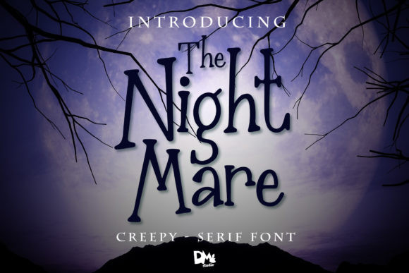
The Nightmare is an unsettling display alphabet for eerie headlines, lettering prints, horror covers, and strange Halloween artwork. The lively, distorted characters help create discomfort without depending on literal bats or pumpkins.

I would choose it for psychological or surreal themes where a familiar seasonal font feels too predictable. Its unconventional forms need size and contrast, so supporting copy should remain especially clean.
Best for: surreal posters, horror covers, lettering prints
Key features: distorted construction, uneasy rhythm, unconventional character shapes
22. Elastika
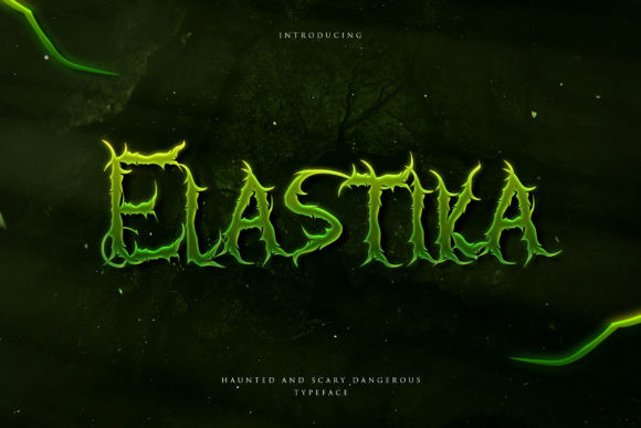
Elastika is a stretched horror alphabet for retro movie posters, Halloween decorations, eerie packaging, and stylized headlines. Its elastic proportions recall expressive hand-lettered titles from vintage genre graphics.
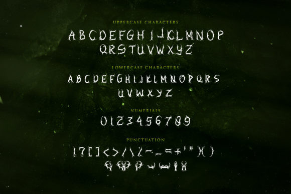
I like Elastika for designers who want a classic horror mood without copying standard gothic typography. The narrow and extended shapes can create uneven visual weight, so adjust individual letter spacing when the layout allows it.
Best for: retro horror posters, decorations, vintage packaging
Key features: stretched forms, cinematic mood, expressive proportions
23. Scary Spooky
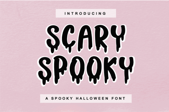
Scary Spooky is a themed display alphabet for general Halloween posters, costume invitations, social graphics, and merchandise. Its expressive construction gives creators an immediate seasonal title without requiring elaborate effects.
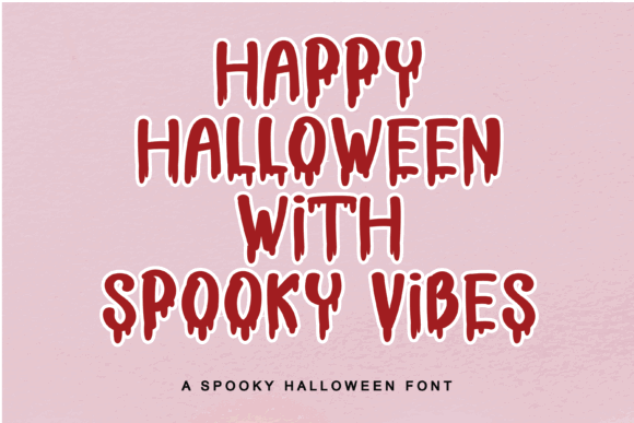
This is a flexible option when you have not committed to one icon such as a witch, ghost, or pumpkin. I would still limit it to headings because its personality can compete with detailed informational copy.
Best for: party posters, social graphics, seasonal merchandise
Key features: broad Halloween appeal, expressive forms, headline versatility
24. The Creepy
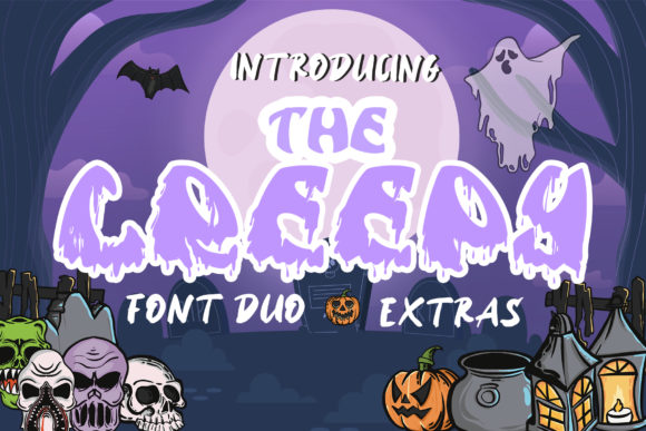
The Creepy is a fun spooky alphabet for October parties, humorous cards, kid-friendly decorations, and casual craft projects. Its display-focused style adds atmosphere while remaining less severe than traditional horror lettering.

I would use it for hosts who want recognizable Halloween typography without gore. The informal tone makes it less suitable for elegant masquerade invitations, but it fits relaxed community and family events nicely.
Best for: October parties, humorous cards, family decorations
Key features: playful creepiness, informal display style, approachable mood
25. Creepy Spooky
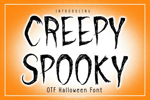
Creepy Spooky is a Halloween display alphabet for shirts, mugs, digital products, party signs, and seasonal promotional graphics. Its decorative personality helps simple words carry enough visual interest for merchandise.
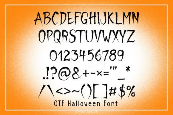
I like it for creators who need one adaptable title face across several product types. Before using it on very small items, check that the unusual contours remain open and recognizable after printing or cutting.
Best for: mugs, shirts, digital products
Key features: decorative characters, merchandise flexibility, seasonal personality
26. Ghost Halloween
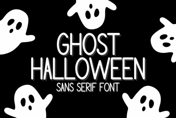
Ghost Halloween is a playful spooky sans serif for invitations, minimalist ghost posters, labels, and contemporary seasonal layouts. Its cleaner construction can sit beside bold illustrations without making the composition feel overloaded.
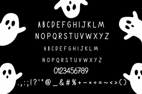
This is my pick for designers who want Halloween personality with more typographic control. It may not feel dramatic enough for a haunted attraction, but its restraint makes it useful for polished family and retail graphics.
Best for: modern invitations, ghost posters, seasonal labels
Key features: sans-serif base, quirky details, approachable readability
27. Halloween Creepy
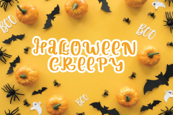
Halloween Creepy is a friendly spooky display alphabet for party stationery, decorations, craft labels, and casual October designs. Its tone is playful enough for community events while still looking unmistakably seasonal.
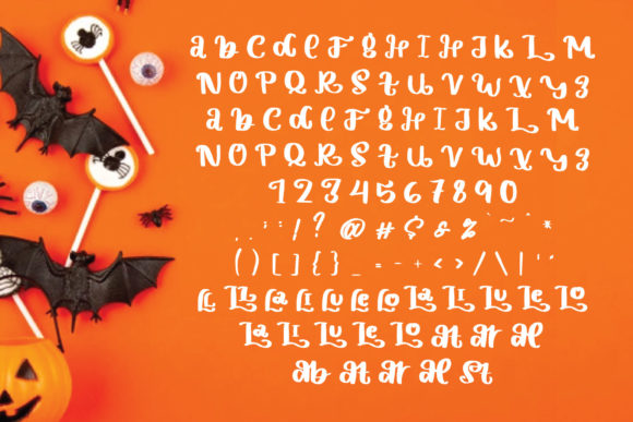
I would use this when the project needs one dependable Halloween heading rather than an extreme special effect. It is less distinctive than a mummy or cobweb alphabet, but that neutrality gives it broader use.
Best for: craft labels, party stationery, community events
Key features: friendly horror style, adaptable display forms, broad audience appeal
28. Horror Monster
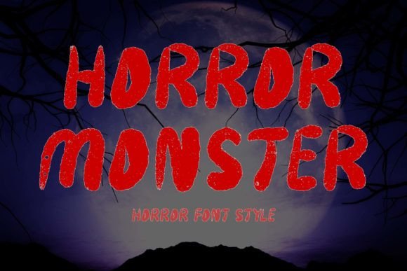
Horror Monster is a forceful display alphabet for movie-style posters, action-horror graphics, stickers, banners, and Halloween titles. Its strong forms are designed to command attention from a distance.
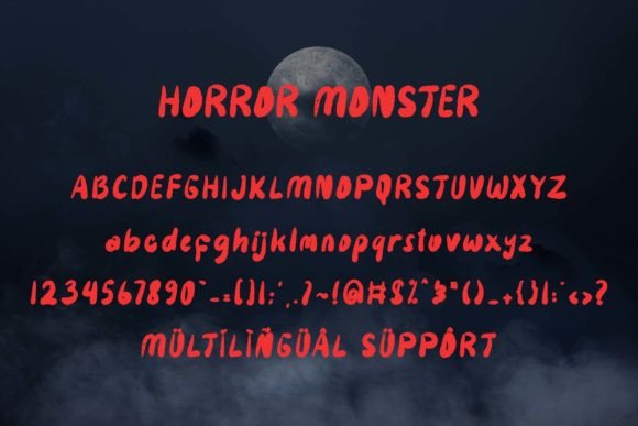
This is my top option for a poster that needs an unmistakable horror focal point. The assertive style can overpower small decorative elements, so build the composition around the headline instead of treating it as an afterthought.
Best for: horror posters, banners, large stickers
Key features: high visual impact, monster theme, distance-friendly headline shape
29. Spooky Creepy
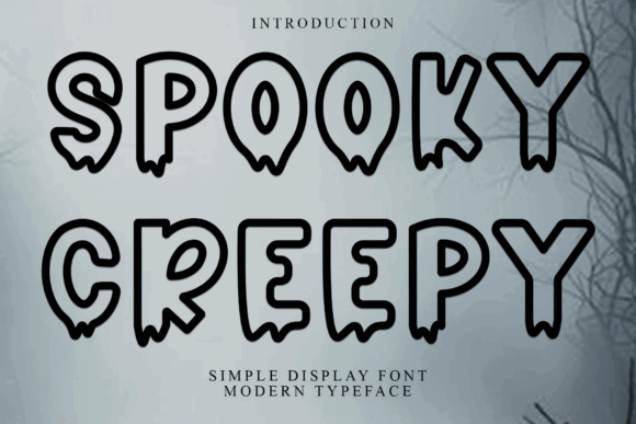
Spooky Creepy is a versatile display alphabet for Halloween branding, posters, product graphics, craft signs, and social posts. Its decorative style can support multiple themes instead of locking the design into one monster category.

I see this as a practical library font for creators who produce several seasonal collections. It needs a clear hierarchy, however, because using the same expressive face for every text level can make the layout feel noisy.
Best for: seasonal branding, craft signs, social posts
Key features: versatile theme, decorative rhythm, broad project compatibility
30. Witch Spooky
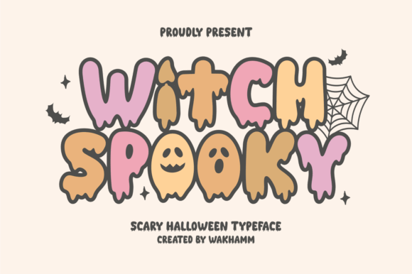
Witch Spooky is an enchanted Halloween alphabet for witch-party invitations, magical posters, shirts, potion labels, and horror-movie graphics. Its shapes emphasize mystery and movement rather than heavy monster styling.
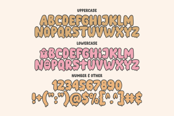
I would use it with moons, stars, broomsticks, or cauldrons to reinforce the theme. Because the font already has an animated quality, keep supporting flourishes limited and protect the readability of longer names.
Best for: witch parties, potion labels, magical shirts
Key features: enchanted mood, animated shapes, strong thematic identity
31. The Scary
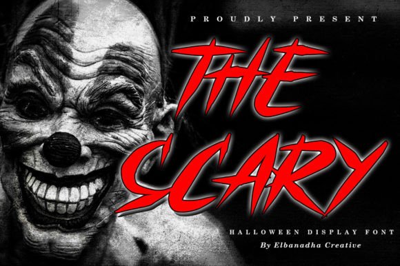
The Scary is a jagged, quirky display alphabet for haunted signs, horror merchandise, book covers, and chilling poster titles. Its irregular construction makes the text feel unstable and threatening.
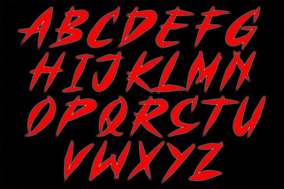
I like this for bold designs that need a raw edge rather than polished gothic elegance. The character variation can make names with repeated letters look especially energetic, though small sizes may exaggerate the roughness.
Best for: haunted signs, horror covers, dark merchandise
Key features: jagged edges, unstable rhythm, quirky horror personality
32. Spooky Scary
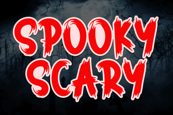
Spooky Scary is a horror-themed display alphabet for dark invitations, poster headings, scary apparel, and seasonal branding. Its letterforms provide a direct, uncomplicated Halloween signal.
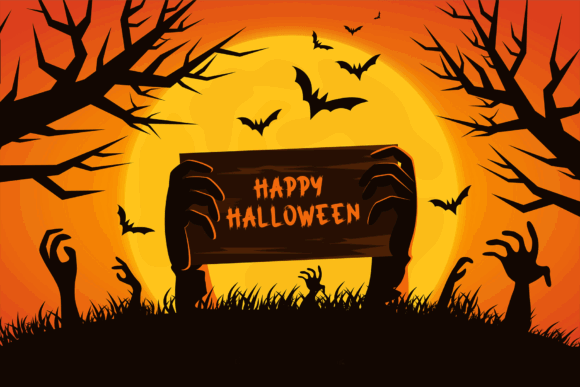
I would select it when the artwork already contains strong imagery and the title needs to support rather than compete with it. A simple two-color treatment should preserve the font’s edges better than multiple layered effects.
Best for: dark invitations, scary shirts, poster headings
Key features: direct horror styling, display proportions, adaptable title use
33. Halloween Bat Font

Halloween Bat Font is a dingbats set for adding bat silhouettes, decorative separators, borders, and small seasonal accents around alphabet-based layouts. It complements a readable headline instead of replacing the main text.
I would use these symbols to frame names, fill awkward corners, or create a repeating border. Check the character map before starting, since dingbats assign images to keyboard keys rather than functioning like a standard alphabet.
Best for: bat borders, corner accents, invitation decorations
Key features: dingbat symbols, reusable silhouettes, easy thematic embellishment
34. Spooky Scary Creepy
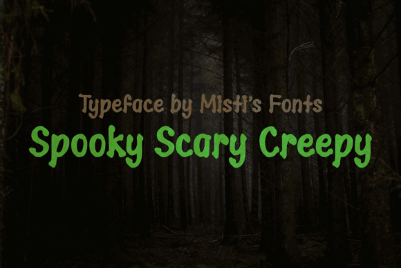
Spooky Scary Creepy is a bold display alphabet for haunted-house signs, merchandise, party posters, and decorative craft text. Its weight helps names and short phrases hold their shape against illustrated backgrounds.

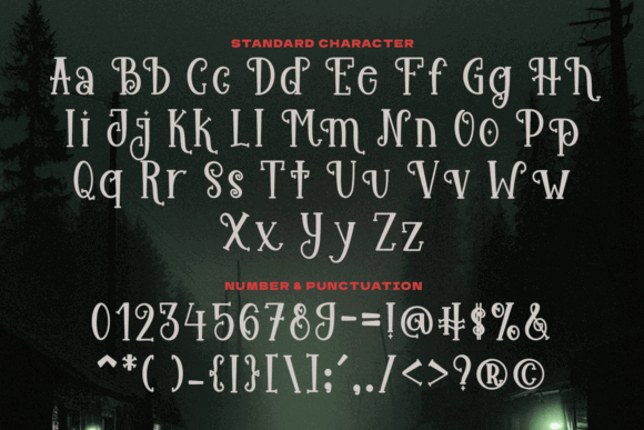
I like this option for vinyl or sign concepts that benefit from substantial strokes. Still, inspect interior spaces in letters such as A, B, and R before reducing the design, since tight counters may close at small sizes.
Best for: haunted signs, vinyl titles, bold merchandise
Key features: substantial strokes, dark personality, strong headline mass
35. Spooky Monster

Spooky Monster is a quirky display alphabet for monster birthday parties, Halloween worksheets, stickers, apparel, and humorous horror designs. Its playful shapes lean toward frightful fun instead of serious terror.
I would use it for children’s or family-focused projects where a traditional horror font feels too harsh. The animated letters already provide plenty of character, so simple block illustrations will usually balance them best.
Best for: monster parties, stickers, children’s apparel
Key features: playful construction, quirky shapes, family-friendly horror mood
36. Spooky Halloween

Spooky Halloween by Creaditive Design is a decorative alphabet for October signs, party projects, shirts, and personalized seasonal crafts. The font is PUA encoded, giving compatible software access to its included glyphs and swashes.
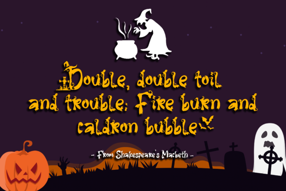
I like this for crafters who enjoy testing alternate characters to make repeated names look less uniform. Decorative swashes can interfere with nearby words, so build the final composition before welding or flattening the design.
Best for: personalized signs, shirts, October crafts
Key features: PUA encoding, alternate glyphs, decorative swashes
37. Halloween Spooky Alphabet SVG
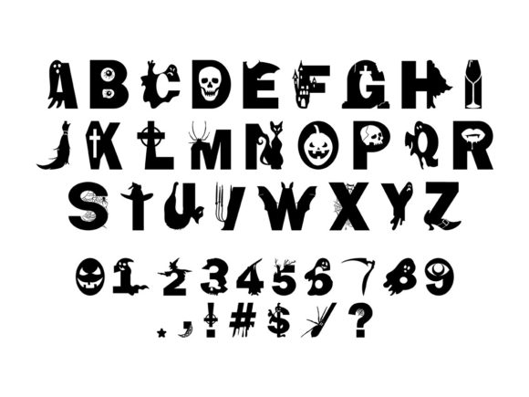
Halloween Spooky Alphabet SVG is an illustrated letter set for cutting, layering, and arranging individual spooky characters in names or monograms. The package includes SVG, EPS, PNG, and AI formats rather than an installable typing font.
I would choose this for highly customized signs where you want to position or recolor every letter independently. Building long sentences will take more time than typing with a font, so it is best reserved for names and short phrases.
Best for: monograms, cut names, custom letter compositions
Key features: SVG letters, PNG and EPS files, individually editable characters
38. Spooky Halloween by Goodrichees
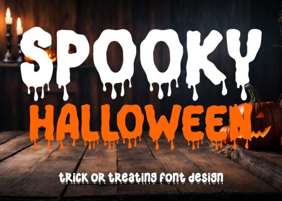
Spooky Halloween by Goodrichees is a horror display alphabet for Halloween events, party graphics, poster titles, and seasonal merchandise. Its focused theme makes it easy to establish the mood with a single prominent word.
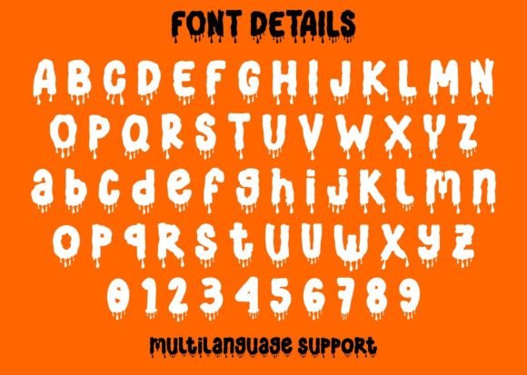
I would use it when the project needs a conventional scary tone rather than a cute or highly specialized concept. Keep the palette restrained so the letter shapes remain the primary visual device.
Best for: event posters, party graphics, seasonal shirts
Key features: horror theme, strong display focus, clear seasonal identity
See Goodrichees Halloween Font
39. Creepy Halloween
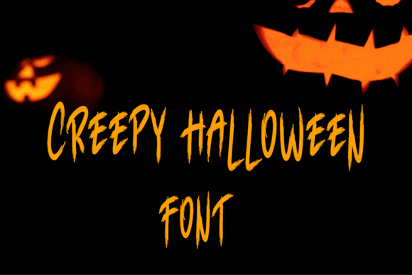
Creepy Halloween is a thick-lettered display alphabet for bold signs, cutting projects, merchandise, and party posters. Its substantial strokes help short phrases retain visual presence across both digital and physical designs.
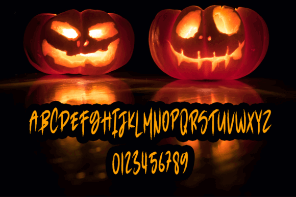
I favor this type of construction for simple vinyl work because it avoids extremely fragile lines. Complex contours may still need testing, and the heavy weight can feel cramped unless the letters have enough spacing.
Best for: bold vinyl text, signs, Halloween merchandise
Key features: thick strokes, spooky display shapes, strong production presence
40. Freaky Spooky
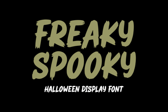
Freaky Spooky is a bold Halloween alphabet for haunted-house decorations, book covers, invitations, shirts, posters, and seasonal branding. It mixes creepy energy with a playful twist, making it useful across several audience levels.

I like it for creators who need one font to bridge family Halloween and darker party graphics. Its boldness carries short words well, but long stacked headlines may need reduced size or increased line spacing.
Best for: haunted decor, book covers, seasonal branding
Key features: bold weight, playful horror balance, broad project range
41. Scary
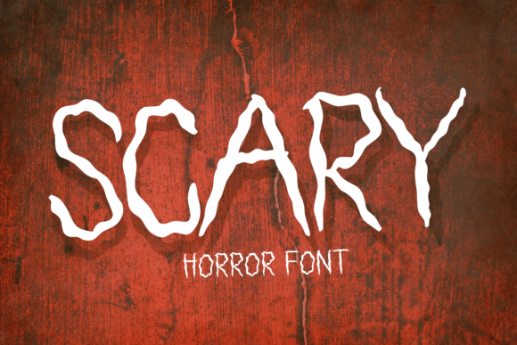
Scary is an eerie display alphabet with trembling character shapes for haunted invitations, decorations, posters, and suspense-themed crafts. The unstable edges give static words a nervous, shivering quality.
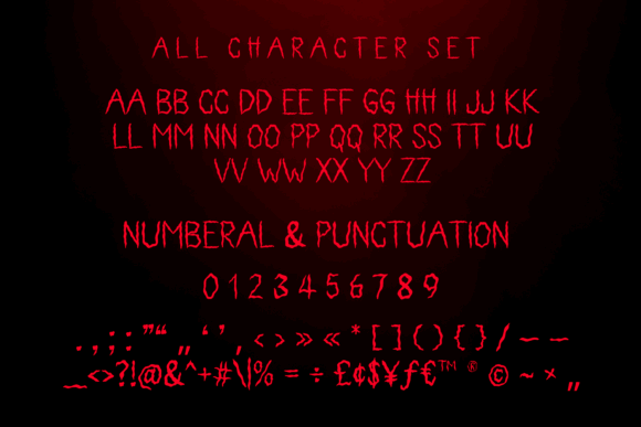
I would use it when the emotional direction is fear or suspense rather than gore. The irregular outline needs strong contrast, and I would avoid applying additional distress that could make the letters look broken.
Best for: suspense posters, haunted invitations, chilling decorations
Key features: trembling forms, eerie rhythm, strong emotional tone
42. Horror Halloween

Horror Halloween is a decorative alphabet for spooky posters, witch graphics, ghost crafts, pumpkin signs, and monster-themed projects. Its broad seasonal identity makes it suitable for mixed-icon compositions.

I would choose it when the artwork combines several Halloween motifs and the typography needs to connect them. Because decorative fonts vary widely by character, preview every required number and punctuation mark before finalizing an event design.
Best for: mixed-theme posters, ghost crafts, pumpkin signs
Key features: decorative construction, eerie charm, multi-theme compatibility
43. Pumpkin Horror
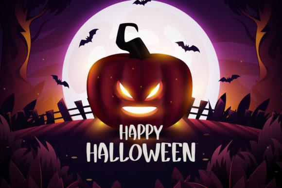
Pumpkin Horror is a stylish spooky display alphabet for fall merchandise, Halloween posters, invitation headings, and seasonal advertising. It brings a darker edge to pumpkin-based designs without losing the harvest connection.
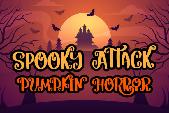
I like it for adult fall events that need more tension than rustic farmhouse lettering provides. Keep supporting pumpkins graphic and simple, since highly detailed illustrations may compete with the stylized title.
Best for: fall merchandise, adult Halloween events, pumpkin posters
Key features: pumpkin-horror mood, stylish display forms, seasonal crossover
44. Halloween Spooky

Halloween Spooky is a coordinated set with four font styles and matching clip art for personalized names, sublimation, DIY crafts, posters, and seasonal product collections. The variety supports more than one text hierarchy within the same theme.
This is my pick for creators building a coordinated collection rather than a single poster. Multiple styles offer flexibility, but establish consistent rules for titles, names, and small copy so the finished products still feel related.
Best for: coordinated collections, sublimation, personalized crafts
Key features: four font styles, matching clip art, flexible design system
How I Picked These Spooky Alphabet Fonts
I prioritized Halloween lettering that gives each alphabet a recognizable identity rather than relying on a generic distressed effect. My selection covers different moods—cute, theatrical, gothic, slimy, magical, monstrous, and cinematic—so you can match the typography to the audience instead of forcing one horror style onto every project.
My top recommendation is Halloween by Trim Studio for colorful family crafts, while Horror Monster is my pick for high-impact posters and Ghost Walker suits playful invitations. Choose thick, open letterforms for cutting machines and small signs; reserve intricate webs, drips, flames, and illustrated characters for larger headlines where their details remain clear.
Quick Picks
| Name | Best for | Format or type |
|---|---|---|
| Halloween | Colorful family projects | Display font |
| Hellaween | Readable cartoon posters | Slab display font |
| The Mummy Returns | Ancient-tomb themes | Mummy display font |
| Halloween Party | Horror event headlines | Dripping display font |
| Mitoos Halloween | Cute seasonal crafts | Decorative font |
| Creepyon | Bloody title effects | Horror display font |
| Ghost Walker | Quirky invitations | Display font |
| The Funny Ghost | Kids’ Halloween crafts | Cartoon font |
| Spooky Webbie | Cobweb lettering | Decorative font |
| Cute Ghost | Friendly ghost designs | Display font |
| Scary Zombie | Monster party graphics | Quirky display font |
| Afterlife Party | Festive spooky signs | Display font |
| Crusterous | Chunky poster titles | Bold display font |
| Cadabra | Magic and witch themes | Decorative font |
| Spicy Fire | Flame lettering | Display font |
| Beastman | Fantasy monster branding | Character font |
| Pumpkinos | Pumpkin-themed crafts | Decorative font |
| Mummy Halloween | Wrapped-letter headlines | Mummy display font |
| Wolfa | Werewolf posters | Sharp display font |
| Drippy Message | Slime and blood effects | Dripping font |
| The Nightmare | Unsettling horror titles | Display font |
| Elastika | Retro horror graphics | Elastic display font |
| Scary Spooky | General Halloween posters | Display font |
| The Creepy | October party designs | Playful display font |
| Creepy Spooky | Merchandise lettering | Halloween font |
| Ghost Halloween | Approachable ghost themes | Sans-serif font |
| Halloween Creepy | Friendly spooky crafts | Display font |
| Horror Monster | Movie-style posters | Horror display font |
| Spooky Creepy | Versatile seasonal titles | Display font |
| Witch Spooky | Witch party invitations | Halloween font |
| The Scary | Jagged horror graphics | Display font |
| Spooky Scary | Dark poster headings | Horror display font |
| Halloween Bat Font | Bat accents and borders | Dingbats font |
| Spooky Scary Creepy | Bold haunted signs | Display font |
| Spooky Monster | Playful monster crafts | Quirky display font |
| Spooky Halloween | Decorative October lettering | PUA-encoded font |
| Halloween Spooky Alphabet SVG | Individual cut letters | SVG alphabet |
| Spooky Halloween by Goodrichees | Party event graphics | Horror display font |
| Creepy Halloween | Thick cut lettering | Bold display font |
| Freaky Spooky | Haunted-house branding | Bold display font |
| Scary | Trembling poster text | Display font |
| Horror Halloween | Eerie decorative titles | Decorative font |
| Pumpkin Horror | Stylish fall merchandise | Display font |
| Halloween Spooky | Coordinated craft sets | Four-font set |
How I Picked These
I compared these options by how well they fit the article’s intended use, including readability, visual character, practical versatility, distinctive features, and how clearly each choice differs from the rest of the roundup. I prioritized options that solve a specific design need rather than simply adding more similar-looking products.
Tips for Posters, Cricut Crafts, and Printables
- Test the complete word because decorative letters can vary dramatically in width.
- Increase spacing around webs, spikes, drips, flames, and long swashes.
- Create a small material test before cutting an entire batch of vinyl or cardstock.
- Use strong contrast between the lettering and its background.
- Keep a clean companion font for dates, directions, and fine print.
- Confirm the current license terms for the specific commercial or print-on-demand use you have planned.
Final Thoughts
The best spooky Halloween alphabet font is the one that communicates your theme while remaining practical at the size and material you plan to use. I would start with Halloween by Trim Studio for colorful crafts, Horror Monster for dramatic posters, Ghost Halloween for cleaner layouts, or Halloween Spooky when a coordinated font-and-clip-art set saves time.
Before committing to a large project, type the exact phrase, inspect every character, and create one production sample. A font that looks striking in a large preview can behave very differently on a small treat tag, narrow tumbler wrap, layered cardstock sign, or weeded vinyl decal.
Frequently Asked Questions
What is the best spooky Halloween alphabet font for posters?
Horror Monster is my strongest pick for a dramatic Halloween poster because its bold display shapes remain prominent beside large illustrations. Hellaween is a better alternative for family events, while Elastika suits retro horror posters and Ghost Halloween fits cleaner contemporary layouts. Keep the main title large and limit the decorative alphabet to one or two lines. Use a simpler companion typeface for the date, location, ticket details, or supporting message so viewers can understand the poster quickly from a distance.
Which Halloween fonts are easiest to use with Cricut?
Halloween fonts with thick strokes, open counters, and limited tiny details are generally easier to cut and weed. Crusterous, Creepy Halloween, and Hellaween are better starting points than cobweb, mummy-wrap, flame, or heavily dripping styles when the final lettering will be small. Ease of cutting also depends on the word, material, blade condition, machine settings, and finished dimensions. Always create a small test using the exact phrase and material before producing shirts, signs, labels, or party favors in quantity.
Is an SVG alphabet the same as an installable font?
No. An SVG alphabet usually contains separate vector letter graphics, while an installable OTF or TTF font lets you type characters from your keyboard. SVG sets offer direct control over each illustrated letter but require more manual arrangement, especially when creating long phrases. Choose an SVG alphabet for monograms, short names, layered cut files, or letters that need individual colors. Choose an installable font for invitations, posters, labels, and repeated personalization where typing and editing speed matter.
How do I keep a spooky decorative font readable?
Use the decorative font only for the main message, enlarge it, increase spacing, and place it against a simple high-contrast background. Supporting information should use a cleaner font so webs, drips, spikes, swashes, or illustrated letter details do not interfere with comprehension. Preview the design at its actual finished size rather than judging only from a zoomed-in screen. If counters close, thin details disappear, or adjacent letters touch, increase the size, simplify the phrase, or choose a sturdier alphabet.
Follow Us