

ℹ️ Affiliate Disclosure: This article may contain affiliate links. We may earn a commission at no extra cost to you. Thanks for your support! ❤️
How to Choose Graffiti Fonts for Logos That Stay Readable
Graffiti fonts for logo design have to do two jobs that naturally pull in opposite directions. They need enough personality to make a brand recognizable, but they also need enough clarity to survive on a mobile header, product label, embroidered cap, social avatar, or tiny corner of a package.
That balance is harder than it looks. Graffiti lettering often uses exaggerated outlines, compressed spacing, irregular baselines, sharp overlaps, drips, or brush textures. Those details create energy at poster size, yet they can merge into a dark blur when the same logo is reduced.
My approach is to judge the underlying letter structure before getting attached to the decorative finish. A font with recognizable silhouettes, open interior spaces, steady stroke weight, and manageable spacing gives you far more room to customize a usable logo.
I reviewed graffiti and urban display fonts available on Creative Fabrica, prioritizing options presented for logos, branding, apparel, packaging, or other short-form display applications. I also considered visible popularity signals when they were available, including favorites and marketplace placement.
Quick Picks
- Best overall: Graffiti Urban
- Best for small playful logos: Street Creative
- Best chunky apparel option: Street Graffiti
- Best handwritten option: The Graffiti
The Five-Part Readability Test I Use
Before choosing any expressive display font, I type the exact brand name and examine five things:
- Silhouette: Can I recognize each letter without studying it?
- Counters: Do enclosed spaces inside letters such as A, B, O, P, and R remain open?
- Spacing: Do adjacent letters collide when the word gets smaller?
- Stroke weight: Are thin sections likely to disappear, or are heavy sections likely to fill in?
- Distinctiveness: Can similar characters such as I, L, T, C, G, N, and M be told apart?
Open counters and apertures are particularly useful when lettering must remain recognizable at a distance or in small reproduction.
A logo also does not have to use one identical file everywhere. Responsive identity systems often include a full wordmark, a simplified small-size version, and a compact icon. That is especially helpful with graffiti typography, where intricate details can be preserved for large applications and removed from the smallest ones.
1. Graffiti Urban
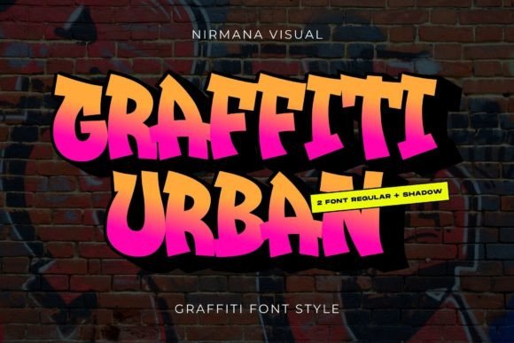
Graffiti Urban is my first place to look when a client wants street-art energy without making the logo feel completely chaotic. The font is positioned for logos, branding, advertisements, social content, and product design, which makes it one of the more broadly oriented choices in this group.
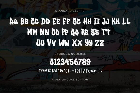
Its biggest advantage is not that it is restrained—it still has a strong urban personality—but that the lettering appears structured enough to support a compact wordmark. I would start with this one for streetwear labels, creative studios, music brands, youth events, or sports-oriented identities.
The font had been added to favorites more than 160 times when its marketplace page was indexed, giving it one of the stronger visible popularity signals among the products I reviewed.
Who should skip it: A brand with a long name or several narrow characters may need extensive spacing adjustments.
Best for: Streetwear labels, music branding, sports identities
Key features: Display construction, urban styling, logo-oriented positioning, broad software compatibility
2. Street Graffiti
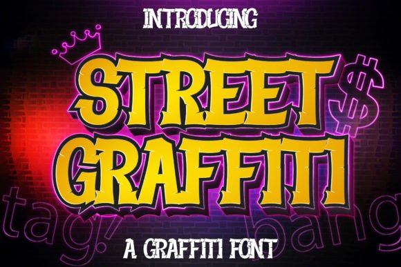
Street Graffiti uses bold, chunky letterforms with the rounded mass I usually prefer for small logo applications. Thick primary shapes tend to survive reduction better than scratchy outlines or delicate spray textures, provided the counters do not close.
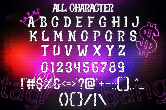
The font is presented for logos, sportswear, advertising, clothing, and other urban or casual projects. Its page also showed 47 favorites when indexed.
I would consider this font for a short name—ideally four to eight letters—where each character has room to breathe. A dense twelve-letter word could become visually heavy, especially when placed inside a badge.
Who should skip it: Premium, minimalist, or highly technical brands may find its chunky personality too playful.
Best for: Apparel marks, skate brands, youth sports logos
Key features: Bold strokes, chunky letterforms, rounded graffiti influence, strong short-word impact
3. The Graffiti
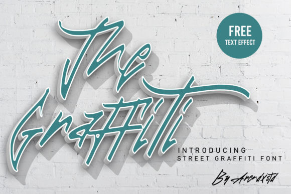
The Graffiti takes a cleaner brush-pen approach. Compared with heavily outlined or fragmented street fonts, brush lettering can create a faster, more personal wordmark while still keeping the letters connected to familiar alphabet shapes.
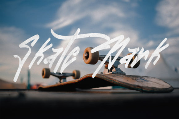
The product is described as clean, casual, slightly quirky, and suitable for logos, branding, social media, and craft projects. It also carried a 5.0 score based on one review at the time its page was indexed.
My concern with any brush-based logo is the transition between thick and thin strokes. Fine sections may weaken when printed very small, cut from vinyl, embroidered, or reversed out of a dark background. I would prepare a simplified version with slightly reinforced thin strokes.
Who should skip it: Brands that need rigid geometry, industrial authority, or flawless embroidery at very small sizes.
Best for: Artist logos, creative studios, casual fashion brands
Key features: Brush-pen construction, cleaner forms, informal rhythm, webfont conversion support
4. Street Creative
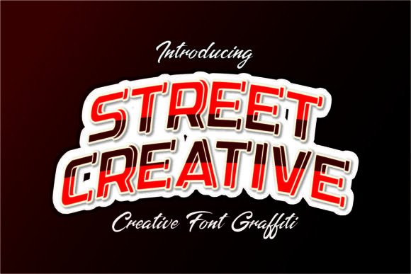
Street Creative is one of my stronger readability picks for playful branding because its listing specifically highlights bold strokes, open counters, and compact spacing. Open counters matter because the interior spaces of letters are often the first details to disappear during reduction.
The overall style leans friendly rather than aggressive. I would use it for a youth clothing line, snack brand, children’s creative program, gaming channel, or colorful event identity.
The tight default spacing may still require work. Tracking that feels energetic at headline size can become congested in a tiny wordmark, so I would open the spacing slightly for digital icons and product labels.
Who should skip it: A serious underground music project may find the softer character too cheerful.
Best for: Youth branding, playful packaging, creator logos
Key features: Open counters, bold strokes, hand-drawn rhythm, outline-friendly shapes
5. Street Paint
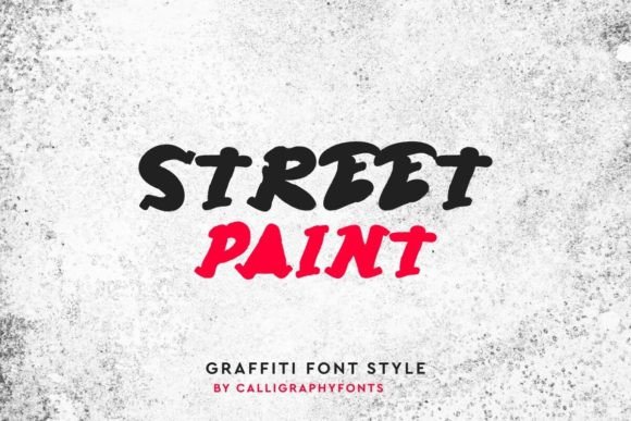
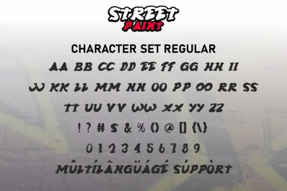
Street Paint has a thick, forceful silhouette with a darker and slightly spooky mood. The font is positioned for logos, labels, posters, screen printing, stickers, clothing brands, games, sports, race graphics, and rock music. It is also PUA encoded, providing access to included glyphs and ligatures through compatible software.
I like this direction for brands that need weight rather than speed. A thick design can hold up well on a T-shirt chest print, sticker, storefront graphic, or album cover.
At small sizes, however, heaviness can become its own problem. Narrow gaps may fill in, especially in one-color printing. I would examine letters such as E, R, A, S, and B before committing.
Who should skip it: Brands whose names contain many enclosed or tightly packed characters.
Best for: Rock branding, racing graphics, heavy streetwear
Key features: Thick strokes, dark mood, ligature access, screen-printing appeal
6. Simple Graffiti
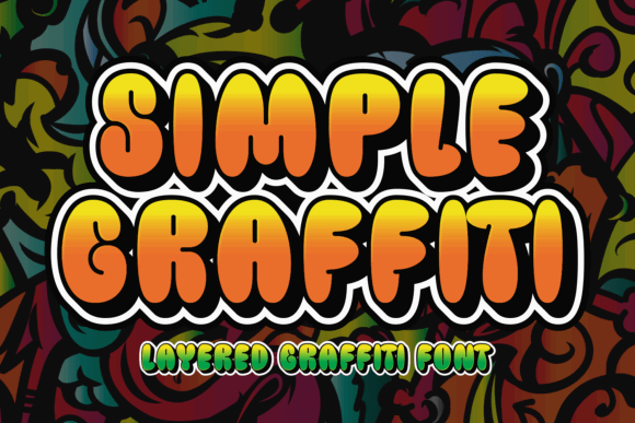
The name explains the advantage. Simple Graffiti offers an urban attitude without relying on the most elaborate wildstyle construction. The product is positioned for posters, streetwear graphics, and other bold urban applications.
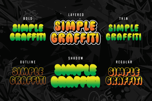
For logo work, “simple” is usually a compliment. The fewer decorative decisions packed into each character, the easier it is to recognize the brand at a glance.
I would shortlist this for a designer who plans to customize the lettering after typing it. A comparatively straightforward base gives you room to adjust terminals, connect two letters, add an underline, or create one signature detail without overwhelming the name.
Who should skip it: Anyone looking for an elaborate mural-like logo straight from the font file.
Best for: Custom wordmarks, streetwear startups, simple urban badges
Key features: Reduced visual clutter, display-focused forms, customization potential, urban character
7. Emurica Graffiti
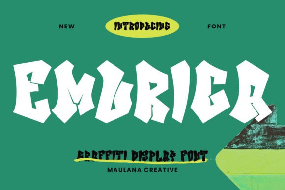
Emurica Graffiti brings a contemporary display style suited to logo design, social media, movie titles, and book titles.
I would look at this font when the logo needs to feel cinematic or entertainment-driven rather than like a literal spray-painted tag. That distinction can make a graffiti-inspired identity more flexible across thumbnails, channel banners, event graphics, and merchandise.
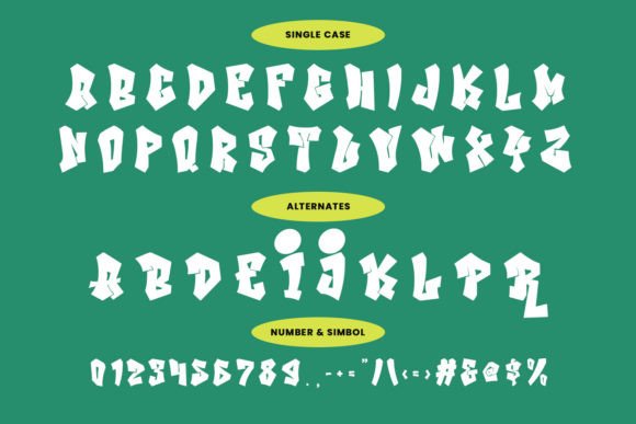
Because highly energetic fonts can cause the eye to read shape before language, I would test Emurica with unfamiliar viewers. Show the wordmark briefly, hide it, and ask what they read. A logo should not require advance knowledge of the brand name.
Who should skip it: Businesses that rely heavily on instant roadside or storefront recognition.
Best for: Entertainment brands, video channels, music artwork
Key features: Modern display style, title-friendly structure, bold personality, logo suitability
8. Absolute Graffiti
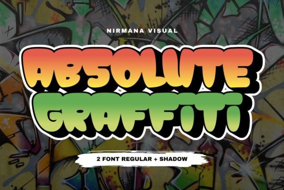
Absolute Graffiti draws directly from expressive spray-painted lettering and carries a rawer street-culture tone. Its product page highlights vibrant, edgy forms and an energetic, rebellious character.
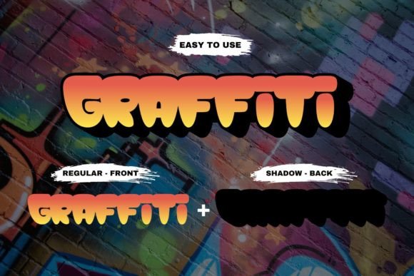
This would be my pick for a brand that values attitude more than corporate polish: a skate crew, dance event, independent label, street-art festival, or limited apparel drop.
I would not expect every decorative feature to survive at icon size. Instead, I would create two versions: a detailed primary wordmark and a stripped-down monogram based on the font’s strongest letter.
Who should skip it: Brands that insist on using one unchanged logo file from favicon to billboard.
Best for: Skate culture, dance events, independent labels
Key features: Spray-inspired expression, aggressive energy, strong display presence, monogram potential
9. Urban Street
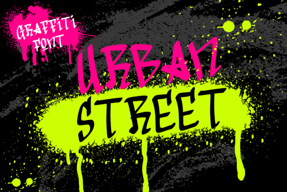
Urban Street is described as a graffiti-tagging font, putting it closer to marker or signature-style street lettering than to a thick bubble display face.
Tag-style fonts can make memorable logos because they feel like a personal mark. They also carry a built-in risk: fast strokes and compressed joins can be difficult to decipher for anyone seeing the brand for the first time.
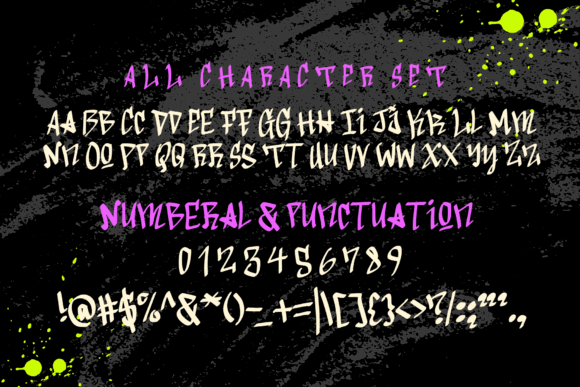
I would reserve this for short names and test it without context. If five people independently misread the same letter, that character needs editing. Converting the final wordmark to vector outlines makes those targeted corrections much easier.
Who should skip it: Long business names, legal firms, service businesses, or brands that must communicate immediate clarity.
Best for: Artist signatures, DJs, dance crews, compact apparel marks
Key features: Tagging influence, handwritten speed, signature quality, short-name focus
10. Retro Graffiti
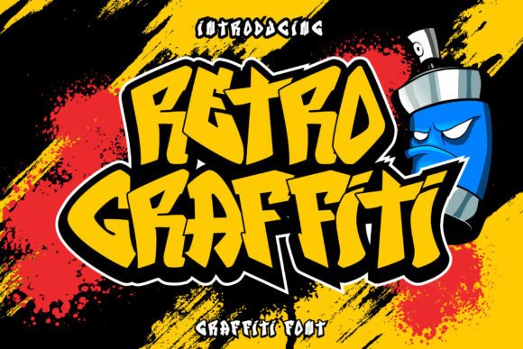
Retro Graffiti combines street lettering with a nostalgic display direction. This kind of hybrid can help a logo feel less generic because it does not rely on contemporary spray-paint cues alone.
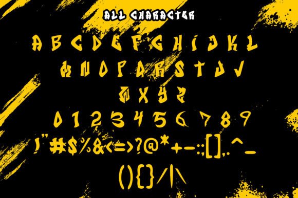
I would explore it for a record shop, throwback clothing line, roller venue, arcade project, food truck, or event series. Retro structure often works especially well with arches, badges, shadows, and limited color palettes.
The danger is piling on too many effects. If the font already has a strong period flavor, the logo may not need extra distress, multiple outlines, a drop shadow, a border, and an illustration at the same time.
Who should skip it: Minimal brands or identities expected to remain visually neutral for decades.
Best for: Retro apparel, record shops, entertainment venues
Key features: Nostalgic graffiti styling, badge potential, display personality, merchandising appeal
Which Graffiti Font Should You Choose for a Logo?
Best all-around starting point: Graffiti Urban
It offers strong urban character while remaining broadly positioned for branding and product applications.
Best for small, playful logos: Street Creative
Bold strokes and open counters give it a practical foundation for compact use.
Best chunky apparel option: Street Graffiti
Its mass and rounded structure suit short clothing or sports-oriented names.
Best handwritten option: The Graffiti
The cleaner brush approach feels personal without moving fully into an unreadable tag style.
Best heavy music or racing option: Street Paint
Its thick construction and darker tone bring weight to one-color merchandise.
Best option for customization: Simple Graffiti
A less crowded base leaves room for the designer to create a unique final wordmark.
The final decision should come from the actual brand name, not the font preview. Make a contact sheet showing every candidate at large, medium, and tiny sizes. View the sheet on your phone, print it in black and white, and ask someone unfamiliar with the project to read each version.
Graffiti styling should make the name more memorable—not make people guess what the name says.
FAQ
What makes a graffiti font suitable for a logo?
A useful graffiti logo font has recognizable letter shapes, open interior spaces, controlled stroke weight, and spacing that can be adjusted without destroying its character. It should also remain identifiable in one color.
Are graffiti fonts readable at small sizes?
Some are, particularly bold designs with open counters and simple silhouettes. Highly detailed wildstyle, distressed, outlined, or tag fonts usually need a simplified alternate logo for small digital uses.
Can I use a Creative Fabrica font for a commercial logo?
Creative Fabrica states that its downloads include a commercial license, but license terms can change and different uses may have specific conditions. Review the current license attached to the product before delivering a logo or trademark application.
Should a graffiti logo use all capital letters?
Not automatically. Capitals may create a stronger block shape, but an entire word in complex uppercase forms can become dense. Compare all-caps, mixed case, and a custom combination using the exact brand name.
Follow Us