

Aesthetic Digital Planner Templates for Goodnotes That Stay Practical
The best aesthetic digital planner templates for Goodnotes need to do more than look polished in a marketplace preview. Once a planner is filled with handwriting, appointments, highlighted deadlines, digital stickers, and half-finished task lists, its underlying layout becomes much more important than the decorative cover.
One thing I often notice when browsing digital planner collections is how easily visual style can disguise weak structure. A soft pastel palette may create a calm first impression, but pale text and low-contrast dividers can become difficult to read on a smaller iPad screen. A large bundle may appear generous, yet dozens of trackers and dashboards can make everyday navigation unnecessarily complicated.
The strongest aesthetic Goodnotes planners usually maintain a careful balance. They have enough personality to make planning feel enjoyable, but they also leave enough visual space for real schedules, notes, and annotations.
For this roundup, I looked at aesthetic Goodnotes planners available through Creative Fabrica, giving particular attention to products appearing in relevant popularity-sorted marketplace results where possible. The marketplace includes dedicated categories for Goodnotes planners, Goodnotes templates, and aesthetic digital planners, with styles ranging from cheerful pastel pages to warm boho layouts, academic systems, and expansive all-in-one organizers.
Rather than selecting ten planners that look almost identical, I included options for different planning habits, visual preferences, and device orientations.
Quick Picks
- Best pastel aesthetic: Digital Planner Cute Pastel
- Best minimal and neutral: Essential Digital Planner for Goodnotes
- Best long-term option: Digital Planner 2025–2027 and Undated Boho
- Best for students: All-in-One Digital Planner for Students
- Best portrait layout: All-in-One Digital Planner Portrait
How I Picked These
I compared these digital planners by navigation, writing space, visual hierarchy, dated and undated flexibility, page orientation, app compatibility, specialization, and how well each layout stays practical after real schedules, notes, stickers, and handwriting are added.
1. Digital Planner Cute Pastel
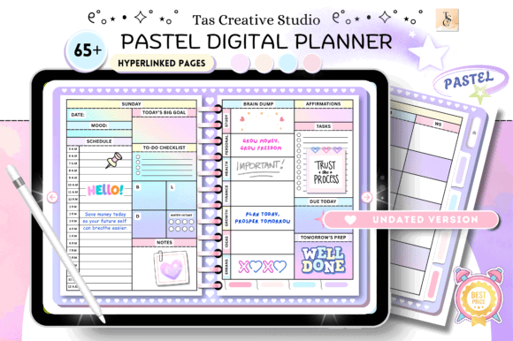
The Digital Planner Cute Pastel from Tas Creative Studio is one of the clearest visual matches for anyone searching for an aesthetic Goodnotes planner with a soft, colorful personality.
Its palette moves away from the beige-and-brown styling that dominates many digital planner collections. Instead, the pages use gentle pastel tones that feel cheerful without becoming overly saturated. Visually, the planner has enough decorative character to feel distinctive, but it still appears restrained enough for everyday handwriting and scheduling.
The undated structure is particularly practical. You can begin using it in any month, pause for several weeks, or restart your routine without leaving behind a long sequence of unused pages. That flexibility matters for anyone who enjoys digital planning but does not necessarily maintain the same routine throughout the year.
This planner also looks naturally suited to decorative planning with digital stickers and handwritten headings. The main limitation is that pastel backgrounds can become visually crowded once several colors are added. Dark handwriting, a limited sticker palette, and consistent highlighting will help preserve clarity.
The product is listed specifically as a Goodnotes digital planner and has appeared in Creative Fabrica results organized using the marketplace’s popularity index.
Best for: Pastel planning, digital journaling, flexible yearly organization
Key features: Undated structure, soft pastel palette, Goodnotes-focused pages
2. Essential Digital Planner for Goodnotes
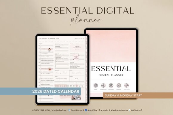
The Essential Digital Planner by TrendyCreative takes a quieter and more restrained approach. Its boho-influenced visual style feels warm and polished, but it does not cover every page with decorative illustrations or competing graphic details.
That restraint is one of its strongest qualities.
A smaller number of visual elements gives handwriting, appointments, color coding, and digital stickers more room to become part of the composition. This is something I often look for in planner templates. An attractive base should support the content added by the user rather than competing with it.
The neutral styling also gives the planner more flexibility across personal and professional settings. It has more character than a plain monochrome productivity template, yet it remains controlled enough for work schedules, project notes, and structured weekly planning.
A potential limitation is that the muted boho direction may feel too subdued for users who prefer bright kawaii graphics, illustrated pages, or strongly themed digital stationery. This planner is better suited to someone who wants a visually appealing foundation and prefers to add most of the personality through handwriting, stickers, or custom color coding.
Best for: Minimal decoration, work planning, neutral boho setups
Key features: Modern boho styling, clean visual hierarchy, Goodnotes-compatible design
3. Digital Planner 2025–2027 and Undated Boho
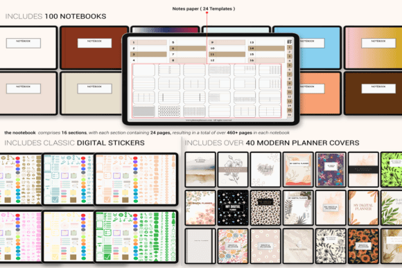
This planner bundle from Plamarplanners combines dated editions for several years with an undated version. From a practical perspective, that makes the collection more useful than a planner tied to a single calendar year.
The dated versions reduce setup time because months, weekdays, and calendar structures are already assigned. The undated edition offers more freedom for irregular planning, long breaks, or future reuse. Having both options in one visual system also means you can continue using a familiar layout without rebuilding your planning routine each year.
The design follows a warm boho aesthetic with muted neutral tones. This type of palette pairs naturally with earthy digital stickers, handwritten headings, and restrained color coding. The visual language appears cohesive across the bundle, which is important in a multiyear collection. When page styles shift too much between sections, a planner can begin to feel like several unrelated templates placed inside one file.
The product is described as compatible with Goodnotes, Notability, and iPad-based planning workflows.
Its main strength is flexibility, although that flexibility may be unnecessary for someone who only wants a lightweight weekly planner. Multiyear bundles can include more pages and files than casual users genuinely need.
Best for: Long-term planning, warm boho layouts, dated and undated use
Key features: Multiple yearly editions, reusable undated option, cohesive neutral styling
4. All-in-One Digital Planner for Goodnotes
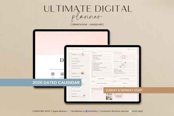
The All-in-One Digital Planner by TrendyCreative is designed for people who prefer to organize several areas of life within one Goodnotes file.
Instead of maintaining separate digital notebooks for goals, routines, appointments, personal notes, and longer-term planning, an all-in-one structure brings those sections together. This can create a more consistent planning experience, especially when the design language and navigation remain the same throughout the file.
With this type of planner, collection size is not the most important consideration. Navigation matters much more. Tabs, linked indexes, predictable page order, and clearly labeled sections determine whether a large planner feels organized or overwhelming.
The public marketplace preview does not reveal every page-level detail, but the product is categorized as a Goodnotes planner and includes a substantial series of preview images suggesting a broad planning system.
Visually, the planner appears intended as a complete digital environment rather than a simple calendar. That makes it more suitable for people who enjoy building routines around their planner and regularly use several categories.
Users who only record appointments and short task lists may find the Essential Digital Planner easier to manage. A large collection does not automatically offer more value if most of its pages remain untouched.
Best for: Life organization, routines, goals, centralized planning
Key features: All-in-one structure, broad page selection, Goodnotes-oriented format
5. Ultimate All-in-One Digital Planner
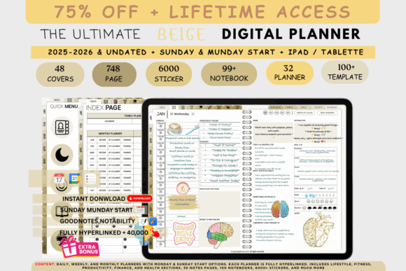
The Ultimate All-in-One Digital Planner from Plamarplanners uses a brown-toned visual identity that feels warmer and more grounded than the bright white layouts commonly used in productivity templates.
This earthy direction can be especially comfortable on an iPad screen. Large areas of pure white sometimes feel stark during longer planning sessions, while muted brown and beige tones create a softer visual atmosphere.
The planner is compatible with Goodnotes and several other annotation apps, including Notability, Samsung Notes, and Xodo. That broader compatibility may be useful for people who expect to change devices or experiment with different note-taking platforms in the future.
The collection appears most suitable for someone who wants a comprehensive personal organizer and enjoys subdued visual themes. The illustrations and decorative details remain secondary to the overall planning system, which helps the pages feel consistent.
One possible drawback is repetition. Brown and beige interfaces can begin to feel visually flat across a very large file. Introducing one or two controlled accent colors for deadlines, priorities, or categories can improve scanning while preserving the original aesthetic.
Best for: Earthy aesthetics, complete planning systems, multi-device use
Key features: Brown color palette, all-in-one structure, broad app compatibility
6. All-in-One Digital Planner Boho Color Bundle

The All-in-One Digital Planner Boho Color Bundle offers more visual variety than a planner built around a single color palette.
It retains the soft and slightly artistic quality associated with boho stationery, while allowing users to choose between several color directions. This can be genuinely useful for people who like to change their planner appearance seasonally or assign different colors to separate areas of life.
For example, one version could be used for work, another for personal schedules, and another for wellness or journaling. Using distinct palettes can make separate planning contexts easier to recognize, especially when multiple planner files are stored in the same Goodnotes library.
The template is described as compatible with Goodnotes, Notability, Samsung Notes, and Xodo across several device platforms.
The collection’s potential limitation is decision fatigue. Multiple color options add value only when the differences serve a clear purpose. A bundle containing more files may look impressive in a preview, but it is not automatically more useful than one carefully chosen planner.
I would choose this collection for its visual flexibility rather than simply for the number of included versions.
Best for: Seasonal themes, color-coded planning, visual customization
Key features: Multiple boho palettes, all-in-one pages, broad annotation-app support
7. Creative All-in-One Digital Planner
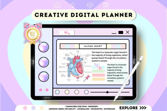
Tas Creative Studio’s Creative All-in-One Digital Planner has a more expressive personality than the neutral and minimalist planners in this roundup.
It is positioned as both a Goodnotes planner and a digital notebook for note-taking. That combination makes it relevant for people whose planning habits extend beyond short appointments and checklists.
A hybrid structure can be particularly useful for creative work. Project deadlines, content ideas, reference notes, brainstorming pages, and regular scheduling can remain inside one visual system. This reduces the need to move constantly between separate notebooks.
Visually, the collection appears more decorative and energetic than the understated boho options. The stronger artistic direction may make personal planning feel less mechanical, especially for users who enjoy adding sketches, stickers, and longer handwritten notes.
The same quality may be a limitation in formal environments. When every page has a strong visual identity, information can take slightly longer to scan. People using a planner primarily for corporate schedules or highly structured project management may prefer a quieter layout.
For personal organization, creative projects, or content planning, however, the additional personality feels purposeful rather than purely decorative.
Best for: Creative projects, note-taking, personal organization
Key features: Expressive visual style, integrated note pages, all-in-one format
8. All-in-One Digital Planner for Students
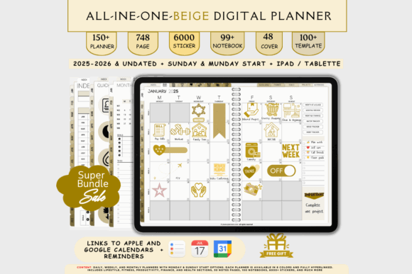
The All-in-One Digital Planner for Students is the most specialized option in this collection.
Instead of asking students to adapt a general life planner to an academic schedule, it begins with a structure intended for coursework, deadlines, classes, and study planning. That focus can make the planner more practical than a broad lifestyle template filled with sections that have little relevance to school or college.
A useful student planner needs more than attractive covers and pastel dividers. The page hierarchy should make classes, assignments, exams, deadlines, study sessions, and personal tasks easy to distinguish.
This is where visual consistency becomes especially important. When every heading, icon, and decorative element has the same visual weight, urgent coursework can disappear among less important information.
The Plamarplanners product includes an extensive series of previews and is presented as a complete student-oriented planning system. The large page selection appears suited to students who want to keep most academic information in one place.
Professionals and casual planners will probably find several of the academic sections unnecessary. For school or college organization, however, that specialization is its main strength.
Best for: College schedules, assignments, exams, academic goal tracking
Key features: Student-focused structure, all-in-one organization, extensive academic page system
9. All-in-One iPad Digital Planner
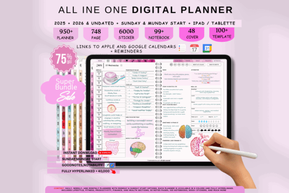
The All-in-One iPad Digital Planner is built for people who do most of their planning directly on a tablet.
It includes daily, weekly, undated, budgeting, and general organization sections while supporting Goodnotes and other annotation apps. The broad structure makes it relevant for users who want one main digital organizer rather than several smaller notebooks.
Its iPad-first positioning is also worth considering. A planner designed for handwritten digital interaction usually handles spacing differently from a document intended mainly for desktop editing. Writing areas need to leave enough room for an Apple Pencil, while tabs and navigation elements should remain easy to tap at normal screen size.
The main challenge with a broad planner is deciding which sections will actually become part of a routine. A large file may appear complete, but unused dashboards and trackers can make navigation feel heavier than necessary.
Before choosing a comprehensive planner, I would identify the three or four sections likely to be opened every week. If those pages are clearly designed and easy to reach, the additional sections can remain optional rather than distracting.
Best for: iPad users, budgeting, daily and weekly planning
Key features: Tablet-oriented pages, multiple planning categories, reusable undated sections
10. All-in-One Digital Planner Portrait
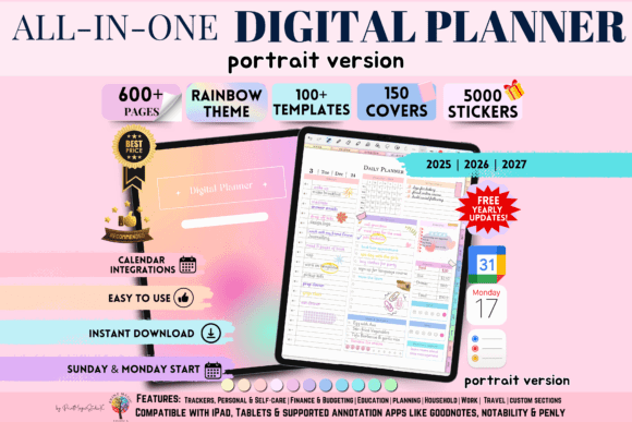
Most digital planners imitate wide desktop dashboards, but portrait planners offer a noticeably different experience.
The All-in-One Digital Planner Portrait from Print Magic StudioX includes editions for 2025, 2026, and 2027, along with daily, weekly, and digital journal content. Its vertical orientation is especially relevant for users who naturally hold their iPad like a traditional notebook.
Portrait pages can feel more comfortable for longer handwritten notes, journaling, and vertically arranged lists. They also create a stronger visual connection to printable planners and paper notebooks.
Some printable artwork and decorative layouts retain their character beautifully in portrait format because the composition feels contained and balanced. Digital planners can benefit from the same effect, particularly when headings, lists, and writing areas follow a clear vertical rhythm.
The tradeoff is reduced horizontal space. People who prefer wide weekly dashboards, side-by-side schedules, or split-screen planning may find landscape pages easier to scan.
Orientation is often treated as a minor aesthetic detail, but it can significantly affect how naturally a planner fits into an everyday workflow.
Best for: Vertical iPad use, journaling, traditional notebook layouts
Key features: Portrait orientation, multiyear editions, daily and weekly pages
Which Aesthetic Digital Planner Should You Choose for Goodnotes?
The Digital Planner Cute Pastel is the most direct match for users who want a soft and colorful Goodnotes aesthetic. Its undated format also makes it forgiving for people whose planning routine changes throughout the year.
The Essential Digital Planner offers a quieter boho direction with stronger visual restraint. It leaves more space for handwriting and personal decoration without feeling completely plain.
The Digital Planner 2025–2027 and Undated Boho provides one of the most practical combinations of long-term flexibility and warm visual design. Its dated and reusable editions make the collection easier to adapt over time.
Students should begin with the dedicated All-in-One Digital Planner for Students rather than trying to force academic planning into a general lifestyle template. Users who naturally hold their iPad vertically may find the All-in-One Digital Planner Portrait more comfortable than a traditional landscape dashboard.
The strongest aesthetic digital planner is not necessarily the one with the most pages, colors, or decorative features. It is the planner whose spacing, navigation, and visual hierarchy continue to feel clear after the pages are filled with real plans.
Some links in this article may be affiliate links. If you purchase through them, we may earn a small commission at no extra cost to you. Thanks for supporting our work.
Frequently Asked Questions
What Is the Best Aesthetic Digital Planner for Goodnotes?
The best choice depends on your preferred style and planning routine. A pastel planner works well for decorative planning, while a minimalist or boho template provides more visual space for handwriting. Students and journal users may benefit from specialized layouts.
Can I Reuse an Undated Goodnotes Planner?
Yes. An undated planner can usually be reused because its pages are not tied to a particular calendar year. Keep a clean copy of the original PDF and import it again when you want to begin a new planning cycle.
Do Digital Planner Hyperlinks Work in Goodnotes?
Hyperlinked PDF planners are commonly used in Goodnotes. You may need to switch from handwriting mode to a navigation or reading mode before tapping links. The exact controls depend on the current version of the app.
Can I Use a Goodnotes Planner Without an Apple Pencil?
Yes. You can use a compatible stylus, type with the text tool, or interact with the planner using touch controls. An Apple Pencil is convenient for handwriting but is not required for every planning workflow.
Are Goodnotes Planner Templates Editable?
You can normally add handwriting, text, images, stickers, and annotations. However, the fixed PDF layout itself may not be directly editable like a Canva or presentation template. Check the included file formats when you need full design customization.
Is Portrait or Landscape Better for Digital Planning?
Portrait orientation is often comfortable for journaling and vertical lists. Landscape orientation provides more horizontal space for weekly schedules and dashboards. Choose the format that matches how you normally hold and use your iPad.
Can I Use a Goodnotes Planner in Notability?
Some PDF planners can be imported into both Goodnotes and Notability, but functions and hyperlink behavior may differ. Confirm the product’s current compatibility information before purchasing.

Follow Us