

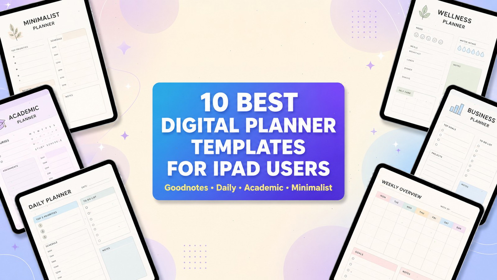
How Digital Planner Templates for iPad Improve Daily Planning
The best digital planner templates for iPad users should feel more natural on a screen than they would on paper. I look for layouts that make sensible use of clickable tabs, reusable pages, handwriting space, and the flexibility of an Apple Pencil rather than simply recreating a printed calendar inside a PDF.
One thing I often notice when browsing digital planner collections is how dramatically the preview images can differ from the actual planning experience. A planner may look polished when every page is filled with coordinated handwriting and decorative stickers, but everyday usefulness depends on quieter details: readable spacing, clear navigation, sensible page density, and tabs that are easy to select.
The planners in this collection approach organization in noticeably different ways. Some are extensive all-in-one systems covering finances, wellness, projects, routines, and personal goals. Others deliberately reduce the number of sections so you can focus on a single day without moving through layers of dashboards and trackers.
Most of these templates are interactive PDF files designed for annotation apps such as Goodnotes, Notability, Noteshelf, or Xodo. Compatibility is not always universal, so checking your preferred app before downloading is important. Creative Fabrica’s iPad digital planner category also provides popularity-based sorting, which helped inform the initial selection while I compared the visual structure and practical scope of each template.
Quick Picks
- Best all-in-one portrait option: All in One Digital Planner Portrait
- Best for maximum flexibility: Digital Planner for iPad, GoodNotes
- Best focused daily option: Daily Digital Planner Portrait
- Best for students: Student Digital Academic Planner iPad
- Best dark-mode option: Dark Mode All in One Digital Planner
How I Picked These
I compared these iPad planners by navigation, writing space, page density, layout variety, portrait versus landscape usability, dated versus undated flexibility, app compatibility, specialization, and how naturally each option fits real Apple Pencil and tablet-based planning routines.
1. All in One Digital Planner Portrait
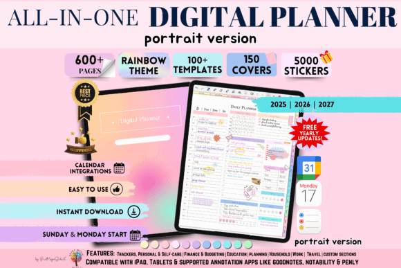
This portrait planner feels like a natural starting point for anyone who usually holds an iPad vertically. The proportions resemble a notebook page, which makes handwritten lists, appointments, and short notes feel visually familiar.
Portrait planners are also practical when the iPad sits beside a laptop. The narrower format takes up less horizontal space and can remain open while you work in a browser, email client, or document on another screen.
Visually, this planner follows an all-in-one structure. That approach is useful for people who want appointments, routines, goals, habits, and personal notes contained in one file. It can create a more cohesive planning system because the pages share the same visual language instead of feeling like unrelated inserts gathered from several collections.
The potential limitation is density. Large planner systems often appear generous because they include many sections, but additional pages do not automatically create a better workflow. A planner with extensive navigation may take time to understand, particularly when several tabs lead to pages you rarely need.
I would consider this style for someone who enjoys developing a complete planning routine and prefers keeping different areas of life visually connected. It may feel unnecessarily elaborate if your routine consists mainly of checking a weekly calendar and writing a short task list.
Best for: Personal planning, routines, and goals
Key features: Portrait format, broad all-in-one structure
2. Digital Planner for iPad, GoodNotes

This is one of the more substantial digital planner templates in the collection. It combines undated planning pages, Monday- and Sunday-start versions, several daily and weekly layouts, digital stickers, and more than 100 templates covering fitness, finance, nutrition, wellness, productivity, and everyday tracking.
The breadth gives the planner considerable flexibility. You can use a detailed time-blocked page during a demanding week, then switch to a more open layout when your schedule becomes quieter. Specialized trackers may also reduce the need to search for separate printable graphics or additional planner inserts later.
What interests me most in large planner bundles is not the total page count but the consistency between sections. A finance tracker, wellness page, and weekly schedule should still feel like parts of the same visual system. When typography, spacing, and decorative details change too dramatically, a large collection can begin to feel fragmented.
This planner appears to maintain a broad but organized structure, which makes the variety more practical. The inclusion of several layout options is particularly useful for people who are still discovering how they prefer to plan.
The file is compatible with PDF annotation apps including Goodnotes, Notability, Samsung Notes, CollaNote, and Xodo. It is not intended for OneNote or primarily for phone use, which is worth noting before purchase.
Its main limitation is scale. More than 100 templates can sound appealing in a product preview, but many users will eventually rely on only a small group of favorite pages. The remaining templates may add navigation without contributing much to the daily routine.
Best for: Detailed life management, tracking, and customization
Key features: Undated pages, multiple layouts, 100-plus templates
3. Daily Digital Planner Portrait
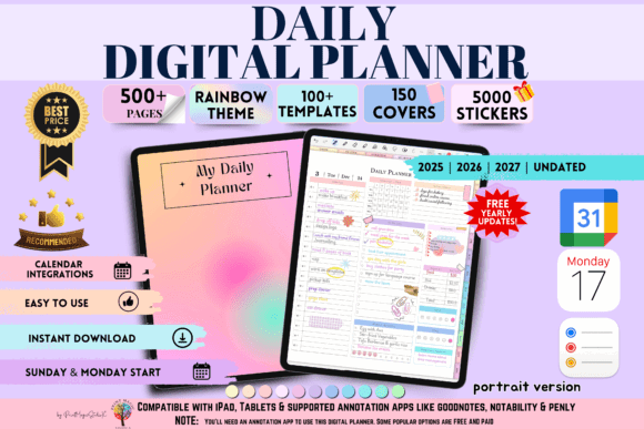
A focused daily planner can be more useful than an enormous life-management bundle, especially for people whose schedules change frequently. Instead of dividing attention among dashboards, yearly goals, and specialized trackers, a daily page creates one clear place for current appointments, priorities, and notes.
The portrait orientation supports this simplicity. Vertical layouts naturally suit handwritten task lists because the eye moves downward in a predictable rhythm. They can also make priorities feel easier to scan than wide landscape pages with several competing columns.
I often find that daily planners reveal their quality through spacing. If the sections are too small, handwriting quickly feels cramped. If they are too open, the page lacks enough structure to guide the day. A well-balanced page should provide visible hierarchy without dictating every detail of your routine.
This format is also useful in split-screen mode. The planner can sit beside email, a browser, or a document without its writing area becoming disproportionately wide.
The main consideration is that a daily planner asks for regular interaction. You need to open it, decide what matters, and transfer unfinished tasks when necessary. For someone who enjoys that quiet daily ritual, the narrower scope can create more focus. For someone who prefers planning once a week and rarely revisiting the file, it may require more maintenance than expected.
Best for: Daily priorities, appointments, and focused work
Key features: Portrait layout, day-focused page structure
4. Student Digital Academic Planner iPad
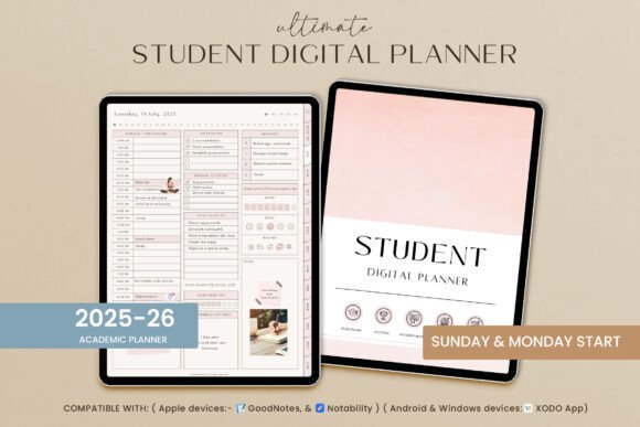
General productivity planners do not always reflect the natural rhythm of school or university life. Students need to see class schedules, assignment deadlines, exam preparation, study sessions, and longer academic projects without forcing everything into a business-style calendar.
This academic planner is designed around those needs. Its category placement also appears near the top of Creative Fabrica’s popularity-sorted iPad planner results, suggesting that its structure aligns with what many students are actively looking for.
The strongest student planners create a clear visual separation between fixed commitments and flexible work. A class at 10:00 a.m. is not the same type of task as reviewing notes or writing an essay, and the page structure should make that distinction visible.
This matters particularly on an iPad, where it is easy to become distracted by decorative stickers, color-coded headings, and additional inserts. An attractive academic planner still needs to keep the next real deadline visually prominent.
I would also look closely at the amount of writing space provided for assignments. Some academic templates include many small subject boxes but leave little room for detailed notes. A more practical layout allows students to record due dates, project stages, and study priorities without squeezing everything into a narrow field.
This planner is naturally less relevant for users whose schedules revolve around clients, business projects, or irregular freelance work. Its value comes from its academic focus rather than broad versatility.
Best for: College schedules, assignments, and exam preparation
Key features: Academic focus, student-oriented planning sections
5. Digital Minimalist Daily Planner
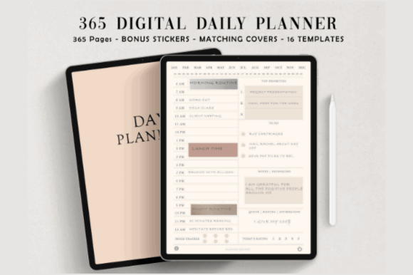
Minimal digital planners are easy to overlook because they do not create the same immediate visual impact as large, highly decorated bundles. Yet in actual use, fewer decorative elements often mean faster scanning, more flexible handwriting space, and less competition between the page design and your own notes.
This planner suits users who find crowded dashboards, tiny trackers, or multiple accent colors distracting. A restrained hierarchy allows appointments and priorities to become the dominant visual elements rather than one more layer inside an already busy composition.
Minimalism, however, is not simply the absence of decoration. The page still needs contrast, alignment, and enough variation in scale to guide the eye. When every section has the same weight, even a clean design can feel visually flat or difficult to navigate.
The strongest minimalist planners usually rely on careful spacing rather than additional graphic elements. Margins, line height, section boundaries, and heading size become especially important because there are fewer decorative devices available to organize the page.
A potential limitation is the lack of specialized systems. Users expecting built-in budgeting, wellness tracking, meal planning, or project-management pages may find the collection too narrow.
For basic daily planning, though, that restraint is the main strength. The planner leaves room for your handwriting, highlights, and occasional digital stickers without requiring them to make the page feel complete.
Best for: Distraction-free planning and short task lists
Key features: Minimal styling, clear daily organization
6. THAT GIRL Digital Planner GoodNotes
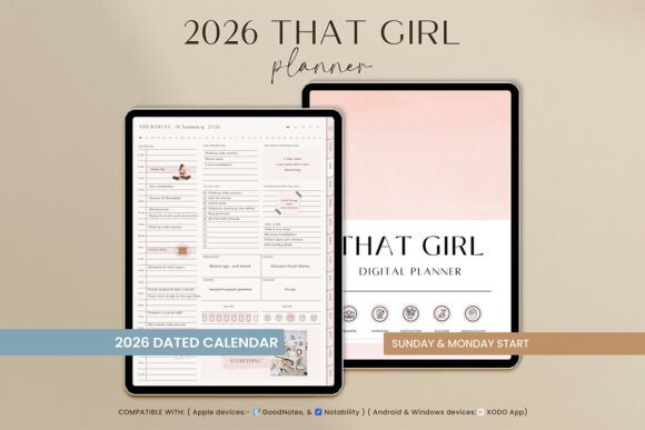
This planner draws on the wellness-focused “That Girl” aesthetic rather than the neutral appearance of a conventional office calendar. Its visual direction is likely to appeal to users who see routines, self-care, habits, and personal goals as connected parts of one lifestyle system.
Trend-led planner designs can be engaging because they make organization feel more personal. A coordinated palette, decorative headings, and cohesive lifestyle imagery may encourage users to return to the planner more regularly.
At the same time, heavily aesthetic planning systems have a shorter visual lifespan than more neutral designs. A style that feels current now may begin to look dated as color trends and social-media aesthetics change. That does not make the planner unusable, but it is worth considering when choosing an undated template intended for long-term use.
The most successful lifestyle planners balance personality with clarity. Decorative elements should frame the planning content rather than compete with it. Habit sections and wellness pages are helpful when they reflect routines you genuinely want to monitor. They become visual clutter when they are included mainly because they look attractive in a preview.
This template appears prominently in Creative Fabrica’s popularity-sorted iPad and dated-planner results. Visually, it offers a more expressive alternative to plain productivity layouts.
I would view it primarily as a lifestyle and wellness planner. Someone looking for a neutral client-management system or a formal business calendar may find the visual style too specific.
Best for: Wellness routines, habits, and personal goals
Key features: Lifestyle aesthetic, Goodnotes-oriented digital format
7. Digital Planner for iPad, GoodNotes 6
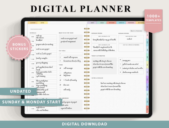
This reusable planner combines four weekly layouts, four daily layouts, Monday- and Sunday-start versions, digital stickers, and more than 100 templates across several planning categories. It supports common PDF annotation apps and is intended mainly for tablets and computers rather than phones.
The choice of page structures is useful for people who have not yet settled on one planning method. You can compare scheduled daily pages with more open layouts without purchasing separate files or rebuilding a planning system from individual inserts.
One thing I often notice with large planner collections is that layout variety can be more valuable than category variety. Four genuinely different daily pages may help you refine your routine, while dozens of highly specific trackers may remain unopened.
This planner’s reusable undated structure also gives it a longer practical lifespan. You can restart the calendar after a break, duplicate favorite pages, or create separate planning sections for work and personal use.
The product page showed a substantial visible engagement count and a 4.8 rating from five reviews at the time it was checked. Those signals are useful, although they do not replace examining the page previews and compatibility details yourself.
The most obvious limitation is overlap with other all-in-one digital planner bundles. Many large collections include similar wellness, finance, and productivity sections. I would choose this one for its layout options and reusable structure rather than assuming every included tracker will become part of your routine.
Best for: Flexible planning, layout experimentation, and tracking
Key features: Eight core layouts, reusable undated pages
8. Dark Mode All in One Digital Planner
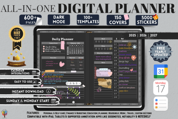
Dark digital planners can be genuinely useful for people who work on an iPad in the evening or simply find bright white pages visually tiring. This landscape planner uses a dark background with brighter accent elements and includes dated layouts for 2025, 2026, and 2027.
Its feature list is extensive. The planner includes Apple and Google Calendar integration, hyperlinked navigation, ten custom sections, 12 note-paper templates, more than 5,000 digital stickers, and 150 covers. It is compatible with apps including Goodnotes, Notability, Penly, Noteshelf, and Xodo.
Visually, dark planners create a different relationship between the page and the handwriting. Light ink colors tend to appear more prominent, while muted shades may lose contrast. Digital stickers created for white backgrounds may also look out of place or show visible edges when placed on a dark page.
That means the planner’s large sticker library could be more useful than it initially appears, provided the included graphics have been designed specifically for the darker interface.
The landscape orientation offers generous horizontal space for weekly schedules, time blocking, and side-by-side sections. It may feel especially comfortable when the iPad rests on a stand or is used with a keyboard.
The volume of included content is generous, although it may also make the file feel heavier and more complex than a simple planner. The darker appearance is also highly specific. Users who print planner pages or regularly export them to white documents may prefer a lighter system.
For anyone strongly drawn to dark interfaces, this is the clearest option in the collection.
Best for: Evening planning, dark interfaces, and customization
Key features: Dark landscape design, calendar links, dated layouts
9. 2026 Bundle Digital Planner, Goodnotes
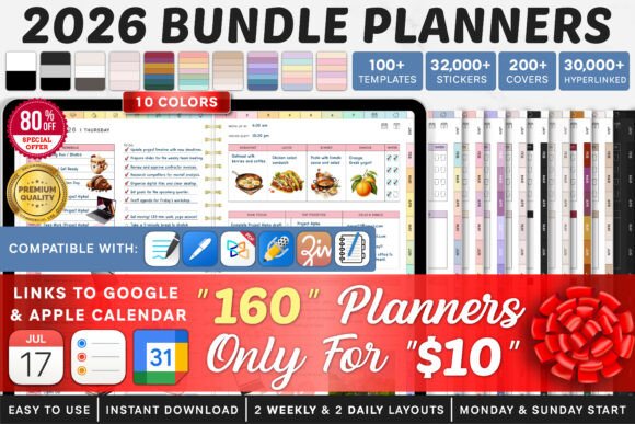
A dated planner bundle is useful when you want every month, week, and day arranged in advance. It removes the setup required by undated templates and makes it easier to place appointments several months ahead.
This 2026 bundle appears near the top of Creative Fabrica’s popularity-sorted digital planner results.
The main advantage of a bundle is the ability to compare several versions or page styles without reconstructing a planner from separate files. This can be particularly helpful when you know you want a dated system but are still deciding which visual arrangement feels most natural.
I would look beyond the number of included planners and compare how distinct they actually are. Some bundles repeat nearly identical pages with small color or cover changes. A smaller group of meaningfully different layouts may offer more practical value than dozens of lightly altered files.
The dated structure provides clarity for annual planning, recurring appointments, school terms, launches, and travel. Its limitation is an unavoidable one: the calendar pages eventually expire.
Some note pages and additional inserts may remain reusable, but the central planning system is tied to 2026. This makes the bundle most sensible for someone ready to begin a new annual routine rather than someone who tends to start and stop planners throughout the year.
Best for: Annual planning, scheduled events, and a fresh-year setup
Key features: Dated 2026 structure, Goodnotes planner bundle
10. Premium 2026 Digital Planner for Goodnotes
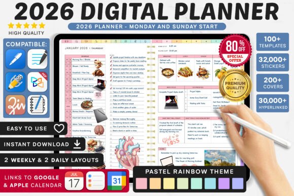
This option is aimed at users who prefer a defined yearly framework instead of an open-ended notebook. Dated planners make recurring calendar reviews easier because each month and week already has a fixed place in the sequence.
The template also ranks prominently on the marketplace’s popularity-sorted 2025 digital planner page despite being designed for 2026.
A structured annual planner is useful for appointments, launches, school terms, travel plans, and other commitments that need to remain visible over several months. Hyperlinked months and weeks can make long-range navigation faster than scrolling through a generic notebook.
The quality of a dated planner often depends on how comfortably the different time scales connect. Monthly pages should provide a broad overview, weekly spreads should reveal workload, and daily pages should allow enough detail without repeating information unnecessarily.
Before importing a large annual file, I would check the orientation and page density carefully. A landscape planner may feel spacious on a desk but less comfortable when held vertically. A portrait layout may suit handwriting but provide less room for complex weekly schedules.
The main limitation is flexibility. A fixed yearly structure can feel restrictive for users who frequently redesign their workflow or abandon planning systems halfway through the year. Unlike an undated template, unused calendar pages cannot simply be restarted later.
Best for: Yearly scheduling, forward planning, and Goodnotes users
Key features: Dated annual format, structured digital navigation
Read More: Expanding on ways to enhance your digital organization, you might also enjoy discovering the 15 Best Digital Planner Templates for Goodnotes in 2026, perfect for those who use this popular planning app.
Quick Comparison
| Digital planner | Best suited to |
|---|---|
| All in One Digital Planner Portrait | Managing several areas of life |
| Digital Planner for iPad, GoodNotes | Extensive tracking and customization |
| Daily Digital Planner Portrait | Focused day-to-day scheduling |
| Student Digital Academic Planner | Classes, assignments, and study planning |
| Digital Minimalist Daily Planner | Simple planning without visual clutter |
| THAT GIRL Digital Planner | Wellness and lifestyle routines |
| Digital Planner for iPad, GoodNotes 6 | Reusable all-purpose planning |
| Dark Mode All in One Digital Planner | Evening use and darker interfaces |
| 2026 Bundle Digital Planner | Dated annual planning |
| Premium 2026 Digital Planner | Structured yearly organization |
Which Digital Planner Should You Choose for iPad?
The best digital planner is not necessarily the one with the most pages, covers, or digital stickers. It is the one you can open quickly, understand without effort, and continue using after the initial excitement has faded.
For maximum variety, the larger Digital Planner for iPad, GoodNotes collections provide several layouts and more than 100 specialized templates. Their main strength is flexibility, although users who prefer simpler systems may find the scale excessive.
The Student Digital Academic Planner offers a more focused structure for classes, assignments, and exam preparation. The Digital Minimalist Daily Planner takes the opposite approach, reducing visual noise so that priorities and handwriting remain central.
The THAT GIRL Digital Planner has a stronger lifestyle identity, while the Dark Mode All in One Digital Planner stands apart through its darker interface, landscape composition, calendar links, and extensive customization.
For users who want every date prepared in advance, the two 2026 planners provide a clearer annual framework. Their dated structure supports long-range scheduling, although it naturally has a shorter useful lifespan than an undated planner.
Whichever template you select, test the navigation and core page layouts before spending time decorating it. Reliable hyperlinks, readable spacing, and a few thoughtfully structured pages usually contribute more to a sustainable planning routine than hundreds of inserts.
A planner should make the iPad feel calmer and more organized. When the interface begins to demand more attention than the plans themselves, even the most visually impressive bundle has missed its purpose.
Some links in this article may be affiliate links. If you purchase through them, we may earn a small commission at no extra cost to you. Thanks for supporting our work.
FAQ
What is the best digital planner app for iPad?
Goodnotes and Notability are among the most commonly supported apps for interactive PDF planners. Noteshelf and Xodo are also supported by some templates. The best option depends on your preferred handwriting tools, file organization, and navigation controls.
Do digital planners work with Apple Pencil?
Yes. An Apple Pencil lets you write, highlight, draw, and annotate the planner much like a paper notebook. The planner itself is usually a PDF, while the annotation app handles the handwriting tools.
Is a dated or undated iPad planner better?
Undated planners are more reusable and can be started at any time. Dated planners require less setup and are easier for scheduling future events. Beginners who are uncertain about their planning routine may get more value from an undated format.
How do hyperlinks work in a Goodnotes planner?
Hyperlinked tabs connect sections such as the index, months, weeks, and daily pages. In Goodnotes, you may need to use navigation or read-only mode to open the links instead of writing over them.

Follow Us