

Introduction
The best collegiate fonts have a visual confidence that is difficult to mistake. Heavy strokes, squared proportions, slab serifs and compact letterforms immediately bring to mind university athletics, varsity jackets, team jerseys and traditional school merchandise.
That does not mean every varsity typeface serves the same purpose.
Some collegiate fonts are designed around classic university lettering. Others feel closer to vintage sportswear, contemporary athletic branding or decorative outlined typography. A font that looks convincing in a short team logo may become too dense when used for player names, jersey numbers or a longer school slogan.
The collegiate fonts below include clean block styles, condensed jersey lettering, vintage textures and outlined constructions. Each one has a slightly different balance of personality, readability and production flexibility.
Table of Contents
Best Collegiate and Varsity Fonts
1. Modern College
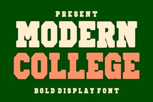
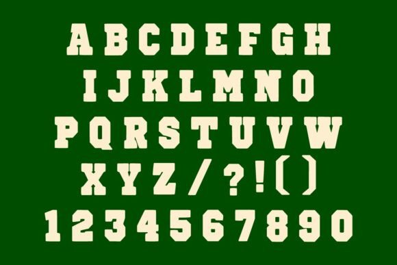

Modern College is a sensible starting point when you want familiar varsity lettering without making the design look intentionally aged. Its geometric construction, clean edges and substantial strokes create a polished athletic appearance.
From a branding perspective, the controlled letterforms are the main advantage. They give the font enough personality to establish a sports theme while remaining relatively easy to use across digital graphics, printed apparel and embroidered patches.
I would use it for short school names, initials, championship wording or a compact team logo. Longer phrases may begin to feel visually heavy, especially when additional outlines or shadows are applied.
The clean construction also makes it easier to pair with mascots, shields, stars and secondary sans serif typography. It already has a strong visual voice, so the supporting elements do not need to compete for attention.
Best for: Modern team logos, clean jerseys, school merchandise
Key features: Geometric letterforms, clean edges, bold athletic construction
2. Collegiate by T.D. House
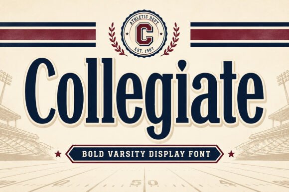
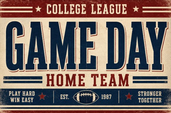
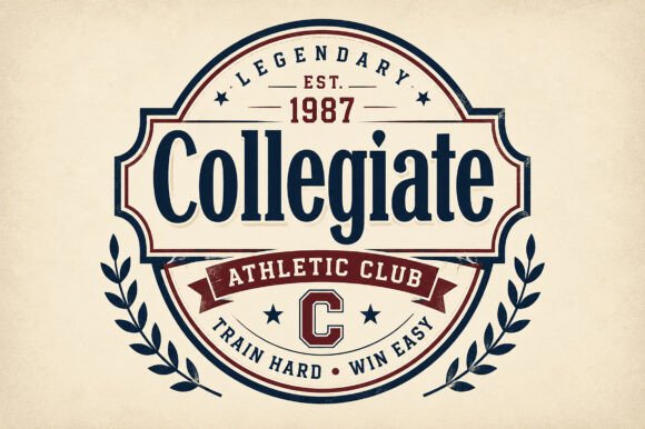
This Collegiate typeface leans directly into traditional American university and athletic branding. Its bold display construction and crisp retro character give it the authority associated with old-school team lettering.
The uppercase forms are particularly effective in compact words such as a team name, city, department or graduating class. The font carries plenty of visual weight on its own, which means it rarely needs a complicated treatment behind it. A restrained outline, curved baseline or simple badge composition is usually enough.
Visually, this typeface creates a more established and heritage-driven impression than a playful sports font. That makes it suitable for alumni apparel, athletic department graphics and university-style emblems.
The limitation is that its traditional character can feel generic if it is used without customization. For a distinctive identity, I would consider adjusting a few terminals, corners or letter connections rather than treating the font as a finished logo.
Best for: Heritage logos, alumni shirts, university-style emblems
Key features: Bold display shapes, retro character, traditional varsity mood
3. Varsity Narrow
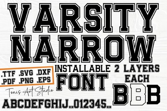
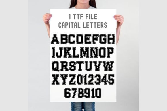
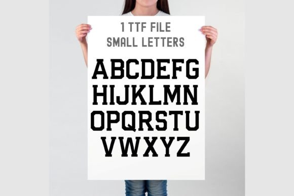
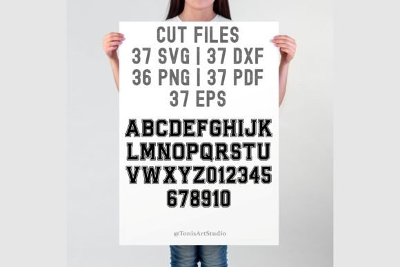
Varsity Narrow addresses one of the most common jersey-layout problems: fitting a longer name into a limited horizontal space.
Its condensed proportions allow you to preserve letter height without forcing the entire word to become too small. This is useful for player surnames, league titles, long school names and narrow banner layouts.
The sharper outlined forms give it a familiar collegiate personality, but the outline needs to be handled carefully. At small sizes, thin interior spaces may close up during embroidery, vinyl cutting or low-resolution printing.
I would keep this font reasonably large and test it at the actual production size rather than judging it only on screen. A typeface can look perfectly legible while zoomed in and become surprisingly fragile once transferred to fabric.
The condensed structure also suits stacked and vertical compositions, where a wider collegiate face might create too much bulk.
Best for: Player names, narrow banners, long school names
Key features: Condensed width, sharp outlines, space-efficient varsity letters
4. Vintage Varsity
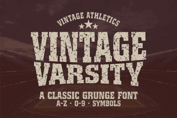
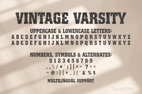
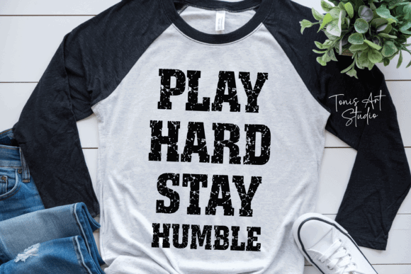
Vintage Varsity combines classic athletic letter construction with a visibly distressed surface. The texture gives the impression of an older screen-printed sweatshirt, faded gym shirt or frequently washed piece of team merchandise.
That worn character is the main reason to use it.
The font can make a new design feel less digitally perfect, particularly when paired with muted colors, old mascot illustrations, rough borders or established-date details. From a visual identity perspective, it suits brands that want to communicate heritage, nostalgia or a slightly rugged personality.
The texture also introduces a practical limitation. Distressed details become noisy when the font is used too small, and they can weaken readability in longer phrases.
I would reserve Vintage Varsity for the main headline or team name, then use a cleaner sans serif or slab serif for dates, locations and secondary information. That contrast gives the design hierarchy while allowing the vintage texture to remain intentional.
Best for: Retro T-shirts, distressed jerseys, vintage sports posters
Key features: Rugged texture, bold varsity structure, worn print character
5. Double Jersey
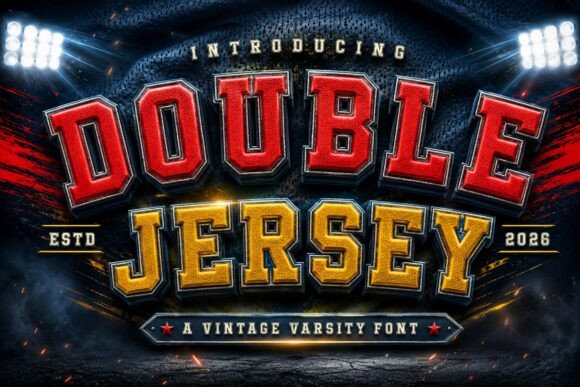
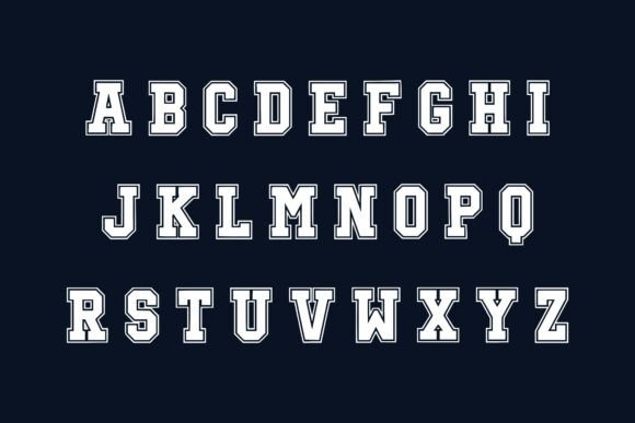
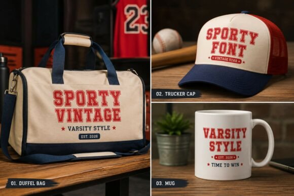
Double Jersey is built around bold geometric forms and a distinctive double-line treatment. The layered construction resembles the outlined lettering commonly seen on American sports uniforms and college apparel.
One practical advantage is color separation. The internal and external lines create opportunities for two- or three-color treatments without requiring you to build several offset paths manually.
This can be especially effective when the lettering sits over a team-color panel, photograph or busy background. The layered structure helps separate the word from its surroundings while reinforcing the athletic character.
Double Jersey makes the most sense at display sizes. On a jersey front, poster or oversized T-shirt graphic, the interior lines remain visible and contribute to the design. At thumbnail size, those details may merge and reduce clarity.
I would test simplified logo applications before using it as the main typeface across an entire brand system. It has strong personality, but that personality depends on having enough space.
Best for: Multicolor jerseys, bold apparel, sports event graphics
Key features: Double-line outlines, geometric forms, layered athletic appearance
6. Brooklin Varsity
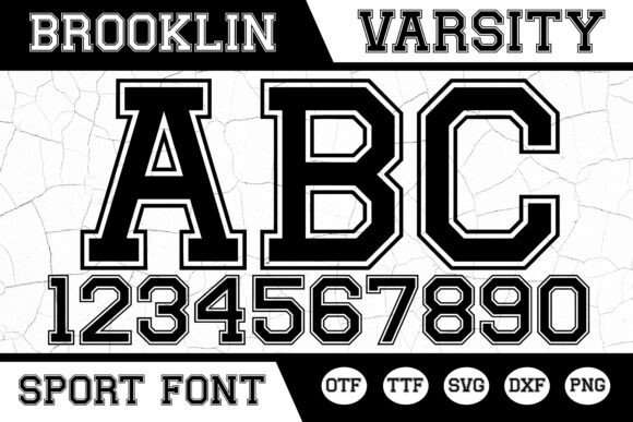
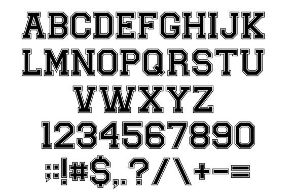
Brooklin Varsity uses sharp edges, strong outlines and large, commanding letterforms. Its proportions are close to familiar championship and university-team typography, but the cleaner execution gives it a more contemporary appearance.
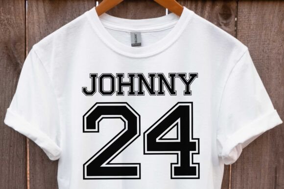
The font is particularly effective for short names. Words containing roughly four to eight letters can be set at a generous size without the composition feeling empty or underdeveloped.
Its visual weight also allows it to sit beside a detailed mascot without being overpowered. That balance is important. A lighter typeface can disappear when placed next to an illustrated animal, shield or sports emblem.
I would consider Brooklin Varsity for merchandise collections where the same typography needs to appear across shirts, banners, social graphics and uniform concepts. The outline gives it flexibility, while the internal shapes remain relatively easy to recognize.
As with most outlined fonts, check the spacing after adding additional strokes. Excessive layering can quickly close counters and make the lettering feel heavier than intended.
Best for: Championship graphics, team merchandise, uniform concepts
Key features: Sharp edges, strong outlines, commanding display proportions
7. Mascot College
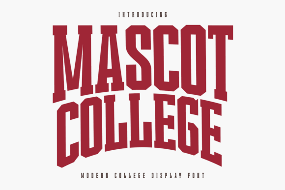
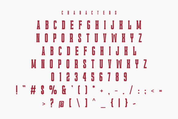
Mascot College is a blocky modern display font with athletic slab-serif details. Its dense construction is intended for high-impact applications such as team logos, sports jerseys, university graphics and print-on-demand apparel.
What stands out most is its ability to hold visual space.
A font used beside a roaring animal mascot, shield or illustrated piece of sports equipment needs enough mass to remain part of the composition. Mascot College has the visual weight to balance those elements rather than becoming secondary decoration.
That same density means spacing requires attention. Give the letters enough room to breathe, particularly when adding shadows, inline effects or extra outlines. Tight tracking can close counters and make the final print look darker than it appeared on screen.
I would use this font for concise team names and bold merchandise graphics rather than long supporting text. Its role is to establish the main visual hierarchy.
Best for: Mascot logos, fan merchandise, bold university graphics
Key features: Blocky anatomy, slab serifs, dense visual weight
8. Varsity Distressed
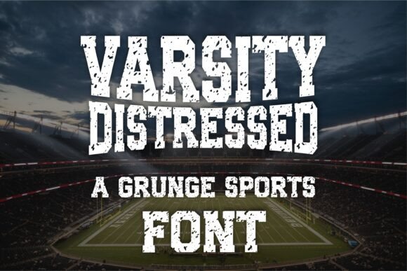
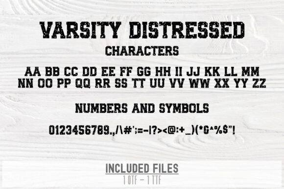
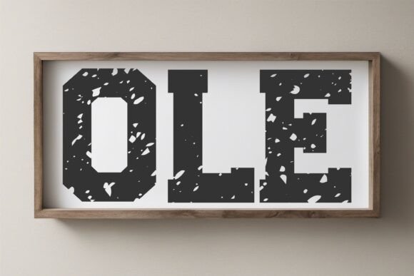
Varsity Distressed combines a heavy slab-serif sports structure with a rough grunge texture. The result feels closer to throwback football merchandise, worn gym apparel and rugged team graphics than polished institutional branding.
Compared with a lightly weathered font, the distressing plays a larger role in the final personality. It is not simply a surface detail. It changes how the lettering communicates.
This can be useful when a brand or collection needs to feel physical, imperfect and established. It pairs naturally with faded colors, vintage illustrations and heavier garment fabrics.
The trade-off is versatility. The rugged surface is less suitable for formal school identities, academic emblems or applications that need a clean and consistent appearance.
It may also require additional cleanup for small heat-transfer vinyl projects. For screen printing, direct-to-garment printing and sublimation, however, the irregular texture can create depth without adding a separate distress overlay.
Best for: Gym shirts, throwback merchandise, rugged team logos
Key features: Slab-serif structure, grunge texture, strong sports character
9. College Outline
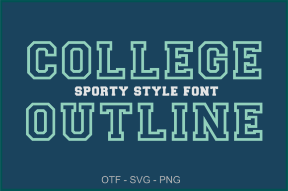
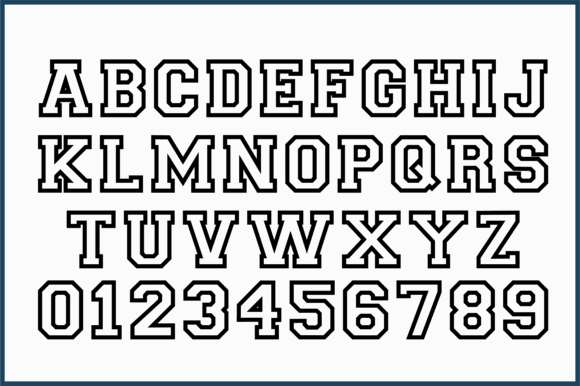
College Outline offers a lighter alternative to the typical solid varsity block. Its structured geometry, sharp corners and open construction suit sports teams, school-spirit graphics and layered apparel designs.
An outlined font can be useful when you want the garment color or background texture to become part of the lettering. It also reduces visual density, which helps when the typography needs to share space with a large mascot, banner or illustration.
The package includes OTF, SVG and PNG formats. For cutting-machine projects, the SVG files may provide more direct control than recreating the outline manually.
Contrast is important here. A thin outline placed over a patterned photograph can disappear quickly. A two-layer treatment, solid backing shape or sufficiently contrasting color usually produces a more stable result.
From a brand-system perspective, I would not rely on the outline alone for every application. A solid companion style or simplified version may be needed for small digital icons and embroidered details.
Best for: Spirit shirts, layered vinyl, lighter athletic logos
Key features: Outlined design, sharp geometry, OTF, SVG and PNG formats
10. Classic Varsity
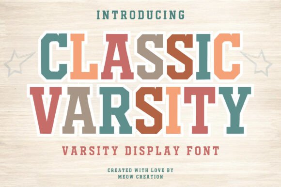
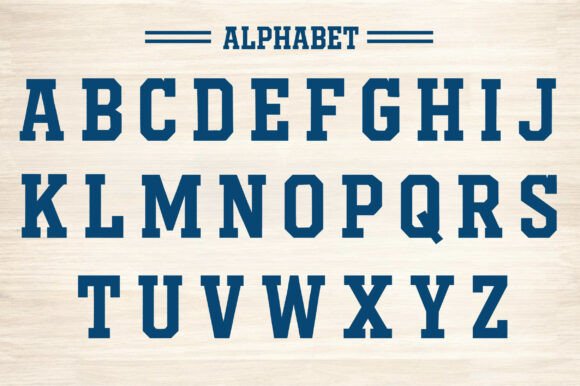
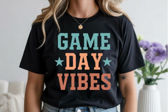
Classic Varsity stays close to the familiar visual language of college lettering and vintage sports uniforms. Strong slab serifs and clean outlines give it an immediate athletic identity.
This is the kind of font that communicates its reference without much explanation. Viewers quickly associate the letterforms with schools, teams, championships and varsity apparel.
That familiarity is both its strength and its limitation.
For school events, reunion shirts, community teams and straightforward merchandise, the conventional character makes the font easy to understand and use. For a major professional identity, however, it may need custom modifications to avoid looking interchangeable with other team graphics.
I would consider adjusting the proportions of a few letters, changing the outline relationship or integrating a distinctive monogram. A typeface can provide the foundation, but a memorable logo usually requires more than typing the name and adding an arch.
Best for: School events, team shirts, traditional sports logos
Key features: Clean outlines, slab serifs, familiar varsity construction
11. Boston College
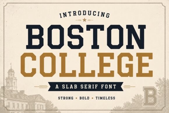
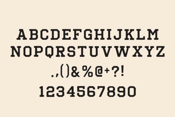
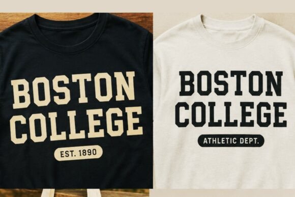
Boston College is a collegiate slab serif with strong geometric letterforms and a traditional campus-athletics feel. Its solid structure is suited to school branding, sports logos, jerseys, banners and retro-inspired apparel.
The letterforms feel slightly more formal than those found in heavily distressed or exaggerated varsity fonts. That makes Boston College useful for designs that need to bridge academics and athletics.
I can see it working in an emblem containing a school name, founding year and central monogram. The substantial strokes establish hierarchy, while the slab-serif construction gives the identity a sense of stability and tradition.
This more formal tone also makes the font easier to pair with restrained serif typography or a neutral sans serif. The combination can support a broader visual identity rather than limiting the design to sports merchandise alone.
As always, test the longest intended wording. Formal slab serifs can become dense when tracking is too tight.
Best for: Academic emblems, campus branding, readable team jerseys
Key features: Geometric slab serifs, formal structure, strong readability
12. Varsity Athletic
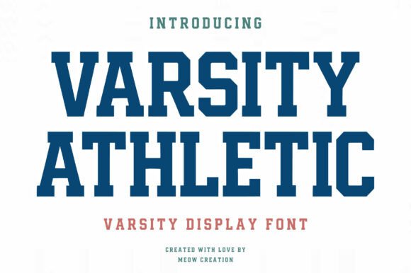
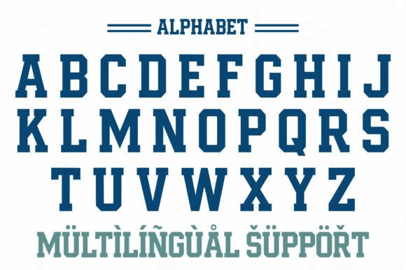

Varsity Athletic uses bold block shapes and a clean collegiate structure. Its character set includes uppercase letters, numbers, symbols and multilingual support, which makes it more flexible for complete uniform systems and international teams.
The inclusion of numerals is especially important for jersey design.
A font may look convincing in a team name but become far less useful when its numbers feel unrelated, lack clarity or are missing entirely. A coordinated letter-and-number system creates stronger visual consistency across player names, uniforms, score graphics and promotional materials.
Varsity Athletic is clean enough to customize with outlines, shadows and alternate color layers. It provides a stable foundation without forcing a specific vintage or distressed treatment.
From a design-system perspective, that flexibility is valuable. You can create several visual variations while keeping the underlying letterforms consistent.
Best for: Complete jersey systems, multilingual teams, athletic branding
Key features: Uppercase letters, numerals, symbols, multilingual character support
13. Scholar Block Outline
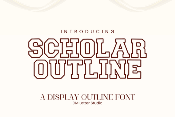
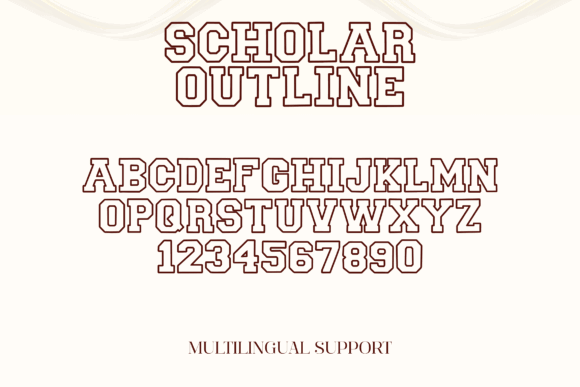

Scholar Block Outline combines traditional college lettering with a clean outlined treatment. It remains bold, but it is less visually dense than a fully filled varsity face.
This style is particularly suitable for layered school-spirit shirts. The open centers allow a second color, garment fabric or texture to show through while the surrounding strokes preserve the recognizable collegiate silhouette.
It can also function as secondary wording beneath a heavier team name. For example, a solid mascot name paired with an outlined city, division or school year creates contrast without introducing a completely unrelated typeface.
That kind of font pairing is often more successful than combining two equally expressive display fonts. The relationship feels intentional because both styles share a similar structural language.
For small production sizes, check that the inner and outer outlines remain clearly separated. Narrow gaps can disappear during printing or cutting.
Best for: Layered shirts, secondary wording, modern school graphics
Key features: Open letter centers, block outlines, clean collegiate styling
14. Tigers College
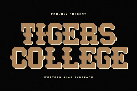
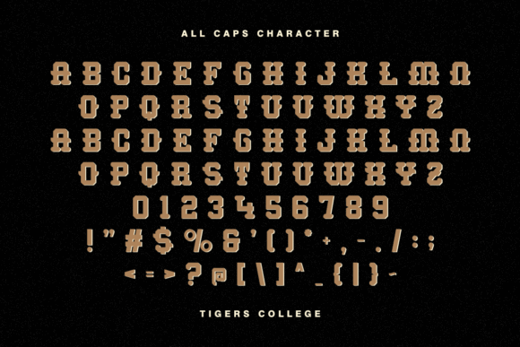

Tigers College combines collegiate and varsity references with a slab-serif display structure. Its letterforms also have a slightly more decorative, old-school quality, which gives the font more personality than a neutral jersey face.
This makes it suitable for mascot-led merchandise, especially when the team identity has a historic, rugged or regional character. The typography has enough presence to serve as the main visual rather than merely supporting an illustration.
From a branding perspective, expressive fonts like this are most effective when used selectively. They can establish a memorable tone, but they may become difficult to manage across a larger identity system.
I would test Tigers College carefully with long names. Its decorative details and wider visual rhythm are easier to appreciate in concise words, initials and badge-style compositions.
For secondary information, a restrained sans serif would provide useful contrast and improve readability.
Best for: Mascot apparel, old-school branding, bold poster headlines
Key features: Slab-serif forms, decorative character, retro collegiate mood
15. Varsity Spirit
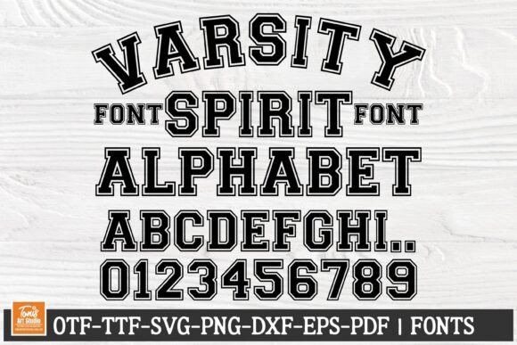
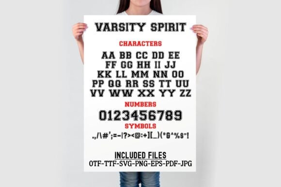
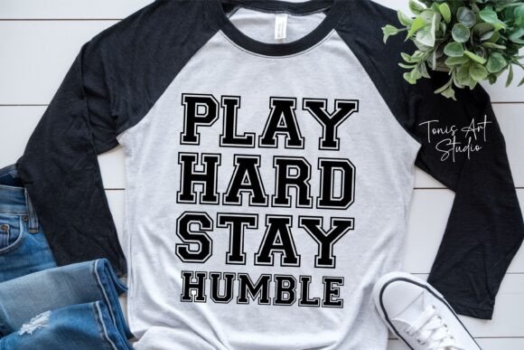
Varsity Spirit is a practical option for crafters because it combines bold collegiate lettering with a broad range of supplied file formats. The package includes OTF, TTF, SVG, PNG, EPS and PDF files.
That flexibility is useful when a project moves between different software and production workflows. The installable font files support standard typography work, while the SVG and EPS formats provide direct access to editable vector shapes.
For Cricut and Silhouette projects, prepared vector artwork can reduce the amount of conversion and cleanup needed before cutting.
The font still needs to be tested at the final size. Collegiate letterforms often contain narrow corners, small internal gaps and layered details that create awkward vinyl pieces when reduced.
I would make a test cut using the actual material before preparing a full batch. The quality of the result depends on the font, but also on blade condition, vinyl thickness and the complexity of the selected word.
Best for: Cricut projects, spirit wear, customizable team graphics
Key features: OTF, TTF, SVG, PNG, EPS and PDF files
16. JP Sport Jersey
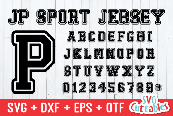
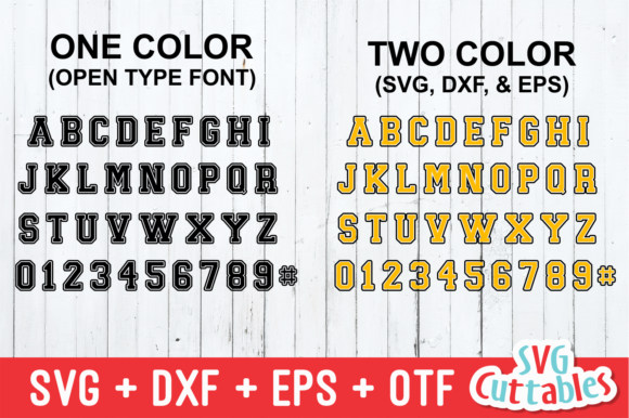
JP Sport Jersey is a bold slab-serif display font with a slightly friendlier personality than many rigid collegiate faces. It retains an athletic influence without feeling overly severe or institutional.
That softer interpretation can suit youth leagues, school clubs, casual spirit merchandise and sports-themed posters. Not every team identity needs to communicate aggression or authority.
The sturdy slab serifs still provide enough visual weight for T-shirt graphics and large headlines. The shapes feel approachable, which can be useful for community-oriented or younger audiences.
I would pair it with a simple condensed sans serif for dates, locations, rosters and supporting information. This keeps the main lettering in focus while establishing a clearer content hierarchy.
The font may be less convincing for formal university seals or heritage identities, but its accessibility is part of its appeal.
Best for: Youth teams, casual spirit shirts, sports posters
Key features: Bold slab serifs, approachable shapes, versatile display style
17. Collegiate by Sakti Avellin
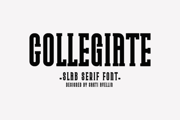
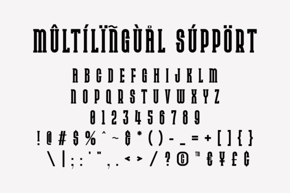
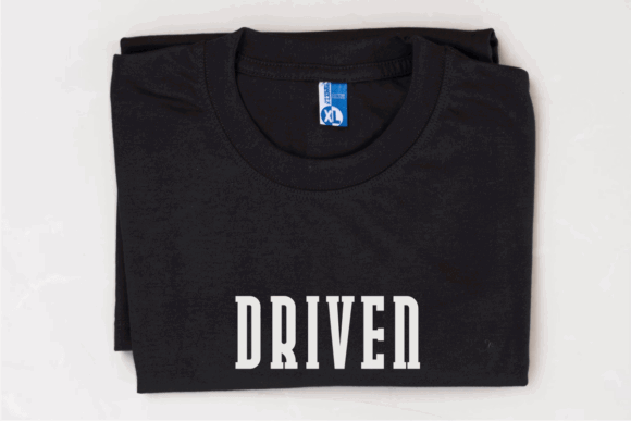
This Collegiate font uses bold block serifs and a mature university-inspired appearance. Its traditional styling suits team logos, jerseys, hoodies, tote bags and alma mater merchandise.
Compared with more aggressive athletic fonts, it carries a stronger academic tone. That distinction makes it appealing for alumni associations, campus clubs and merchandise where university heritage matters as much as competition.
The letterforms would sit naturally inside seals, crests and horizontal wordmarks. They also pair comfortably with a restrained serif or clean sans serif, allowing the typography to support a broader visual identity.
From a branding perspective, this is one of the more useful directions when the project needs to move between academic and athletic applications. It feels established without depending on heavy distressing or exaggerated effects.
For a custom identity, I would still refine the spacing and consider modifying a few letters in the main wordmark.
Best for: Alumni apparel, campus clubs, university-style seals
Key features: Bold block serifs, mature tone, traditional academic styling
Read More: If you're looking for even more specific styles that embody that athletic spirit, 15 Best Varsity Slab Serif Fonts for Winning Sports Designs offers fantastic options perfect for sports branding.
What Are Collegiate Fonts?
Collegiate fonts are bold display typefaces inspired by American university lettering, varsity jackets, athletic uniforms and traditional school merchandise. They commonly use block shapes, squared proportions, slab serifs, outlines and compact spacing.
Although collegiate fonts are closely associated with sports, they are also used for alumni apparel, campus clubs, school events, team logos, Cricut projects and vintage-inspired branding. The best collegiate fonts preserve their readability when printed, embroidered, cut from vinyl or reduced for digital use.
What Makes a Good Collegiate Font?
A useful collegiate font should remain recognizable from a distance. This is particularly important on uniforms, banners, stadium graphics and event signage, where narrow counters and decorative details can disappear quickly.
Traditional college lettering often relies on bold geometric construction and slab-like serifs. These features create the stable, institutional character associated with campus athletics, championship merchandise and varsity apparel. More contemporary versions may introduce outlines, shadows, distressing or sharper corners, but the underlying letterforms still need to feel structurally sound.
Spacing matters just as much as weight.
One thing I often notice in collegiate logo designs is that the letters are left at their default spacing even when the composition is arched or tightly stacked. Small kerning and tracking adjustments can make the difference between lettering that feels intentional and lettering that simply looks crowded.
Short team names can usually tolerate wider, heavier type. Longer school names and player surnames often benefit from condensed proportions. The goal is not to fit as many letters as possible, but to preserve height, legibility and visual rhythm without weakening the design.
You should also consider how the font will be reproduced. Thin outlines may look sharp on a large monitor but disappear in embroidery. Distressed details may print convincingly through direct-to-garment production while becoming frustrating to weed in heat-transfer vinyl.
A good collegiate font is not only bold. It is adaptable.
Final Thoughts
A classic collegiate font should feel confident, but confidence is not the same as maximum weight.
The most useful typeface is the one that keeps its personality after it has been adapted to the actual project. It should remain readable, reproduce reliably and support the wider visual identity rather than dominating every application.
For a clean modern logo, Modern College and Brooklin Varsity are strong starting points. Varsity Narrow is more practical for long jersey names, while Varsity Athletic offers the broader character set needed for a coordinated uniform system.
For vintage apparel, Vintage Varsity and Varsity Distressed introduce texture without requiring a separate grunge overlay. Their worn surfaces create character, although they are less suitable for small text and formal branding.
College Outline, Scholar Block Outline and Double Jersey make more sense when color separation and layered construction are part of the concept. Their open or multi-line letterforms can create a more customized result, but they require more space than a straightforward solid font.
The typeface is only one part of the decision. Kerning, tracking, scale, contrast and production method all influence whether the final lettering feels authentic or simply crowded.
Test the real team name. Test the numerals. Reduce the logo. Print or cut a sample.
Strong typography often feels effortless in the finished design, but that clarity usually comes from a series of careful, practical adjustments.
Some links in this article may be affiliate links. If you purchase through them, we may earn a small commission at no extra cost to you. Thanks for supporting our work.
FAQ
What font is commonly used for collegiate lettering?
Collegiate lettering is usually based on bold slab-serif or block-style display fonts. Typical features include squared curves, clipped corners, heavy strokes and outlined versions designed to resemble varsity jackets and sports uniforms.
What is the best collegiate font for jerseys?
A condensed, readable font such as Varsity Narrow is useful for long player names, while Varsity Athletic is better when you need coordinated uppercase letters and numerals. Decorative texture should generally be avoided on functional jersey numbers.
Can collegiate fonts be used for commercial T-shirts?
Many fonts sold through commercial design marketplaces include some form of commercial-use licensing, but the exact terms can differ by product, subscription and production method. Review the current license before selling physical products, digital files or print-on-demand merchandise.
Which collegiate fonts are easiest to use with Cricut?
Fonts with solid shapes and limited distressing are usually easiest to cut and weed. Varsity Spirit includes SVG alongside several other formats, while College Outline provides SVG files for outlined designs. Always test the lettering at the intended cut size.

Follow Us