

ℹ️ Affiliate Disclosure: This article may contain affiliate links. We may earn a commission at no extra cost to you. Thanks for your support! ❤️
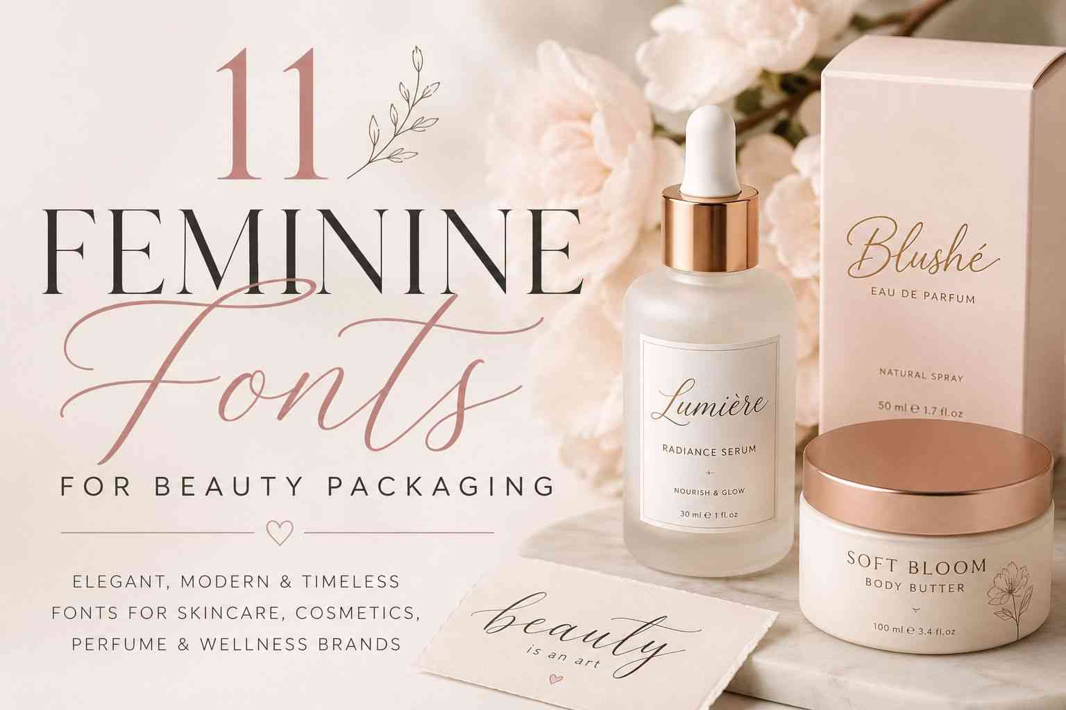
11 Feminine Fonts for Beauty Packaging That Make Brands Look Luxurious
Beauty packaging works a little differently from most product design.
People usually notice the label before they notice the formula. Before they test the serum texture, smell the candle, or swatch the lipstick, they’ve already formed a first impression from the packaging sitting on a shelf or showing up in an Instagram Reel.
And typography quietly does a lot of that work.
I’ve tested dozens of script fonts on mock skincare labels and candle mockups over the past year, and honestly, some fonts that look stunning in previews completely fall apart once they’re printed small. Others feel too formal, too trendy, or just hard to pair with modern packaging layouts.
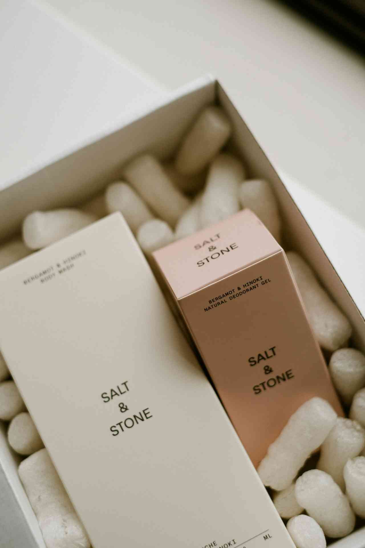
The fonts in this list are the ones that actually feel usable for beauty branding. Some lean minimalist and modern. Others are softer and more romantic. A few work especially well for luxury packaging with foil stamping and muted color palettes.
If you're building branding for skincare, perfume, candles, cosmetics, wellness products, or boutique packaging, these are worth looking at.
Many of these typefaces were originally designed specifically for branding and packaging projects. For example, Beauty Baey is described as “a flowing handwritten font with an elegant touch,” while Relaytemore focuses on understated modern elegance with smooth monoline strokes that work surprisingly well on real packaging layouts.
Let’s get into the fonts that actually make beauty packaging feel elevated instead of generic.
11 Best Feminine Fonts for Beauty Packaging
1. Beauty Baey
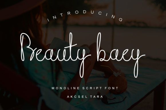
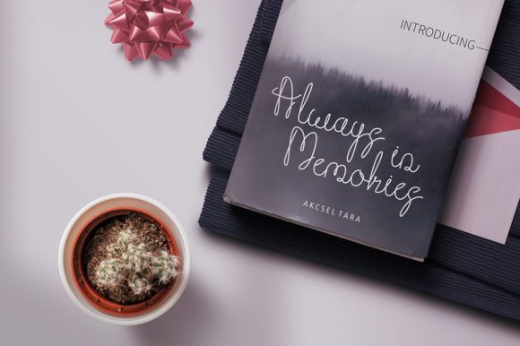
Beauty Baey has a very relaxed kind of elegance.
Instead of looking overly polished or dramatic, it feels natural and modern — almost like stylish everyday handwriting, but cleaner.
The official specimen describes it as “a flowing handwritten font with an elegant touch,” and that honestly sums it up pretty well.
What I like most about this font is how usable it feels.
A lot of feminine scripts look amazing in previews but become difficult once applied to actual packaging layouts.
Beauty Baey holds up surprisingly well on:
- skincare labels
- candle jars
- perfume packaging
- wellness branding
- minimalist cosmetic boxes
The monoline structure helps readability a lot.
I also think this font works especially well with muted packaging palettes:
- nude tones
- warm creams
- dusty pinks
- matte white packaging
- rose gold accents
It feels feminine without trying too hard.
For brands aiming toward minimalist luxury instead of dramatic glamour, Beauty Baey is probably one of the safer long-term choices on this list.
2. Callisa Beauty
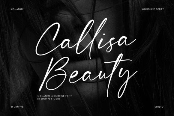
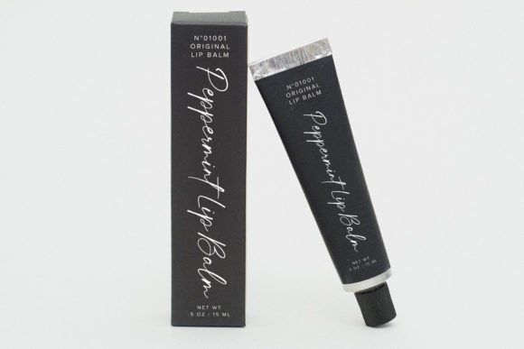
Callisa Beauty leans softer and more refined.
The lettering feels airy and intentional, almost like modern signature calligraphy rather than traditional decorative script.
This is the type of font I’d naturally associate with:
- premium facial serums
- boutique perfumes
- spa products
- feminine wellness branding
The spacing is handled really nicely too. That sounds minor, but poor spacing ruins a lot of script fonts once they’re placed on packaging.
Callisa Beauty has enough personality to feel premium without overwhelming the design around it.
It also pairs beautifully with minimalist uppercase sans-serifs. That contrast creates the kind of clean luxury branding that’s become really common across modern skincare brands lately.
One thing I appreciate is that it still feels readable at smaller sizes. Some elegant scripts lose clarity immediately on labels, but this one stays surprisingly balanced.
3. Hey Beauty
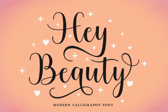
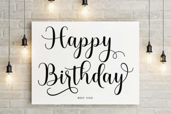
Hey Beauty has noticeably more personality than some of the cleaner minimalist scripts.
It feels expressive, glamorous, and slightly playful without becoming chaotic.
The flowing ligatures and loops give it more visual energy, which makes it a strong fit for:
- makeup branding
- beauty subscription boxes
- influencer product packaging
- colorful cosmetic collections
I could easily picture this font on trendy lip gloss packaging or beauty PR boxes designed for social media unboxings.
What keeps it usable is readability.
Even with the decorative movement, the lettering still feels fairly clean. That balance matters because highly stylized scripts often become difficult to work with across packaging systems.
Hey Beauty feels younger and more social-first than some of the other fonts here. If the brand identity leans modern, expressive, and visually playful, this one makes sense.
4. Winter Beauty
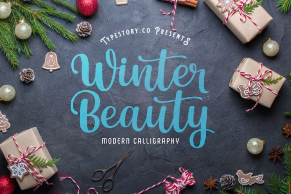
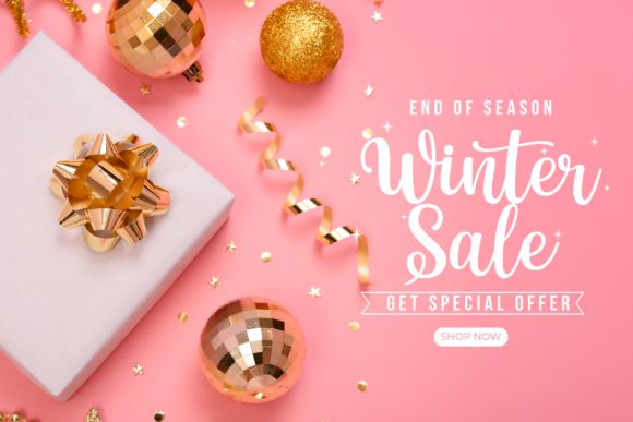
Winter Beauty feels softer and more cheerful than traditional luxury scripts.
Instead of polished editorial elegance, it leans into warmth and personality. The rounded characters give it a more approachable feel, which works really well for self-care and handmade beauty branding.
I especially like this font for:
- bath products
- handmade skincare
- seasonal packaging
- boutique candle labels
- cozy wellness branding
There’s a slightly whimsical quality to it that makes products feel more personal and less corporate.
And honestly, that handmade energy matters more than ever right now. A lot of beauty consumers are moving toward brands that feel small-batch, artisanal, or emotionally comforting instead of hyper-polished.
Winter Beauty fits naturally into that space.
I could also see it working beautifully with:
- kraft packaging
- cream labels
- earthy textures
- muted pink palettes
- holiday collections
The rounded flow gives the typography a softer emotional tone without sacrificing readability.
5. Beauty
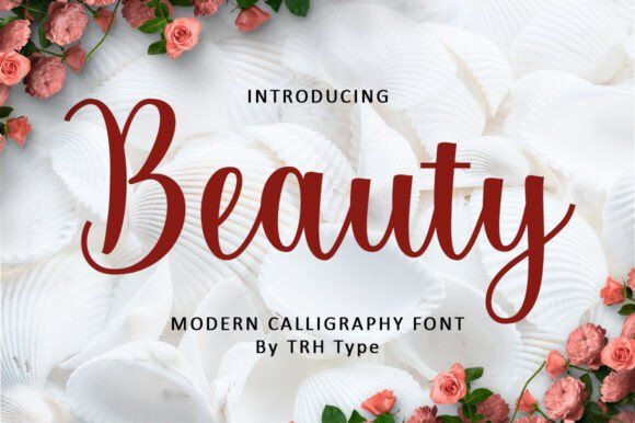
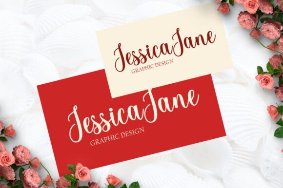
Beauty is much more understated than its name suggests.
Instead of dramatic flourishes, it relies on natural handwritten flow and clean modern rhythm. The result feels polished without becoming too formal.
This font works particularly well in minimalist packaging systems where typography needs to support the product instead of overpowering it.
I tested similar monoline-style scripts on matte skincare bottle mockups recently, and the cleaner handwritten fonts almost always looked more premium than heavier brush calligraphy. Especially once the labels were scaled down.
Beauty fits perfectly into that quieter aesthetic.
It would work really well for:
- luxury soaps
- modern skincare
- feminine perfume branding
- wellness products
- neutral-toned packaging
The included ligatures and alternate characters also help make branding feel more customized. Small typography details like that make a bigger difference than people realize, especially in logo design.
Another thing I like here is versatility.
Some script fonts only work in one very specific aesthetic.
Beauty adapts surprisingly well across:
- social graphics
- packaging
- logos
- website headers
- influencer campaigns
That flexibility makes branding systems easier to maintain long term.
6. Gloria Beauty
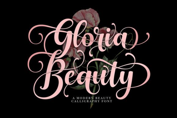
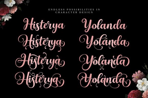
Gloria Beauty is probably the most glamorous font on this list.
This one definitely leans luxury-first.
The sweeping swashes and decorative curves instantly create drama, and honestly, it feels made for perfume branding or high-end cosmetic packaging.
Unlike minimalist monoline scripts, Gloria Beauty wants attention.
It works especially well for:
- luxury perfume boxes
- bridal beauty branding
- boutique cosmetics
- foil-stamped packaging
- feminine editorial campaigns
I’d personally avoid using it for minimalist skincare brands because the typography already carries a strong visual presence on its own.
But for glamorous beauty aesthetics? It works beautifully.
This is also one of those fonts that looks significantly better with premium print finishes:
- gold foil
- embossing
- soft-touch matte packaging
- black luxury boxes
- metallic accents
Decorative fonts like this can feel excessive in digital-only branding, but once printed properly, they suddenly make sense.
That’s something people don’t always realize until they see the packaging physically produced.
7. Simple Beauty
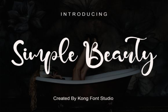

Simple Beauty sits somewhere between playful and professional.
The handwritten structure feels casual and modern, but there’s still enough control in the lettering to keep it usable across real packaging layouts.
This font feels especially suited for:
- self-care brands
- skincare startups
- candle packaging
- lifestyle beauty products
- social-first cosmetic brands
The personality feels younger and friendlier compared to more formal calligraphy styles.
I could easily imagine this on a trendy Instagram skincare brand using pastel packaging and clean flat-lay photography.
One thing I appreciate is the readability.
A lot of playful script fonts become messy quickly once you start layering them into packaging systems, but Simple Beauty stays fairly balanced.
It also pairs naturally with minimalist sans-serif typography, which helps create clean packaging hierarchy without making everything feel too serious.
For newer indie beauty brands working with smaller budgets, this kind of approachable modern script often works better than highly ornate luxury fonts anyway.
8. Beauty Nayshilla Duo
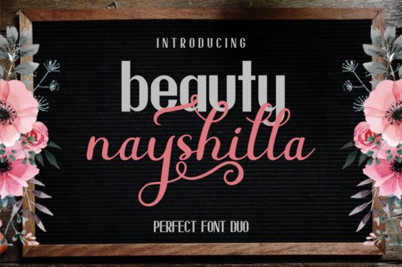
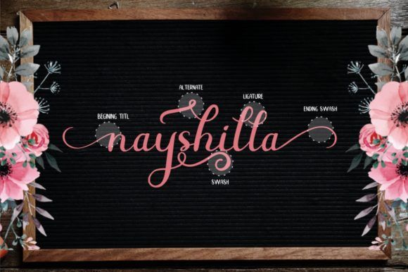
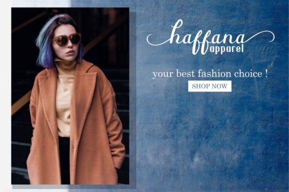
Beauty Nayshilla Duo solves a problem a lot of designers run into:
finding fonts that actually pair well together.
Instead of hunting for separate headline and support fonts, this duo already gives you a coordinated typography system.
That’s genuinely useful in beauty packaging because most labels need:
- decorative branding
- readable supporting text
- hierarchy between product names and information
The script side brings softness and elegance, while the companion font keeps everything structured and practical.
I especially like this approach for:
- skincare collections
- subscription beauty boxes
- feminine wellness brands
- boutique cosmetic lines
Typography consistency becomes much easier when both fonts were designed to work together from the start.
And honestly, font pairing is where a lot of DIY beauty branding starts falling apart. People often combine two decorative fonts that compete with each other visually.
A pre-built duo helps avoid that problem completely.
Depending on the layout and color palette, Beauty Nayshilla Duo can feel:
- romantic
- minimalist
- modern luxury
- feminine editorial
That flexibility makes it easier to adapt across multiple product lines.
9. Beauty Diary
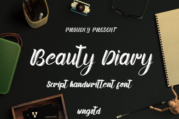
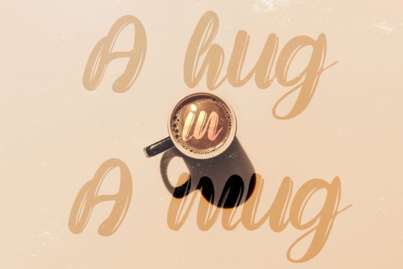
Beauty Diary feels the most relaxed and personal out of all the fonts here.
Instead of aiming for polished luxury, it leans toward warmth, creativity, and handwritten authenticity.
This font immediately makes me think of:
- handmade skincare
- self-care brands
- cozy candle labels
- wellness packaging
- lifestyle-focused beauty products
There’s a slightly imperfect handwritten rhythm that actually works in its favor. It feels human.
And that matters because a lot of beauty branding today feels overly polished to the point of becoming generic. Fonts like Beauty Diary help brands feel more approachable and emotionally grounded.
I also think this font performs really well across social content.
The casual handwritten energy fits naturally into:
- Pinterest graphics
- TikTok packaging videos
- Instagram quotes
- creator-style branding
It feels less like a luxury fashion campaign and more like a real person built the brand thoughtfully.
That distinction matters more now than it did a few years ago.
Beauty Diary also pairs especially well with:
- kraft textures
- earthy tones
- warm neutrals
- natural product photography
- organic branding aesthetics
If the goal is emotional warmth instead of polished glamour, this font does that really well.
10. Relaytemore
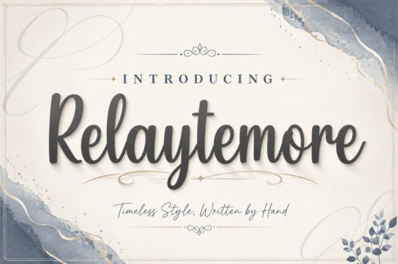
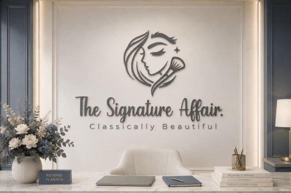
Relaytemore is probably the strongest all-around packaging font on this list.
It captures the modern “quiet luxury” beauty aesthetic extremely well without becoming cold or sterile.
The monoline construction keeps everything clean and readable, while the rounded handwritten structure still adds softness.
That balance is difficult to get right.
A lot of minimalist beauty fonts become too clinical. Relaytemore stays elegant without losing warmth.
I’d especially recommend it for:
- premium skincare
- wellness brands
- modern candle packaging
- boutique cosmetics
- minimalist beauty startups
This font also performs really well in practical packaging applications.
That sounds obvious, but many elegant scripts struggle with:
- foil stamping
- small labels
- embossing
- digital scaling
Relaytemore holds together surprisingly well across all of those.
I also think it has the best long-term branding potential out of the fonts here because the aesthetic feels timeless instead of trend-driven.
Five years from now, it’ll probably still feel current.
That’s valuable for packaging design.
11. Anchyka
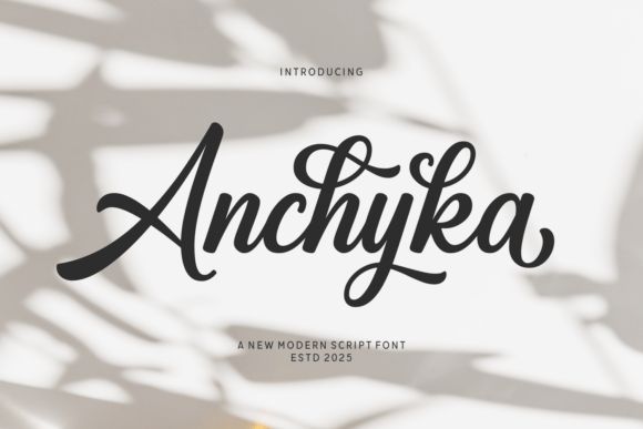
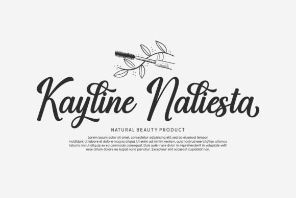
Anchyka feels polished in a very balanced way.
It has decorative softness and luxurious movement, but the swashes stay controlled enough that the typography never becomes overwhelming.
This is the kind of font that works beautifully for:
- spa branding
- feminine perfume packaging
- bridal beauty collections
- upscale skincare
- boutique wellness products
The smooth handwritten flow gives it elegance without looking overly formal.
I also like how adaptable it feels.
Some luxury scripts only work in highly decorative branding systems, but Anchyka transitions nicely across:
- packaging
- websites
- social graphics
- logo design
- influencer collaborations
That flexibility makes brand consistency easier.
Visually, it pairs especially well with:
- gold foil
- soft-touch packaging
- neutral palettes
- cream matte labels
- minimalist photography
The emotional tone is probably its strongest feature though.
Anchyka feels luxurious, but still approachable.
That combination is hard to fake in typography.
While feminine fonts are perfect for beauty packaging, exploring other elegant styles like Modern Serif Fonts for Branding: Best Elegant Fonts for Creators can also significantly enhance your designs.
Conclusion
Typography shapes beauty branding far more than most people realize.
Before customers experience the formula, scent, or texture of a product, they experience the packaging first. And the font becomes part of that emotional first impression immediately.
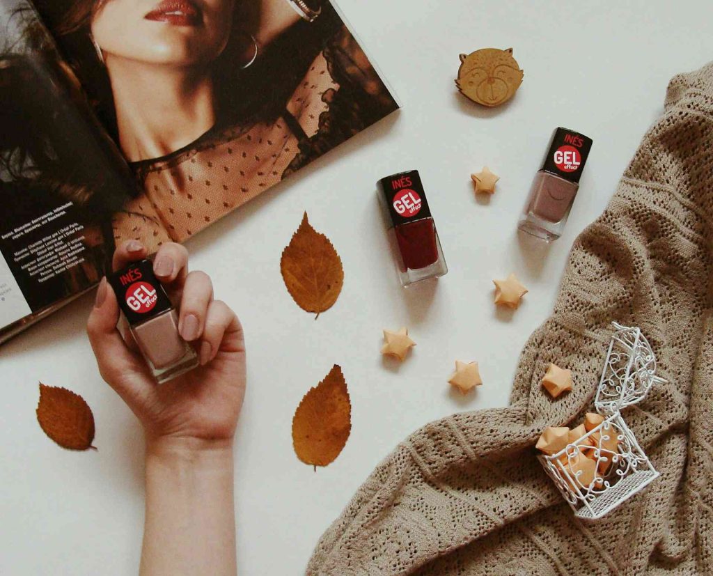
The strongest feminine fonts don’t just decorate packaging.
They create mood.
Some feel luxurious and editorial.
Some feel soft and handmade.
Others feel modern, minimal, and quietly premium.
The right choice depends on the story the brand wants to tell.
Personally, I think the fonts that work best long term are usually the ones balancing elegance with restraint. Clean scripts like Relaytemore or Beauty Baey tend to stay visually relevant longer because they don’t rely too heavily on trend-driven flourishes.
But there’s still room for expressive typography too. Fonts like Gloria Beauty or Hey Beauty can create incredible visual identity when paired with the right packaging style.
At the end of the day, good beauty typography should feel intentional.
Not forced.
Not overdesigned.
Just emotionally aligned with the product sitting in someone’s hands.
FAQs
What type of font works best for beauty packaging?
Elegant script fonts, handwritten typography, soft serif fonts, and modern monoline scripts usually work best because they create warmth, softness, and luxury without feeling too corporate.
Are script fonts good for skincare labels?
Yes, but readability matters a lot. Some decorative scripts become difficult to read on small serum bottles or cosmetic jars, so cleaner handwritten styles often work better in real packaging situations.
Which feminine font works best for luxury beauty branding?
Relaytemore, Gloria Beauty, and Anchyka are especially strong for luxury beauty packaging because they balance sophistication with readability and visual elegance.
How should I pair feminine fonts?
Usually one decorative script font paired with one clean sans-serif font works best. The script adds personality while the supporting font keeps the packaging readable and structured.
Can handwritten fonts still feel modern?
Definitely. Modern handwritten fonts often feel more personal and emotionally engaging than overly polished corporate typography, especially in skincare, wellness, and indie beauty branding.
Follow Us