

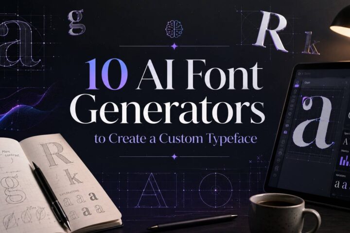
AI Logo Design Mistakes Beginners Make
Over the last couple of years, I've watched AI completely change the way people approach logo design.
What used to require hiring a designer, scheduling meetings, exchanging revisions, and spending a significant budget can now be done in a matter of minutes. Open an AI logo generator, type a few prompts, choose a style, and suddenly dozens of logo concepts appear on the screen.
Some links in this article may be affiliate links. If you purchase through them, we may earn a small commission at no extra cost to you. Thanks for supporting our work.
It's easy to understand why so many entrepreneurs, creators, Etsy sellers, freelancers, and small business owners are excited about these tools.
The speed is impressive.
The convenience is real.
And in many cases, the results are surprisingly good.
But after spending a lot of time exploring typography, branding assets, logo design resources, and AI-powered creative tools, I've noticed something interesting.

Most logo problems don't come from the AI itself.
They come from the decisions people make while using it.
The software can generate hundreds of ideas. What it can't do is understand your business the way you do. It doesn't know your customers, your goals, your positioning, or the story you're trying to tell.
That's where many beginners get into trouble.
They assume AI is making branding decisions when it's really just generating visual possibilities.
Some of the logos look professional at first glance. But once you start looking closer, you notice the same recurring mistakes.
I've seen logos that look beautiful but completely miss the target audience.
I've seen businesses choose trendy designs that already feel dated six months later.
Beyond just avoiding costly AI logo design mistakes, selecting the perfect typography is paramount for conveying your brand's essence, particularly when considering 15 Fonts for Luxury Beauty Brand Logos That Instantly Elevate Your Brand.
I've seen founders fall in love with the very first logo they generate without exploring better options.
And I've seen AI-generated logos that could have become strong brand identities with just a little more refinement.
If you're using AI to create a logo, these are the mistakes I'd pay attention to before committing to a final design.
Table of Contents
Mistake 1: Starting With AI Instead of Starting With Strategy

This is probably the most common mistake I see.
People open the AI tool first.
They should open a notebook first.
Before generating a single logo concept, I think it's worth spending time defining the brand itself.
Not the logo.
The brand.
A logo should communicate something meaningful.
If the business identity is unclear, the logo will usually reflect that confusion.
Whenever I evaluate branding projects, I like to think about four basic questions:
- Who is the audience?
- What problem does the business solve?
- What makes it different?
- What feeling should people associate with it?
The answers often influence the final logo far more than any design trend.
For example, a luxury skincare brand and a budget skincare brand may sell similar products, but their visual language should be completely different.
One needs exclusivity.
The other needs accessibility.
Without strategy, AI can't make that distinction effectively.
It can only guess.
And guessing is rarely the foundation of great branding.
Why a Logo Is More Than Just Something That Looks Nice
One thing that becomes obvious when studying successful brands is that memorable logos aren't memorable because they're decorative.
They're memorable because they're meaningful.
Every design element communicates something.
Typography communicates personality.
Color communicates emotion.
Shapes communicate character.
Spacing communicates professionalism.
Even subtle details influence perception.
A clean serif wordmark might suggest heritage and sophistication.
A bold geometric sans serif might feel modern and innovative.
Neither approach is inherently better.
The effectiveness depends entirely on the brand behind it.
That's why I always encourage people to think beyond aesthetics.
A logo isn't wall art.
It's a communication tool.
The best logos happen when visual decisions support business goals rather than simply following personal taste.
Mistake 2: Choosing the First Logo AI Generates

This one is understandable.
You type a prompt.
A polished logo appears.
It looks surprisingly good.
You feel excited.
And suddenly the temptation is to download it immediately and move on.
I've done enough creative work to know how dangerous that excitement can be.
First ideas are often good.
They are rarely the best.
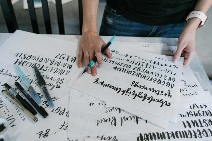
Professional designers explore dozens of concepts before reaching a final direction.
AI doesn't eliminate that process.
It simply makes exploration faster.
When someone chooses the first generated logo, they're usually comparing it against nothing.
That's a difficult way to evaluate quality.
What if logo number eight is stronger?
What if logo number twelve communicates the brand more clearly?
What if a different typography direction creates a more distinctive identity?
You'll never know if you stop after the first result.
One pattern I've noticed with AI-generated logos is that the first outputs often lean toward familiar design formulas.
They're attractive because they're safe.
Unfortunately, safe often means forgettable.
A logo that resembles hundreds of others may look professional while still struggling to create brand recognition.
The strongest results usually emerge after multiple rounds of refinement.
Generate variations.
Change the typography.
Test different symbols.
Experiment with different visual directions.
You don't need to use every version.
But seeing alternatives almost always leads to better decisions.
Many beginners struggle not because AI logo tools are ineffective, but because they don't fully use the customization options available. For example, platforms like Creative Fabrica's AI Logo Generator allow users to describe their business, niche, tagline, and even preferred brand colors before generating concepts. This approach helps create more relevant logo variations and reduces the risk of ending up with generic designs. According to Creative Fabrica, users can quickly brainstorm multiple logo concepts, customize colors, shapes, and icons, and continue refining designs directly inside the platform.
Why Iteration Usually Produces Better Branding
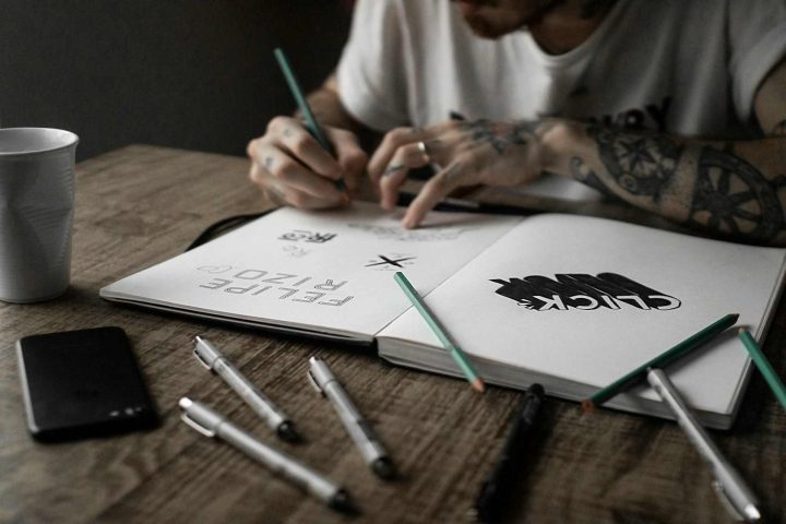
Creativity rarely appears fully formed.
Most strong logos evolve.
Sometimes the best concept starts as the worst one.
Sometimes a tiny adjustment completely changes how a design feels.
That's why iteration matters.
When I compare multiple logo concepts side by side, weaknesses become much easier to spot.
A font that initially looked elegant may suddenly feel generic.
An icon that seemed clever may start to look overly complicated.
A color palette that appeared modern may reveal itself as trendy and short-lived.
The comparison process creates perspective.
And perspective is exactly what many beginners lose when they become attached to the first AI-generated result.
Mistake 3: Designing for Yourself Instead of Your Audience

This mistake is surprisingly common because it feels completely reasonable.
After all, it's your business.
It's your logo.
Of course you should like it.
The problem is that your opinion isn't the one that determines whether the logo succeeds.
Your customers do.
I've seen business owners reject effective branding because they personally disliked a color.
I've also seen founders choose logos they loved even though the design clearly communicated the wrong message to their market.
Good branding isn't self-expression.
It's communication.
And communication only works when the audience receives the message you're trying to send.
A logo for a luxury law firm should not communicate the same things as a logo for a gaming channel.
A children's toy company shouldn't look like a cybersecurity startup.
A wellness brand shouldn't feel like an industrial manufacturer.
These examples sound obvious, but AI tools make it surprisingly easy to forget.
Because the designs arrive instantly, users often evaluate them emotionally instead of strategically.
They ask:
“Do I like this?”
Instead of:
“Will my customers respond positively to this?”
Those are very different questions.
Ensuring your logo communicates the right message to your target audience is especially vital for niches like luxury businesses, where the choice of typeface can be paramount to conveying a premium feel, as highlighted in these 12 Font for Logo Luxury Jewelry Businesses That Look Premium.
Customer Perception Is More Important Than Personal Preference
One of the most useful branding exercises is imagining the logo through someone else's eyes.
Not yours.
Your customer's.
What would a first-time visitor think?
Would they see professionalism?
Trust?
Luxury?
Creativity?
Reliability?
Innovation?
The answer depends heavily on visual choices.
Typography alone can completely change perception.
A refined serif typeface often feels established and premium.
A geometric sans serif can feel modern and efficient.
A handwritten script can feel personal and approachable.
None of these are inherently right or wrong.
The key is matching the visual language to the audience you're trying to attract.
This is where human judgment still matters far more than automation.
AI can generate options.
Understanding how customers interpret those options remains a human skill.
Mistake 4: Using Generic Prompts

One of the fastest ways to get generic logos is to give AI generic instructions.
I constantly see prompts like:
“Modern business logo.”
“Professional company logo.”
“Minimalist logo.”
“Luxury brand logo.”
The problem isn't that these prompts are wrong.
The problem is that they're incomplete.
Imagine hiring a designer and telling them only:
“Make something professional.”
You wouldn't expect remarkable results.
AI works the same way.
The quality of the output is directly connected to the quality of the information you provide.
Vague instructions usually produce vague branding.
And vague branding rarely stands out.
Better Inputs Create Better Outputs
Whenever I experiment with AI logo generators, I get significantly stronger results when I provide context.
Instead of writing:
“Modern technology logo”
I might write something like:
“Minimalist logo for a cybersecurity company serving enterprise clients. Trustworthy, professional, modern, geometric typography, dark blue color palette, clean symbol, scalable design.”
Suddenly the AI has direction.
It understands the audience.
It understands the tone.
It understands the desired perception.
The difference in quality is often dramatic.
Think of prompts as creative briefs.
The more useful information you provide, the more relevant the results become.
Helpful details include:
- Industry
- Target audience
- Brand personality
- Desired emotions
- Preferred typography style
- Color direction
- Symbol ideas
- Brand positioning
The goal isn't to overwhelm the AI with information.
The goal is to reduce ambiguity.
Clear direction almost always produces stronger branding.
Mistake 5: Making the Logo Too Complicated

This is where AI can sometimes become a trap.
Because AI is capable of generating incredibly detailed artwork, many beginners assume more detail equals a better logo.
In practice, the opposite is often true.
The logos that stay in people's minds tend to be remarkably simple.
Not boring.
Simple.
There's a difference.
A lot of famous brands rely on little more than strong typography, a memorable shape, or a recognizable symbol.
When I review beginner logo concepts, I often notice the same issues:
- Too many decorative effects
- Excessive gradients
- Multiple competing icons
- Overly detailed illustrations
- Complex typography treatments
- Visual clutter
Each element might look interesting individually.
Together, they often weaken the logo.
A logo doesn't need to tell the entire story of a business.
It simply needs to create recognition.
Simplicity Usually Ages Better
One thing I've noticed after studying logos from different decades is that simple designs tend to survive longer.
Design trends come and go.
Complex visual effects eventually look dated.
But clean typography and strong shapes often remain effective for years.
A useful test I like is shrinking the logo dramatically.
Make it tiny.
About the size of a social media profile image.
Then ask yourself:
Can I still recognize it immediately?
If the answer is yes, that's usually a good sign.
If important details disappear, the design may be too complicated.
This becomes especially important now that so much branding lives on mobile devices.
Tiny icons matter.
And simplicity usually wins.
Mistake 6: Trying to Look Like Famous Brands

I've seen prompts like:
“Make it look like Apple.”
“Similar to Nike.”
“Inspired by Tesla.”
“Luxury like Chanel.”
It's easy to understand the thinking behind this approach.
People admire successful brands.
They want some of that same visual credibility.
The problem is that copying rarely creates credibility.
It usually creates comparison.
And comparison is difficult to win against companies worth billions of dollars.
The purpose of branding isn't to resemble someone else's success.
The purpose is to create your own identity.
A logo that reminds people of another company immediately loses some of its uniqueness.
Instead of thinking about your business, customers start thinking about the brand you're imitating.
That's not the outcome you want.
Originality Creates Stronger Recognition
When people remember a brand, they're usually remembering something distinctive.
A unique symbol.
A recognizable wordmark.
An unusual visual approach.
Originality doesn't require being radically different.
It simply requires having your own voice.
AI should help uncover that voice.
Not replace it with someone else's.
One practical habit I recommend is comparing your final logo against competitors before launching it.
Look at the visual landscape in your industry.
Does your logo blend into the crowd?
Or does it have its own identity?
Even small distinctions can make a significant difference over time.
Strong branding isn't about fitting in.
It's about being recognizable.
Mistake 7: Forgetting Where the Logo Will Actually Be Used

Many AI-generated logos look fantastic inside the generator.
The problem comes later.
A logo doesn't live inside the design tool.
It lives everywhere else.
Websites.
Packaging.
Business cards.
Social media.
Mobile apps.
Product labels.
Email signatures.
Advertising.
Merchandise.
This is where practical testing becomes incredibly important.
A logo that works beautifully at full size may completely fall apart when reduced.
Tiny typography becomes unreadable.
Thin lines disappear.
Complex details turn into visual noise.
I've seen this happen countless times.
The logo looked impressive during creation.
But the moment it appeared as a profile picture, its effectiveness disappeared.
That's why scalability matters so much.
A logo should remain recognizable whether it's printed on a billboard or displayed inside a small circle on Instagram.
Always Test Real-World Scenarios
Before committing to a logo, I like to test it in realistic situations.
Not just on a white canvas.
I place it in:
- Website headers
- Mobile mockups
- Social profile images
- Business cards
- Packaging concepts
- Black-and-white versions
These tests reveal weaknesses quickly.
Sometimes a logo needs minor adjustments.
Sometimes the entire concept needs refinement.
Either way, it's far better to discover these issues before launching than after investing in branding materials.
The strongest logos are flexible.
They work almost everywhere.
That's not accidental.
It's the result of deliberate testing.
Mistake 8: Chasing Design Trends Instead of Building Something Timeless

Design trends aren't inherently bad.
In fact, I enjoy following typography trends, branding trends, and visual design movements. They can be a great source of inspiration and often reflect broader cultural shifts happening in design.
The problem starts when a logo becomes entirely dependent on a trend.
I've seen this happen repeatedly.
A visual style becomes popular.
Suddenly every AI generator starts producing similar results.
Thousands of businesses begin using nearly identical aesthetics.
For a short period, the logos feel fresh.
A year or two later, they start looking dated.
That's a problem because a logo isn't temporary content.
It's not an Instagram post.
It's not a Pinterest graphic.
It's one of the longest-lasting visual assets a brand owns.
Ideally, your logo should still feel appropriate years from now.
That's why I always encourage people to separate what's trendy from what's timeless.
A Timeless Logo Doesn't Mean an Old-Fashioned Logo
One misconception I hear frequently is that timeless branding means boring branding.
I don't think that's true at all.
Some of the most recognizable logos in the world still feel contemporary despite being decades old.
The reason isn't luck.
It's because they were built on strong fundamentals.
Things like:
- Clear typography
- Strong visual hierarchy
- Memorable shapes
- Effective contrast
- Consistent proportions
- Simplicity
These principles don't expire.
Visual trends do.
When evaluating an AI-generated logo, I often ask myself a simple question:
“Would this still feel relevant five years from now?”
No one can predict the future perfectly, but the question helps reveal whether the design relies too heavily on current trends.
The best logos evolve gracefully.
They don't need constant reinvention.
Mistake 9: Treating Color Like Decoration

Color is one of the most underestimated parts of logo design.
Many beginners choose colors because they personally like them.
Others simply accept whatever palette the AI suggests.
Neither approach is necessarily wrong, but neither is particularly strategic either.
Colors communicate.
They influence perception before someone reads a single word.
When I analyze successful brands, I often notice how intentionally their colors support their positioning.
Luxury brands frequently lean toward black, white, neutral tones, or restrained metallic accents.
Technology companies often use blue because it reinforces feelings of trust and reliability.
Health and wellness brands frequently incorporate greens associated with growth and balance.
Children's brands often embrace brighter and more energetic palettes.
These aren't strict rules.
But they are patterns worth understanding.
Color Psychology Matters More Than Most People Realize
Customers may not consciously think:
“This company uses blue, therefore I trust them.”
But visual associations still influence perception.
Color operates quickly.
Sometimes subconsciously.
And when those signals align with your brand message, they strengthen recognition.
Some common associations include:
| Color | Typical Associations |
|---|---|
| Blue | Trust, stability, professionalism |
| Green | Growth, health, sustainability |
| Red | Energy, passion, urgency |
| Yellow | Optimism, warmth, creativity |
| Black | Luxury, sophistication, authority |
| Purple | Creativity, premium positioning |
| Orange | Enthusiasm, confidence, friendliness |
Of course, context matters.
I've seen brands successfully break these conventions.
But they usually do so intentionally.
Not accidentally.
That's the important distinction.
AI can generate attractive palettes.
Choosing the right one still requires understanding what message you want customers to receive.
Mistake 10: Assuming AI Has Finished the Job

If I had to pick one mistake that causes the most branding problems, it would probably be this one.
People assume the AI-generated logo is finished.
In reality, it's usually the beginning.
Not the end.
This isn't a criticism of AI.
It's simply recognizing what the technology does best.
AI excels at idea generation.
It excels at exploration.
It excels at creating options.
But branding involves much more than creating options.
Branding involves judgment.
And judgment is still very human.
The Small Details Matter More Than People Think
Sometimes a logo is almost perfect.
Almost.
The typography spacing may feel slightly off.
The icon may need simplification.
The proportions may require balancing.
The visual weight may be uneven.
The color palette may need refinement.
These adjustments often seem minor.
Yet they can dramatically improve the final result.
Professional designers spend a surprising amount of time making these kinds of refinements.
Not because they're perfectionists.
Because details influence perception.
When customers look at a logo, they rarely identify exactly why something feels polished or unpolished.
They simply feel it.
That's why refinement remains so important.
Feedback Is One of the Most Valuable Design Tools
One thing I've learned from creative work is that self-evaluation has limits.
After staring at a logo for hours, it's easy to lose objectivity.
Fresh perspectives help.
Whenever possible, I recommend showing logo concepts to:
- Potential customers
- Business partners
- Colleagues
- Designers
- Creative professionals
You don't need to follow every suggestion.
But patterns in feedback can reveal useful insights.
If multiple people interpret the logo differently than intended, that's valuable information.
If several people struggle to recognize the symbol at small sizes, that's worth investigating.
Feedback doesn't weaken creativity.
It strengthens communication.
And branding is ultimately about communication.
What AI Actually Does Well in Logo Design
After discussing all these mistakes, I think it's important to acknowledge something.
AI is genuinely useful.
Very useful.
In fact, I believe we're only beginning to see how much it will influence branding workflows.
The key is understanding where AI provides the most value.
From my experience, AI performs exceptionally well in several areas.
Rapid Idea Generation
Instead of spending hours sketching rough concepts, AI can generate dozens of directions within minutes.
This dramatically speeds up the exploration phase.
Creative Inspiration
Sometimes the best result isn't the generated logo itself.
It's an idea hidden inside the generated logo.
A typography treatment.
A symbol concept.
A composition approach.
AI often helps uncover possibilities that might not have emerged otherwise.
Visual Experimentation
Testing different industries, aesthetics, and design directions becomes much easier.
Luxury.
Minimalist.
Vintage.
Tech-focused.
Editorial.
Futuristic.
AI allows users to explore these styles quickly before committing to a direction.
Reducing Creative Friction
Blank canvases can be intimidating.
AI eliminates that problem.
Even imperfect outputs provide something to react to, refine, and improve.
That's incredibly valuable.
How I Would Use AI to Create a Better Logo
If I were starting a new brand today and using AI as part of the process, my workflow would look something like this:
Step 1: Define the Brand
Before opening any AI tool, I'd clarify:
- Audience
- Positioning
- Mission
- Personality
- Competitors
- Desired perception
Step 2: Generate Multiple Directions
Not one.
Not two.
Dozens.
The goal would be exploration rather than selection.
Step 3: Compare and Refine
I'd identify recurring strengths.
Strong typography.
Interesting symbols.
Effective layouts.
Then refine those elements further.
Step 4: Test Everywhere
Desktop.
Mobile.
Website.
Social media.
Print.
Black and white.
The logo would need to work consistently across all environments.
Step 5: Gather Feedback
Before launching, I'd seek outside perspectives.
Customers often notice things business owners overlook.
Step 6: Final Refinement
Only after all of that would I consider the logo complete.
Not because AI failed.
Because branding is a process.
And processes rarely end after the first draft.
If you're creating your first AI-generated logo, don't rush the process. Take time to compare multiple concepts, test different prompts, and refine the final design. Tools such as Creative Fabrica's free AI Logo Generator make this process easier by allowing users to generate logo ideas in seconds, customize colors and visual elements, and continue editing until the branding feels right.
Final Thoughts
AI has made logo design dramatically more accessible.
That's a good thing.
Small businesses, creators, startups, Etsy sellers, freelancers, and entrepreneurs now have access to creative tools that would have seemed almost impossible just a few years ago.
But accessibility doesn't eliminate the need for strategy.
The most successful logos aren't successful because AI created them.
They're successful because someone made thoughtful decisions after AI generated the options.
That's the distinction I think many beginners miss.
AI can create visual possibilities.
It can't define your brand.
It can't understand your customers.
It can't determine your positioning.
And it can't decide what makes your business unique.
Those responsibilities still belong to you.
When AI and human judgment work together, the results can be impressive.
Not because the technology replaces creativity.
Because it amplifies it.
The businesses that understand this balance will almost always build stronger brands than those relying entirely on automation.
And as AI tools continue to improve, I suspect that lesson will only become more important.
FAQs
Can AI create a professional logo without hiring a designer?
Yes, AI can generate professional-looking logos, especially for startups and small businesses. However, the strongest results usually come from combining AI-generated concepts with human review, refinement, and strategic branding decisions.
What is the biggest AI logo design mistake beginners make?
The biggest mistake is starting with logo generation before defining the brand itself. Without a clear audience, positioning, and brand identity, even attractive logos can miss their purpose.
How many logo variations should I generate?
Personally, I recommend exploring at least 10–20 variations before making a final decision. The strongest concepts often appear after several rounds of experimentation.
Are AI-generated logos unique?
Some are, but similarities can occur. It's always worth comparing your logo against competitors and reviewing potential trademark conflicts before commercial use.
Should I follow logo design trends?
Trends can be useful for inspiration, but I generally recommend prioritizing timeless design principles. A logo should remain effective for years, not just during the current design cycle.
Can AI replace logo designers completely?
For some simple projects, AI may be enough. For more complex branding projects, human expertise still provides strategic thinking, refinement, and contextual understanding that AI cannot fully replicate.
Follow Us